Quantcast
Channel: Blogs
Viewing all 737 articles
Browse latest View live

Telerik UI R3 2017 Release Webinar Wrap-Up

$
0
0

Join us for a recap of the latest release of our Telerik UI tools, updated and upgraded to help you develop better apps faster.

Earlier this week, Ed Charbeneau, Sam Basu, and I hosted the R3 2017 release webinar for our Telerik UI tools. We featured everything new in our latest release for Telerik UI for ASP.NET MVC, Telerik UI for Xamarin, Telerik UI for WPF, and many more. This blog post provides an overview of the webinar, a recording (in case you missed it), and a summary of the questions (with answers) that were posed during the webinar through #HeyTelerik on Twitter.

Webinar Recording

Don’t worry if you didn’t get a chance to watch the webinar. We’ve posted it to YouTube. You can watch it now.

Webinar Prize Winners

What would be a webinar without some cool prizes? Here are the winners of this webinar for asking great questions:

  • Koti Vuppalapati
  • Igor Soyfer
  • Shawn Hosp
  • Jennifer Bartolome
  • Peter Geiter

Congratulations! You’ve won a Holy Stone F181 RC Quadcopter Drone!

Questions and Answers

We received a wide range of questions during the webinar. Here’s a few of them that we had an opportunity to answer.

Kendo UI for jQuery

Are there plans to include the Material Theme in the jQuery version of Kendo UI?
A Material theme is available Kendo UI for jQuery, Kendo UI for Angular, Telerik UI for ASP.NET MVC, and Telerik UI for ASP.NET Core. This theme is a SCSS-based theme for the Kendo UI components which is based on the Material design guidelines.

What is the best way to get trained on Kendo UI and others and leverage the great potential of the product?
We offer training, here’s where you can read more: Kendo UI Training.

Telerik UI for ASP.NET MVC

When will this release appear on your private NuGet server?
Our release is available now.

Why RadVirtualGrid doesn’t include built-in filter/sorting like RadGridView?
I would take a look at our virtualization demo with the RadGrid. If that won’t help you achieve what your looking for, please let us know: Feedback & Feature Requests.

Does the new infinite scrolling grid load data periodically similar to the “News Feed” on most social media platforms?
Yes, that’s the idea!

Are these grids updates available only on Kendo UI, or are comparable updates available in the Grid for ASP.NET AJAX for .NET?
They should be pretty close to feature-parity. Since the RadGrid is older, it often has existing features that are “new” to the Grid widget in Kendo UI for jQuery. That stated, we improved accessbility with the RadGrid in the R3 2017 release; we now offer WAI-ARIA support validated by WAVE.

Looking at the new grid, I notice that when clicking delete we still get a standard confirm alert. Will it ever be possible to plug in our own confirm box?
You should be able to use PreventDefault and implement your own dialog. There’s an example in our docs: Customize Confirmation Window.

When using Virtual Scrolling at what point is the Read action executed? Only at the beginning? Or, at page breaks? How much and when is the data sent from the controller to browser?
When the page loads, Read() is called. Upon reaching the end of the page, Read() is called. The page length can be adjusted via property.

For operations with the Grid, what client-side security is possible to prevent attacks?
First, never trust the client. And second, always validate on the server before committing any operations against data. The good news is that you can perform this validation quite easily with Telerik UI for ASP.NET MVC since you can control the what happens on the server side.

Is it easier for searching data with the Grid instead of having to tweak the control in order to perform a search after pressing the enter key?
We have several ways to filter the grid. One type allows the enter key to submit the filter. Filtering is one of the Grid’s best features. We’ve made it highly-customizable so you can build the kind of user experience you need.

Can a grid cell be edited like a Spreadsheet? For example, to automatically move the cursor to the next cell when enter key is pressed.
We have many inline and batch editing capabilities. We also added new keyboard shortcuts to Kendo UI for jQuery and Telerik UI for ASP.NET MVC for this latest release.

Can you add Drag & Drop controls to Telerik UI for ASP.NET MVC?
We have Drag & Drop functionality built into many of our controls. It’s supported through Kendo UI, which is the client-side library used by Telerik UI for ASP.NET MVC. Further details about the Keyboard, Section 508 and WAI-ARIA support of Telerik UI for ASP.NET MVC extensions can be found in the Accessibility Overview section of the documentation.

Does the Scheduler support CRON inputs?
No. The recurrence rule string for events in the Scheduler follows the RRULE format as outlined in the iCalendar specification (RFC 5545). You’d need a cron parser and converter in order to get this working with the Scheduler.

With Virtual Scrolling and Endless Scrolling, how does the Excel export work?
Great question. Virtual scrolling and endless scrolling operate in similar ways in that they load data on-demand. This means that the Grid will typically have only a subset of the entire underlying data source loaded in its view. When the user exports this data to Excel, only the data contained in the current view will be exported.

Telerik UI for Xamarin

For the busy indicator, what is the default timeout? If we have more data, will it spin until it’s done loading?
The Busy Indicator has a simple IsBusy property that you can turn it on/off programmatically as needed.

Is there anything planned like the Scheduler or the Gantt chart for Telerik UI for Xamarin?
We are talking about it. Please drop us a line: Feedback & Feature Requests. We’ll update the roadmap for Telerik UI for Xamarin very soon.

What packages and/or products do I need from Telerik to use the Xamarin tools?
I’d start with Telerik UI for Xamarin and learning resources from Microsoft such as Xamarin University.

Are you going to support bottom navigation (tabs) for Xamarin Android?
The RadTabView allows developers to create user interfaces similar to the Android tab view (view pager and app bar combo) that can be positioned on all four sides of the parent view (typically of the main view).

If using Xamarin forms, do Windows apps compile to UWP to work on xbox, desktop, and mobile?
Yes. Xamarin.Forms has full UWP support and Telerik UI for Xamarin can light up your apps everywhere.

Is there performance hit using paths in Xamarin vs doing the drawing natively?
It’s minimal. We’re using Skia. Drawing native isn’t for the faint-hearted.

Why is Grid showing as a CTP?
We have many grids, each written ground-up. The one in Telerik UI for Xamarin is new and customized for cross-platform mobile. Hence, the CTP. It should be final soon.

When do you expect the DataGrid in Telerik UI for Xamarin to be fully-released?
Soon. We’ll likely do a couple of updates before final release. ETA R1 2018.

Telerik UI for UWP

How does UWP OSS work? Surely if all source is available then developers could do anything without a proper license?
It is completely free & OSS under MIT licensing. We do offer support. Sharing the love :)

With the recent news about Windows Mobile, is it worth writing UWP apps that target mobile?
I would suggest using Xamarin and Telerik UI for Xamarin if you’re looking to build mobile applications. That stated, UWP and Telerik UI for UWP helps you to build applications that run on all types of Windows-based devices. This includes the Xbox, HoloLens, IoT, and more.

Do you have anything with ink on Windows 10?
We had a demo with our UWP grid at Microsoft Build earlier this year showing how to use ink. Here is the moment from the keynote address where the Grid control was demonstrated with ink support:

Is there something for holographic apps? I know, it’s basicly like a UWP or Xamarin app, but maybe you got something more.
Telerik UI for UWP is open source and works in applications built for HoloLens.

Telerik UI for WPF

When should I use GridView vs (new) VirtualGrid for WPF? Is the GridView going to be replaced in the future with the VirtualGrid?
These controls are similar but they serve two very different purposes. The GridView displays data in a tabular format and supports many operations against this data. It’s ideal for displaying small-to-large sets of data. The VirtualGrid—on the other hand—is best suited for displaying massive data sets with a minimal in-memory footprint. The GridView is here to stay. It’s packed with features and is one of our most popular controls.

Telerik Reporting

We use Telerik Reporting in a WebForms application. Our large reports that have included controls (icons) fail to render. Is there a solution?
This sounds like you have a broken resource somewhere in your application. I’d recommend firing up your browser’s developer tools or Telerik Fiddler. Look for HTTP 404s (File Not Found) occurring for requests in stylesheets or for images. If any 404s are present then you need to resolve them.

What improvements have you made to the Standalone Report Designer in R3?
You’ll find a summary of the improvements we’ve made in the R3 2017 release: Telerik Reporting – Release History.

Did you think about a R interface or integration for your charts?
Nice suggestion! Please drop us a line and let us know what you’d like to see: Feedback & Feature Requests.


How to Use ASP.NET Core TagHelpers

$
0
0

ASP.NET Core has gained a helpful new feature in TagHelpers. Stay up to date with the latest info and learn how you can use them in your apps.

Recently Microsoft announced the release of ASP.NET Core 2.0. With this release comes a new feature for building HTML views called TagHelpers. With ASP.NET Core 2.0 TagHelpers allow developers to write component based views for server side rendering by utilizing a syntax similar to HTML. This new syntax incorporates concepts used in HTML, elements and attributes.

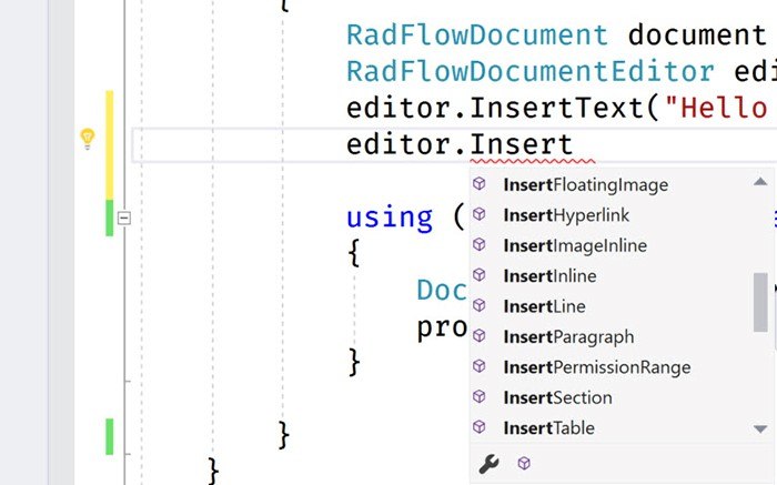
When using TagHelpers in a .cshtml view, Visual Studio treats the TagHelper as it would HTML but with added server side functionality. Often with HTML Helpers the CSS class attribute was difficult to add, and completely lacked Intellisense. With TagHelpers, developers get rich Intellisense for not only server side code but also with any HTML attributes supported by Visual Studio.

In addition to better Intellisense, TagHelpers also make great container elements. TagHelpers treat their inner HTML content as normal HTML elements do. In comparison to HTML Helpers, nested content required escape codes, or specialized using blocks to contain inner HTML content.

Throughout .NET’s journey from conceptualizing ASP.NET Core TagHelpers to our recent release, Progress has continued to support the community by sharing information about TagHelpers. Below are resources that will help keep you up to speed on the latest developments with ASP.NET Core TagHelpers.

Building Reuseable Components in ASP.NET Core

Telerik UI for ASP.NET Core supports a variety of TagHelpers with more on their way. Try our TagHelpers with a thirty-day free trial of UI for ASP.NET Core.

Test Studio and the Meaning of “Do You Even Test”

$
0
0

Ever wonder about the meaning behind Test Studio's slogan? Learn about why you need to test and offer up your own testing stories.

Most people see the slogan “Do You Even Test” and it immediately prompts a reaction. Whether you are a developer or tester you may have heard this saying before, and usually it is not a good thing.

Back about a decade ago when I was a Product Manager at a different software company I received an email that made me cringe, by the subject line alone, and worse yet it was from a big customer. Even worse than that, it had the CEO CC’d on the email too. 

From: BigCustomerCo

Subject: Do You Even Test?


This was one of those high priority emails that you dread opening, but you know you must, and hopefully before the CEO comes looking for you. Gulp!

There is so much money, energy, and time spent across the company leading up to a major software release. Both internal and external marketing campaigns are rolling out in full force to build up the hype and excitement for new features. 500 fresh new t-shirts arrive with the latest branding for the product. The sales teams have been trained up on all the new cool features they are going to make a living on. The development team is finishing up the final pieces to the most important release of the product’s history, and everyone is ready for the party that is planned for the big release day announcement.  Looking back at these moments I just think how naïve we were.

The big day arrives. A press release goes out, and the C-levels make their speeches. The cake gets cut and served as everyone cheers, and the celebration begins for a long-awaited new version of the software. The best version yet, right? The customers and prospects are buying it up left and right! 

Then, before the afterglow of the party has faded a high priority email hits your inbox, and the wheels come off. That new version that everyone is so proud of just crashed when the customer started to use it.  They can’t even try the new features because something is broken and preventing them from even using it. This story does not end well. In fact, the weight and embarrassment of the failure in this example caused the company to jettison this application, and sadly 100 employees too. All of this could have been avoided if the team had been testing. Of course, they had their unit testing routines down to a science, and of course the developers were top notch, but they failed to have a regression testing plan for the full product.

Please don’t let this happen to you. Make sure that you do have a testing plan for Regression Testing, for Functional UI Testing, and for Performance and Load testing too. I have heard many similar versions of this from many clients over the years. There is something that you can do to protect from this; and it costs about as much as the new order of 500 t-shirts to start automating with Test Studio. 

DYETStarwest2017

Share Your Own Testing Stories

Please feel free to share your “Do You Even Test” stories in the comments, and start a Test Studio trial today.

Visit Us at the StarWest Expo

Also, please come visit us at BOOTH 27 at the StarWest Expo next week, and grab a t-shirt while they last!!

Progress @ DEVintersection: Sessions, Product Showcases and Lots of Fun

$
0
0

DEVintersection is coming up! This October 31 – November 2, 2017 at the MGM Grand in Las Vegas, we invite you to join us at Booth 111. Hope to see you there!

Looking forward to DEVintersection 2017? So are we! There are bound to be some amazing announcements. We will be there too (booth #111), so make sure to stop by, meet the team and discuss the latest trends in tech, including our Telerik UI for Xamarin, Telerik UI for UWP, Kendo UI and Telerik Reporting. We have some cool SWAG too.

DEVintersection starts in just a few days and the excitement around the event is growing by the minute. As usual, there are high expectations for the conference with various sessions and talks by some of the biggest names in the industry.

Progress @ DEVintersection: Booth and Sessions

We wouldn’t miss the conference for the world and as usual the cool guys from the Product and Developer Relations teams will be present there. Head over and meet us at Booth 111, where we will have some great product demos, theater sessions and prize giveaways. We'll also be giving out our epic Telerik and Kendo UI T-shirts and a big prize: MICROSOFT XBOX ONE X.

devintersection tshirt

Sessions at Booth 111

Let me reveal a little secret about our product sessions at the booth: We're coming with the very people who personally developed the great advancements in our Telerik and Kendo UI products.

Telerik UI for Xamarin: We are excited to show you our Xamarin UI suite. It is all about beautiful, polished and elegant UI widgets for building cross-platform Xamarin applications. Telerik UI for Xamarin comes complete with predefined item templates for Visual Studio. They are included by default when you install the products. You can directly include them in your Xamarin.Forms project and use them as footprints for similar scenarios in your application.

Kendo UI: We are proud to present the most complete UI library for data-rich web applications with support for your favorite JavaScript technologies – jQuery, Angular, React and Vue. We are pleased to announce new support for React and Vue with our Kendo UI wrappers for these frameworks. You get the same great Kendo UI component features that you have come to rely on, now provided via a wrapper interface for the React and Vue frameworks. 

Telerik UI for UWP– Open Sourced! We are thrilled to provide you with UI for Universal Windows Platform - a complete UI suite for building amazing Windows 10 applications with a single code base. Completely Open Sourced!

Telerik Reporting:We are excited to present you our complete and mature reporting solution. You'll see how to build, style, view and export elegant reports seamlessly and very quickly.

Sessions and Workshops

Meet our visionaries and trend-setters @ DEVintersection:

We'll be There @ DEVintersection!

Looking for us at the conference? Just hunt down our Ninja and Kendoka and our smiling faces will greet you.

.NET DevChat: Responsive Web Apps with ASP.NET MVC and Bootstrap 4

$
0
0

In this .NET DevChat recap, we talk about building responsive web applications with UI for ASP.NET MVC and Bootstrap 4. Dive into the source code and Q&A below.

Bootstrap 4 is great, and it’s even greater when used in conjunction with Telerik UI for ASP.NET MVC.

In this .NET DevChat, we covered the basics of Bootstrap, its NavBar component, the Grid layout system as well as the new and shiny Bootstrap 4 Cards!

We dived right in and added all of these to an ASP.NET MVC application that uses Razor-based Layouts and Views.

We also covered how Telerik’s UI for ASP.NET MVC comes with an out-of-the-box Bootstrap 4-inspired theme so that all the widgets will look as any other Bootstrap styled UI element. In particular, we worked with the Telerik MVC Button, Grid, and Chart.

As promised, here’s the source code for the sample application that we developed during the live webinar.

As usual, we were thrilled to have received great feedback from you in the form of interesting questions!

Questions and Answers

What is the current status on Bootstrap 4?

As of the writing of this post, Bootstrap 4 is on its first Beta release. It had been in alpha for a few months now, but back in August Bootstrap 4 beta came out.

Can I modify the Kendo UI themes to match my company’s branding?

Yes, you can. You can use our Sass ThemeBuilder tool to generate a new theme. You can use the Bootstrap 4 theme as a base and modify from it.

If you are comfortable with Sass you can also modify scss variables to compile a new Kendo theme to use within your MVC application.

What is this Deferred functionality that was used in the demo?

This is a personal preference, and it’s not a requirement.

The reason to use the Kendo MVC Deferred initialization functionality is so that the JavaScript code to initialize the widgets can all go in the same place. Normally, you would put this at the bottom of the page.

Will this work with Telerik UI for ASP.NET Core?

Yes! Since Bootstrap 4 is just CSS, it can be used no matter the server side technology.

In the case of Telerik UI for ASP.NET Core (which supports ASP.NET Core 1 and 2), Razor is also used to generate the MVC widgets, and the actual markup rendered on to the final html page will be the same.

Hence, with the same Razor code all the UI concepts (including Deferred initialization) covered in this webinar will apply on an ASP.NET Core application

Is this type of UI also possible with Angular 4?

Certainly! We also have a webinar where we cover how to write Responsive Angular 4 Dashboards with Kendo UI for Angular.

Kendo UI R3 2017 Release Webinar Recap

$
0
0

We recap all the news from the latest Kendo UI release and answer the questions we couldn't get to live about Angular, React and more. Missed the webinar? You can watch the replay below.

Last week, we hosted the Kendo UI R3 2017 release webinar, which highlighted the latest features and improvements we’ve added to Kendo UI for jQuery and Kendo UI for Angular. It also introduced Kendo UI Support for React and Kendo UI Support for Vue. This blog post summarizes the event and provides answers to the questions that were asked by attendees.

Webinar Recording

If you were unable to join us for the live webinar, don’t worry: we’ve posted the recording to the Kendo UI channel on YouTube.

Prize Winner

It’s a bit of a traditional for us to give away prizes to attendees who ask the best questions. This time is no different. The winner this time around is Tony Garcia who will receive an Oculus Rift + Touch Virtual Reality System!

Questions and Answers

What’s the oldest version of AngularJS you support?
You can read the supported versions of AngularJS from our documentation.

Are features like the Material theme and features in the Grid component available for Vue?
Yes since Kendo UI Support for Vue are wrappers of Kendo UI for jQuery.

Where can I find documentation?
That’s easy: docs.telerik.com.

Does endless scrolling in the Grid require a static grid height to be set?
No. The Grid has a default height. It uses that value (or the height you set) to calculate the view for endless scrolling.

Can VueJS be implemented using a custom Kendo UI build?
I’d recommend checking out the Getting Started article we have in the documentation. In particular, there’s a section entitled, Integrate Kendo UI for Vue.js using NPM and Webpack that’s worth checking out.

Is the Material theme supported in React?
Yes. All the themes that ship with Kendo UI for jQuery are available in Kendo UI Support for React.

Are the same Sass-based themes used for both Angular and jQuery?
Yes. We have the theme available in the GitHub repository, kendo-theme-material.

What about Material Design theme for Kendo UI for jQuery?
This theme is currently available for Kendo UI for jQuery and Kendo UI for Angular.

Is there a roadmap of when the theme builder is updated with the R3 release changes?
The Progress Sass Theme Builder is currently up-to-date with everything we covered in the webinar.

When is the ngModel update of a TimePicker? onBlur or onChange?
It’s for the event, valueChange. We have a demo of this capability available here.

How about the Grid making it responsive to different media sizes? Is it covered on this new release?
I’d recommend checking out the documentation we have that covers the responsive design support in the Grid.

You referred to the new ReactJS support as “wrappers”. So, does this still require jQuery? If so, are there any plans for KendoUI for React that is “native” to React and doesn’t require jQuery? (i.e. KendoUI for Angular)?
Yes, Kendo UI Support for React are wrappers of Kendo UI for jQuery. Therefore, jQuery remains a dependency. We have plans to introduce native support for React in the R1 2018 release timeline. You can read about this in the Kendo UI roadmap.

Can you resize the columns of the Grid component?When will column resizing be part of Angular Grid component?Do you have grid column resizing and moving feature in this release?
The column resizing got delayed a bit, sorry! We need few weeks to complete it and will publish an incremental update.

I’ve been working with the Kendo UI for Angular and would like to know how to modify the themes for the UI. Is there any documentation that explains the functionality of the themes?
Here’s the link for themes and styling with kendo for angular: http://www.telerik.com/kendo-angular-ui/components/styling/

When will a tree component be available in Kendo UI for Angular?
I’d recommend checking out the Kendo UI for Angular roadmap for more information about timelines for components like the TreeView. It’s a short-term goal of ours to deliver this component.

Is there any plans to make a Vanilla JS of version Kendo UI for jQuery so that jQuery wouldn’t be required to use?

We have no such plans at this time.

Transcript

Prefer reading a transcript to watching a video? We've got you covered as usual—check out the full transcript below:

00:04 John Bristowe: Hello, everyone, and welcome to the R3 2017 release webinar for Kendo UI. My name is John Bristowe. On behalf of all of us at Progress, I'd like to thank you for taking the time to hear about our latest release. Joining me during today's webinar is my colleague, Tara, and together, we'll walk you through the latest features and updates we've made to Kendo UI. Before we begin, I'd like to let you know that all the bits we'll be showing you here are available online. Make sure to fire up the Telerik control panel to download the latest updates. Individual product updates are also available through your account page on telerik.com.

00:40 John Bristowe: Now, I know it can be tough to sit through an entire webinar. It's easy to get distracted or pulled away from your desk. If that happens, don't worry. This webinar is being recorded and will be available up on YouTube. You can find our channel at youtube.com/telerik. We'll be answering your questions during this webinar on Twitter through the 'heykendoUI' hashtag. Make sure to use this hashtag, because it will help us find those questions. Also, we'll be giving out a special prize to the best question that's asked. It's in your best interest to ask, and ask often. It's our way of thanking you for taking the time out of your busy schedule to join us. And please note, that this prize is subject to our sweepstake rules.

01:19 John Bristowe: A couple of housekeeping items before we begin. Everyone should keep an eye open on the wrap-up blog post that we'll be publishing shortly after the conclusion of today's webinar. You'll find this up on the Telerik blog site which should be your homepage. And if it's not, please subscribe to the RSS feed or bookmark it. You can find the Telerik blog site at blogs.telerik.com. Another bookmark where the site is the Telerik Developer Network; there you'll find articles on topics that are relevant to you. Recently, we've been talking a lot about JavaScript, Angular CSS, and a whole host of other things. You can find the Telerik Developer Network or TDN at developer.telerik.com.

01:54 John Bristowe: And now, onto the main part of our webinar. Kendo UI is our UI framework for building rich HTML5 and JavaScript apps for any platform, browser, or device. It features many robust controls that are beautifully themed and responsive. Support for third-party frameworks is extensive with libraries like jQuery, Angular, Vue, React, and Aurelia. The R3 2017 release is packed with features. In fact, this release is one of our biggest to date. Not only have we improved the product and added new features, we're introducing two new products, wrappers for Vue and React. Tara will be talking about these in just a bit. For now, I'd like to walk you through the changes we made to our Core Library and Angular components.

02:35 John Bristowe: Let's start with the updates we've made to the Core Library of Kendo UI. The Sass Theme Builder was introduced in the R2 2017 release. It's a WYSIWYG tool that's designed to help you create custom themes based on built-in ones that ship with Kendo UI, namely, Default and Bootstrap. In our latest release, we made a number of updates to the Sass Theme Builder and the Kendo UI themes, including updated support for Bootstrap v4, which shipped as a beta release just a few weeks ago.

03:04 John Bristowe: Now, let's move on to some of the improvements made to the widgets in Kendo UI for jQuery. The grid continues to be one of most popular widgets. In this release, we've added number of features that you'll love. The first one is infinite scrolling. Infinite scrolling, also known as endless scrolling, is a new feature of the grid. It enables the ability to display large amounts of data by appending additional pages of data on demand. Loading of new items occurs when the scroll bar of the grid reaches the bottom of its view. When data is returned, only new items will be rendered and appended to existing ones. The great news is that infinite scrolling works for both local and remote data. It's also compatible with grouping, hierarchy, and editing. Let's see how this works.

03:50 John Bristowe: Here we have a grid on the page that's bound to a set of 5,000 data items. You'll notice that as we scroll to the bottom of the View, items are populated on the bottom. Switching over to the code, you can see it's easy to configure the grid to support infinite scrolling. Specifying the endless value of the scrollable property to be true will enable this functionality. This functionality is supported even after you perform operations against the grid. For example, you'll notice that if I sort one of the columns, and then scroll to the bottom of the View, the grid automatically fetches the next items as determined by the page size on the bound data source. Now, in this case, the data is local, however, this functionality would work with data from a remote data source, as well.

04:35 John Bristowe: While we're on the topic of scrolling, I'd like to highlight another update to the grid that enables support for CRUD operations against one that employs virtual scrolling. Virtual scrolling was introduced in the previous release. It's a feature that's super useful when working with large amounts of data in the grid. In this scenario, fetching and processing of this data at once would impose a performance penalty due to limited browser resources. Virtual scrolling helps in this situation by automatically requesting rows when the page size of the bound data source is exceeded. The nice thing here is that with virtual scrolling, you can now perform CRUD operations against a local data source.

05:13 John Bristowe: Sticking with the grid, we've implemented a small change to the behavior of the Pager widget. This is what allows you to control the page index that the grid is displaying. It turns out that, sometimes, all items in the grid can fit into a single page. If this is the case, then showing the pager might not be necessary. With this release, we've added the pageable.alwaysVisable configuration property to allow you to tune this behavior.

05:41 John Bristowe: Let's switch over to the Scheduler. This is a very popular widget, because it provides a great user experience for event planning and coordination. It's responsive, flexible, and provides a wide variety of features. In the R3 2017 release, we've improved the Scheduler by allowing events to span across days in the Timeline view. This is super useful on scenarios where events might occur overnight or over a long period of time. Here's a great example. As you can see, I have a Scheduler here on the page that has a Timeline view configured to span across two days. I can create and modify events, as well as, switch to Timeline view to different hours.

06:22 John Bristowe: Now, I'd like to talk briefly about accessibility. Our engineers have worked incredibly hard for this release to provide updates to our accessibility compliance across the entire framework. This includes adhering to standards like ARIA and Section 508. You can find out more by visiting our documentation. While you're there, you should also check out the shortcuts and keyboard navigation improvements we've made to each control. Speaking of documentation, did you know that we now have a knowledge base section? Check it out, it features a lot of code examples that target customer how tos and questions that have been asked on stack overflow.

06:58 John Bristowe: Alright. Now, let's switch gears and talk about the latest and greatest features we've added to our Angular components. We've added ton of features and updates to the R3 2017 release of Kendo UI for Angular, our native set of Angular UI components. Let's start with an important update to our built-in theme support. As you know, Kendo UI for Angular ships with a Default theme and a Bootstrap theme. This release introduces a preview of our material theme which is based on the material design guidelines. This is a sassy CSS based theme that's supported across various components.

07:33 John Bristowe: Let's see how this works by using the example from our Getting Started guide. It's a simple page with a button component that will change the heading text when clicked. The button component on this page has the default theme applied to it. Let's see how we can use the new material theme. The themes in Kendo UI for Angular are distributed as separate NPM packages. You can also use Yarn, as well. To include a theme in your application, you can either use the pre-compiled als.css file or customize the theme styles by loading the theme source files through the application build process. In this example, we'll go the ladder route. First, we'll install the material theme into the working directory. Next, we'll update our styles to import the material theme. Webpack will spot the change, compile the changes and then reload the page.

08:26 John Bristowe: As you can see, the appearance of the button component has now changed to reflect the material theme. Now, as I stated earlier, this is a preview of the material theme support across various components in Kendo UI for Angular. This theme can be applied to components like the text box, button group, check box, radio button and chart. Make sure to check out the repo up on GitHub for more information about the material theme support in Kendo UI for Angular. We also have documentation on the variables you can target if you wish to override the material theme.

09:00 John Bristowe: Let's now talk about components. Kendo UI for Angular ships with many powerful components. In this release, we've added a new one called the TimePicker. As the name implies, this component provides a time selection control with the dropdown. Let's see how this works. We'll start with an existing project that I've generated using the Angular CLI called Kendo TimePicker. It's basically the same page you saw in the previous demo, except there are no components present on this page. Next, we'll add the date inputs package to our project which includes the new TimePicker component. Once these packages are added to our project, the next step is to integrate the TimePicker module into the NG module.

09:44 John Bristowe: Once imported, we can now add the Kendo TimePicker directive to our template to utilize it. The value property binding is defined underneath in our component. With this in place, we can see that the page has now been updated and displays the TimePicker component. The component itself is highly interactive and customizable. For example, you can navigate through time values using the keyboard or mouse, set ranges with minimum or maximum values, and specify time formats for different cultures. The TimePicker can be used in both template driven forms, as you saw, and reactive forms to the form group decorator. It's a really nice component and one that we hope you'll start using today.

10:39 John Bristowe: Another new component in the R3 2017 release of Kendo UI for Angular is the Range Area Chart. Unlike in Area Chart which is filled right to the access, the Range Area Chart is filled between it's minimum and maximum values. This makes it ideal for plotting values like temperature. Here, I have one cents chart. As you can see, the values are plotting within this range. Looking at the underlying code, we're using the same Kendo Chart Directive as with other charts; the only difference is that we've specified the type property as range area.

11:16 John Bristowe: While we're on the subject of components, let's now take a look at one of the most popular ones in Kendo UI for Angular, the Grid. Many of our customers have asked us about adding more features to the Grid. And I'm happy to report that we've added many new features to it in this latest release; one example is Selection. The Grid today offers a sort of classic selection of single and multiple items. But we wanted to add support for richer scenarios like check box only selection for selecting and de-selecting rows. Another example is In Cell Editing; not everyone wants to put entire rows in edit mode or work with a bulky external form just to update single cells here and there. The Grid now provides editing on a cell by cell level. This dramatically improves the overall user experience and user effectiveness when editing data in this manner.

12:07 John Bristowe: And finally, if you're binding to the Grid with large sets of data, and let's be honest, that's most of us, we've added a powerful configuration option that allows you to combine virtual scrolling with grouped data. It should be noted that this feature is available only through a binding of in memory data. Let's take a look at these new features in action. Here we have a page with a grid that's bound to some data. Let's modify this grid to demonstrate the latest improvements we've made to the R3 2017 release. First, we'll enable check box based selection through the selectable option. I'll do this by specifying a value that can be either a bullion or of type selectable settings. Here I'll set this to a selectable settings parameter with check box only set to true and its mode set to multiple. I'll then add a Kendo grid check box column to the grid to display the check boxes for selection.

[pause]

13:13 John Bristowe: Once Webpack picks up these changes and rebuilds the project, you can see that the grid now has a check box based column for selecting multiple rows. Let's now enable in cell editing. Here I have the same grid as before, except this time, I've made a few changes to the underlying code. First, I've defined a form group to support plumbing needed for performing edits. Next, I've defined editors for each of the columns that we want to perform inline editing for. And finally, I've bound the Kendo grid in cell editing property to invoke create form group. This will also take advantage of any validators defined in this method. With these changes in place, we can see that the grid now supports inline editing against the columns we specified earlier. Note that validators are present in the case of missing values, or in the case of invalid input.

14:08 John Bristowe: At this point, I'd like to pass the webinar over to Tara who has the honor of walking you through the latest products we've added to the Kendo UI family, our Kendo UI wrappers for Vue and React.

14:20 Tara Manicsic: Hey, everyone. Thank you so much for joining us. I'm really excited to be here today with you because I get to walk you through our new UI component libraries for React and Vue. As you may be familiar with, the Kendo team has been building awesome UI component libraries for a while now, including our jQuery and Angular libraries, and we're super stoked to be able to bring you that same support for your Vue and React projects.

14:48 Tara Manicsic: We're gonna go ahead and get started with React, and just jump right in. To get our base React app, we're gonna go ahead and globally install Create React app using npm install -g create React app. Create React app is basically a tool that helps us build our project up real fast, so we can hit the ground running and not have to worry about build configuration, and just lets us concentrate on the code and get these things going, and see how everything works with our new Kendo UI libraries. And once we have that installed, we can use Create React app to create our new awesome React Kendo project.

15:31 Tara Manicsic: An interesting thing about Create React app is, just by default, it gives you the files you need to make your React application into a progressive web app. I won't go into detail about everything that that means, but you'll see when we're going through our files that we have a manifest.Json, and a registered service worker.js file, and these are all components that you add to make your application a progressive web app.

15:58 Tara Manicsic: Just a fun little tidbit as we go through creating our app through Create React app. Once that's all set, up we can go ahead and go into our project directory, and we'll run npm start to see what we have right from the jump off point. Here, we could see that our project is over at localhost:3000, so we'll make our way over to there, and see that we have our starter react project. So far, so good. The first thing I wanna do is open up our code, so we can take a look and see what we have thus far, so we know what we're working with. I'm using visual studio code and just open up the whole directory from the command line. We can see some of the usuals in the main directory, the node modules folder, get ignore, package Json and readme. We also have a public directory that houses our fave icon and main index.html page, and that manifest Json file I was talking about earlier. This is a progressive web app helper that lets browsers know how to display your application. We'll be doing most of our work in the source file today, app js to be exact. There's the service worker file, another PWA tool. And you'll see that we have a yarn.lock file, but I'll actually be using npm instead of yarn. Besides npm 5 being super fast you also get a default package Json lock file.

17:27 Tara Manicsic: Okay, if we take a look inside our app js file, we see we're already importing a few things. And today, we will be adding the ever so handy date picker from our Kendo UI library. This gives us a great looking UI component for users to input dates easily, and we just have to install a few modules and add a few lines to our component's js file. Although, we would usually make a new component for our date picker, today we'll just keep it simple. The very first thing we're going to install is Kendo UI. Yay! And we'll do that using NPMI to install @progress/Kendo-UI, and with NPM 5, you don't need to add the DASH Stash save to save as a dependency, that is there by default. We need this in order to use the UI component library, which is Kendo UI.

18:23 Tara Manicsic: The next thing I'm installing, I'm using Control R to back-search to install our default styling for Kendo UI; basically saying, "Please make everything look nice without me having to do much work." One of my favorite things. And the last thing we'll install is our module of the hour, the Kendo date inputs React Wrapper, and this is where our calendar lives that we will be implementing inside of our application. Heading back to App.js we'll import all the fun parts we just installed. First Kendo UI, of course, then the default theme, and last but far from least, we import calendar from the date inputs module.

19:10 Tara Manicsic: At this point, I will save it, and then save it again 'cause I guess BS code thought I wasn't serious. There we go. Then, jump down into our template, remove the default filler and add our calendar component. The first thing we'll add is the value, which we will bind to this.state.datetime. We will set this anytime we trigger a change, we're binding that change event to on "change function" which we'll cover in a second. But first, we create a constructor passing at the props. Here we'll also pass props to super, we don't technically need to pass props to super because we're not using this stop props currently in our constructor but it is best practice to do this, what I like to call future safing your code.

20:00 Tara Manicsic: Next, we'll add date time to this.state, and assign it to the current date. The last thing we'll do inside our constructor is bind this to this.onChange, so it knows what we're referring to. Finally, we create our onChange function, passing it if the event that was triggered on the click. Whenever onChange is called, we wanna set state to this to reassign date time to the value and sender on the event object. If you wanna see what this object looks like, you can add a console log before or after the set state function, and you can log out either "e" or "e.sender". Okay, that's it. We have everything that we needed to add to our App js file, everything that we set to our calendar component, we went ahead and made a constructor, so it's set as soon as we build our component and we have our function for when we make changes and trigger the onChange function.

21:02 Tara Manicsic: We'll go ahead and click Control Backtick to open up our terminal. I can't recall if I ran NPMI when we first started so, I'll go ahead and run it again for safe measure and good tidings. And I'mma go ahead and clear that out, and run NPM Start. Again, if we go back over to localhost:3000 and take a look, we should see our beautiful calendar. Yay! [chuckle] You see, we have everything styled out because we imported that default styling. That was all the work with it we had to do to make it look this great, and to have all those little interactions, like the hover overs and the color changes, and you even see that when you hover over a number, you will get that whole date time value with the day-month, date-year, all that information that you want from a calendar.

22:03 Tara Manicsic: That was really easy. That was the way that you will bring those components into your React projects. If you come back to kendoui.com and look again at our support for React section, you will get everything that I went over, plus more. And at the very bottom, if you keep scrolling down, you'll see that there is also, instead of using NPM, you can also do the CDN files, and that's basically letting you access these files from unpackaged CDN services, but also down here are all of the widgets that we have available for you to take advantage of. If you get a chance, go there, check those out, and find all the fun things that you can do with our new support for React and Kendo UI.

22:51 Tara Manicsic: This release we're also really excited to add support for Vue. Vue is also a really great library or framework, it's pretty lightweight too, so it can't be considered a library but it's also very adaptable, so you can build it up into a framework.

23:08 Tara Manicsic: We're going to use the Vue CLI to create a project that we're going to incorporate our grid component into. First things first, we globally install the Vue CLI. Then, we're going to use Vue in it, and the Webpack template to create our awesome Vue Kendo app. You have many options for templates like PWA browserify and even Simple to get the cleanest, simplest setup. The Vue CLI will guide us through a few questions to get set up, and will be more specific on some, but mostly, we'll just say yes to everything. Then, we can go into our project directory. Oh geez, I guess, they want me to actually do it correctly. [chuckle] And we can run NPM install to get all of our modules once we're in there. After everything is finally done installing, we can run NPM Start which you can see in our package.json file is an NPM script that says to run node on build/dev-serverjs. Once that's built, we can navigate over to local host port 8080 to see what we've got. Ta-da! It's a lovely starter Vue app.

24:32 Tara Manicsic: Okay, let's get back to the code. When we list out the main project directory, we have the usual suspects again, so let's open it up in VS Code to dig in.

24:45 Tara Manicsic: In build, we have some build files and build tool config files, config has config files. But source is where we'll be doing most of our work. If we take a look at hello.Vue, we can see it's what we were being displayed on the starter app. The first thing we want to do is install what we need from Kendo, starting with Kendo UI. Like before, we don't add the -s flag because it is included by default from NPM 5 Plus. But the next two are actually dev dependencies so we will add a -D flag. Then we need to install the grid wrapper for Vue which will be npm i -D @progress/kendo-grid-vue-wrapper. This is the real meat of what we'll be using today. We'll also need the supporting character of data source to pull our data into the grid.

25:43 Tara Manicsic: Now, if we take a look at our package.Json, we should see that the Kendo UI module is in its rightful place under dependencies and the other two are under dev dependencies. This time, instead of installing the default Kendo UI styling like we did with React, we will actually open up the index.html file and just paste the links to our style sheets. Next, we're gonna go into our main js file to let our Vue app know how to use all of our Kendo UI imports. First and most importantly, we add Kendo UI, then the grid, grid column, and the Kendo grid installer from the grid Vue wrapper module. Next will be the data source and data source installer. Followed by taking advantage of the vue.use to use [chuckle] our plugins by passing in our installers. Then we add all of these, the data source, the grid, the grid column to our Vue app in the components object.

27:14 Tara Manicsic: After that, we just save and close and never touch our main js file again, for now, at least. [chuckle] At times like this, I like to run NPM Start to see if we've broken anything. And aha, seems like I've forgotten the ever important 'from' in my import statements. Notice how I also had a red squiggly line there. I guess, I have to edit the main js file sooner than I thought.

27:43 Tara Manicsic: I'll save it again, and see we have a successful compile. Let's go ahead and take a look at the browser to make sure there are no errors there either. Clear view on this window, as well. See what I did there? Okay. Back at it. We can definitely close main js now and move on. Real quick, I want to nip into the app.vue file to remove the big Vue logo just so we have more room to check out the grid component.

28:14 Tara Manicsic: Everything else in here looks like it's okay and it can stay for now. We'll save and close that and the rest of these files because now we only have one more file to change, the source component's hello.vue file. Again, usually we would separate the grid into its own component but for today, let's just stick it in here. First, we'll remove all of the old code and change the class to grid, for clarity's sake. Now we can start adding our Kendo components, starting with the data source. Kendo data source will have a parameter of its reference. The type of data that this data source is. Page size, just how many data items to display on the page as a default. And the transport read, since we're grabbing this data from another location. In this case, we're just using a svc file from our demos. Oops, let me fix that syntax. Then we'll close out the Kendo data source component.

29:45 Tara Manicsic: Next up on the docket is finally the Kendo grid. Inside here, we'll apply some grid settings. Height, that's pretty self-explanatory. Data source ref is the data source we just added above.

[pause]

30:15 Tara Manicsic: Then, we're gonna give our grid some functionality by making the data both groupable and sortable. We'll see this in action once we run the code. We also let the pages of data not just the page in the app itself be refreshable. We also let the user change the page size, and also give them buttons per page to navigate around the data. I find the next step very straightforward. We first added the Kendo UI grid component, and now inside there, we add the Kendo grid columns component. This first Kendo grid columns component will be displaying the contact's name from our data source file we bound to this grid. The field matches the key to the data we have, and it will fill in the value. The title is the header of that column. The width of the column is 250 pixels, because I said so. I've added three more columns for my data source. The second and third have no width and will fit in where they can. Then, we close out the Kendo grid component. I've also scrapped all the other styling and just added a padding around the grid for readability.

31:51 Tara Manicsic: If we open the terminal, we can see, I already had it compiling in the background; thanks to the Vue CLA with every save. If we go to localhost:8080, we can see our beautiful grid. The scrolling and hover, all these actions all come from that Kendo UI styling that we added. Since we made our grid sortable, you can click a header and the data will sort by that column. On the bottom is the page menu where the user can request how many items per page are displayed.

[pause]

32:37 Tara Manicsic: And on the bottom left is where we're paginating the data. And since we chose five as our page-able button count, that's how many page buttons you can choose from, as well as, click around to navigate the arrows to go through the pages. Since we made the groupable option true, you can also drag a column header to the top to group all those grid items that match that column property.

[pause]

33:16 Tara Manicsic: And we just had to install the Kendo modules and hook them up to our component. This is much easier and faster than piecing together all of that information to form a grid in Vue, or React, or Angular, or jQuery which are all the options we have to use Kendo UI with. You can check out and play around with more of our demos on our demos.telerik.com page. There are demos for the same component in Angular, jQuery, Vue, and React implementations. It's pretty fun. Come play. If you have any questions, please reach out to us on Twitter I'm @Tzmanics and all of us on the team are @KendoUI. We would love to hear from you. I cannot wait to see what you create. Thanks for hanging out with me this afternoon and happy coding.

34:15 John Bristowe: Thanks, Tara. Amazing stuff. I can't wait to see how our customers can take advantage of our latest release. I'm especially jazzed about our wrappers review. Definitely some new ground for us and our customers being discovered here. There's one more thing I'd like to cover before wrapping up and that's Telerik Reporting. As some of you may know, Telerik Reporting uses Kendo UI under the covers to render out beautiful and highly informative charts as part of our reporting solution. In our last release, we introduced a preview of Telerik Reporting with our Angular viewer component. This was a significant milestone for us, and one that many customers had asked for.

34:53 John Bristowe: In the latest release of Telerik Reporting, we're introducing more features and improvements that make it that much better. For example, we've added web report preview accessibility, enabling wider user audiences to view web report previews. Our HTML5 based report viewer support major accessibility features like comprehensive keyboard navigation in both the viewer and its content and dynamically extended markup that provides support for the most popular screen readers.

35:22 John Bristowe: We've also added new financial charts to Telerik Reporting. The OHLC series are designed to represent information about price movement of a stock over a period of time using candle stick or bar markers. And finally, we've implemented a bunch of performance improvements. For example, We've improved the Excel grid generation algorithm that significantly reduces the time required for rendering huge reports to Excel. PDF rendering also now handles the report pages continuously. This enables us to release.NET objects that keep page structure immediately after the page is rendered. Overall, Telerik Reporting is a great product and should be strongly considered by folks using Kendo UI.

36:04 John Bristowe: Well, that about wraps things up for us. Before we go, I'd like to share with you a couple of announcements. On October 11th, we'll be hosting the Telerik UI Tools R3 Release Webinar; please make sure to register. You'll hear and see everything that's latest and greatest in our R3 2017 release. Also, later this year, we'll be hosting separate webinars for our wrappers for Kendo UI for Vue and React. The purpose of these webinars is to provide you with a deeper dive of what you saw here today. We also hope to provide more updates on the product line at that time. Keep an eye on the Kendo UI website, along with your email inboxes. Invites to these webinars will be sent out later this year.

36:50 John Bristowe: On behalf of Tara and the rest of us at Progress, I'd like to thank you for joining us for today's webinar. We hope you can take advantage of the feature's improvements you've seen here today. We look forward to seeing you on the next webinar. See you next time.

Need a DataGrid for Your UWP App?

$
0
0

DataGrids are critical in most business apps. Why reinvent the wheel when you can use the high-performing and open source Telerik UI for UWP DataGrid instead?

Building a Windows 10 app using the Universal Windows Platform? Chances are you’ll need a DataGrid for your application, and what a better choice than the highly-performant and feature rich DataGrid from the Telerik UI for UWP suite, which is also open source and available on GitHub.

As we all know, Grids are the backbone of most line of business applications out there. They are also by far one of the hardest components to create in terms of development time, functionalities, customization, responsiveness and speed.

Developers need to be able to deliver large applications tailored to the needs of the business and following the project requirements on tight deadlines. This means quite often they must choose between building the component internally or using a third-party toolkit, which provides it out of the box.

But you already know all of this, right? So where am I going with this blog?

Well, let me cut to the chase. If you had the pleasure to attend this year’s Microsoft Build Day 2 keynote, either in person or virtually, you were probably thrilled by the announcement about XAML Standard 1.0. Abolade Gbadegesin (Architect for Project Rome) presented on the Microsoft team’s work on improving the Pen capabilities and showcased them with the Telerik UI for UWP DataGrid on stage (57:35). 

So why should you choose the Telerik UI for UWP DataGrid? Well, for starters, if you missed it, as of February 2017 the whole Telerik UI for UWP suite is open sourced. Yes, this includes the DataGrid, meaning you are more than welcome to use it in your Windows 10 application. You can get the whole product package from GitHub and start using it right away. However, there is more to a component than its free availability.

Telerik UI for UWP DataGrid—Benefits and Functionalities

Telerik UI for UWP Grid Overview

The Telerik UI for UWP DataGrid is an extremely powerful component in terms of both speed and functionality. It has been built from the ground up to deliver maximum performance and a native look and feel to your Windows 10 app. It provides advanced UI virtualization for high performance making the grid fast, fluid and responsive and capable of processing huge amounts of data blazing fast.

In addition, the DataGrid offers the ability to customize columns, through templates for the different cell types, as well to manually or automatically adjust their width depending on the content they include. This comes quite handy when one of your columns includes cells with visualizations or long strings of data. On the other hand, for columns consisting of icons, up-down arrows signifying increase/decrease, or other smaller objects, they can be scaled down to a smaller size providing better visualization of all the data in a certain row.

Another key feature that our DataGrid offers is the ability to sort single and/or multiple columns in either ascending or descending values, resulting in users being able to sort data with a single tap on the column header. These not only includes alphabetical sorting, but also numbers, values (True/False) and duration.

Sorting Telerik UI for UWP

A well known and highly used functionality of any grid is the filter. With the filtering feature in the Telerik UI for UWP DataGrid your users will be able to filter ANY type of data, be it string, decimal, Boolean or date and time. There are also various filtering functionalities to further extend the capabilities of the control. For example, you can filter by:

  • is/no equal/great/less than
  • before and after
  • Contains/StartsWith/EndsWith

The rich API behind the control allows you to easily define the advanced filtering criteria through the code and suit it to the project requirements you are working with.

Here are a few other features that the component includes:

  • Cell or Row, Single or Multiple Selection
  • Grid Filtering customization
  • Grouping—users will be able to group data by simply moving a column header to the dedicated grouping panel

Filter Telerik UI for UWP

Verdict

All and all, the Telerik UI for UWP DataGrid is a truly advanced component, which can serve you well in developing Windows 10 applications, while also cutting down your development time substantially.  The extensive documentation will decrease your learning time and will get you running in a jiff. If you are interested in learning more on add a Grid to your current application, check out this blog post on Getting Started with Telerik UI for UWP, where John Bristowe will guide you through creating an application and using the DataGrid and Chart components.

Should you require support during your development, check out our fully supported version Telerik UI for UWP and test it out in a one-month free trial.

Otherwise, get the full project and source code from our GitHub repository and you are welcome to star or fork our project. We love it when people mess with our code and find issues with it (or not ).

Happy coding!

Binding Kendo UI Chart and Editable Kendo UI Grid to the Same Data

$
0
0

In this tutorial, learn how to populate a Kendo UI Chart with data bound to a Kendo UI Grid, and add new capabilities to your apps.

Combining some of the most used widgets from the Kendo UI suite is a common requirement, and the possible integrations and requirements are endless. Maybe it's rendering a Kendo UI Chart within a cell of each row for displaying a collection from the data item; populating external Chart with the data from the selected row in the Grid or from the grouped data, using the aggregates for a specific field; creating multiple series from each data item or from different columns.

As technical support officers, we are often challenged with real-life scenarios for integrating multiple widgets from the Kendo UI suite. There are always some great ideas coming from the developers using the widgets in ways that none of us considered as a use-case (like using the selected/hovered series in the Chart for filtering the Grid). Like everything else in the developers’ world, there is no product that could do everything out-of-the-box, and with every new client there is a new requirement that will require customization. This applies for integrating Chart with Grid as well.

Visualizing Grid Data in Chart

In this blog post I will focus on two different use-cases for visualizing Grid data in the Kendo UI Chart:

  1. Creating series from every data item on the current page
  2. Populating the Chart from grouped data in the Grid, using the group aggregates

It should be mentioned that due to the difference in how both widgets are handling the data, it is highly recommended to create the Chart dynamically, based on the Grid data and the requirement, and to always re-initialize the Chart when needed (by using its setOptions method). This approach gives us the freedom and flexibility to easily manipulate and configure the data.

Now, let's start with the implementation. For both examples, we will be using the following starting point:

<!DOCTYPE html>
<html>
<head>
    <style>html { font-size: 14px; font-family: Arial, Helvetica, sans-serif; }</style>
    <title></title>
</head>
<body>
 
  <divid="example">
      <divid="grid"></div>
      <divid="chart"></div>
  </div>
  <script>
    //TODO
  </script>
</body>
</html>


Chart Series from Data Items in Editable Grid

Grid and Chart with same data

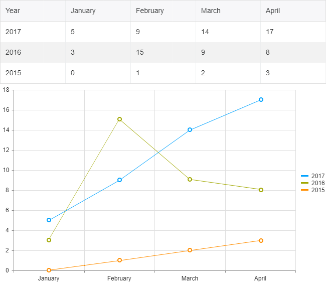
Imagine that we have the following data structure:

{year: 2017, January: 5, February: 9, …},
{year: 2016, January: 3, February: 15, …}

Such data could be easily visualized in Kendo UI Line Chart, where the series will be created for each year and the months will be used for categories. 

Once we know which field from the data items will be used in the series of the Chart, we can initialize the widgets. We will be using dummy data for the example and the records will contain information for a few months only (for brevity):

<script>
    //We will be using a few months for brevity
    var months = ["January", "February", "March", "April"];
    $("#chart").kendoChart({
      seriesDefaults: {
          type: "line"
      },
      categoryAxis: {
          categories: months, //Each month(column) is added as a category
      }
    });
     
    //Initializing the Grid
    $("#grid").kendoGrid({
      dataSource: {
        data: getDummyData(),
        schema:{
          model:{
            id: "Year",
            fields: {
              "Year" :{ editable: false},
              "January" :{ type: "number"},
              "February" :{ type: "number"},
              "March" :{ type: "number"},
              "April" :{ type: "number"}
            }
          }
        }
      },
      editable: true
    })
     
    function getDummyData(){           
      var data = [
        {Year: 2017, January: 5, February: 9, March: 14, April: 17},
        {Year: 2016, January: 3, February: 15, March: 9, April: 8},
        {Year: 2015, January: 0, February: 1, March: 2, April: 3}
            ];
       
      return data;
    }
</script>

The above will render and populate the Grid with the data, but the Chart will be empty. Since our Grid will be editable, we need to ensure that the Chart will be updated after each change in the dataSource. The perfect event for updating the Chart data in this way is the “change” event of the dataSource:

$("#grid").kendoGrid({
      dataSource: {
        change: function(e){
          //The Chart will be updated on each change of the DataSource
          updateChart(e.sender);
        },

And here is where the magic begins. Within the updateChart function, where we'll update the Chart, we will retrieve each dataItem from the current view of the Grid's dataSource and we will create all series based on the updated data. The series will contain a data collection with the values from each month, and the Chart will use the “categories” from the “categoryAxis” array to match the values accordingly. When we create the new series with the new data, we can modify the options of the Chart and call its setOptions method for re-initializing the widget:

function updateChart(dataSource){
  var dataItems = dataSource.view();
    var chartSeries = [];
    var chartData = [];
     
    dataItems.forEach(function(item){         
      var data = [];
      months.forEach(function(month){
        //Each month's value is added to the data collection
        data.push(item[month]);
      })         
       
      chartSeries.push({
        data: data,
        //we will be using the Year from the dataItem as the name
        name: item.Year
        })
    })
   
    var chart = $("#chart").data("kendoChart");
    var options = chart.options;
    options.series = chartSeries; //setting the series with the new data to the options
    chart.setOptions(options); //re-initializing the Chart
}

Try Out the Code

The entire code of the example can be tested in the following dojo:

Chart Series from Grouped Grid Data

Grid and Chart with the same data

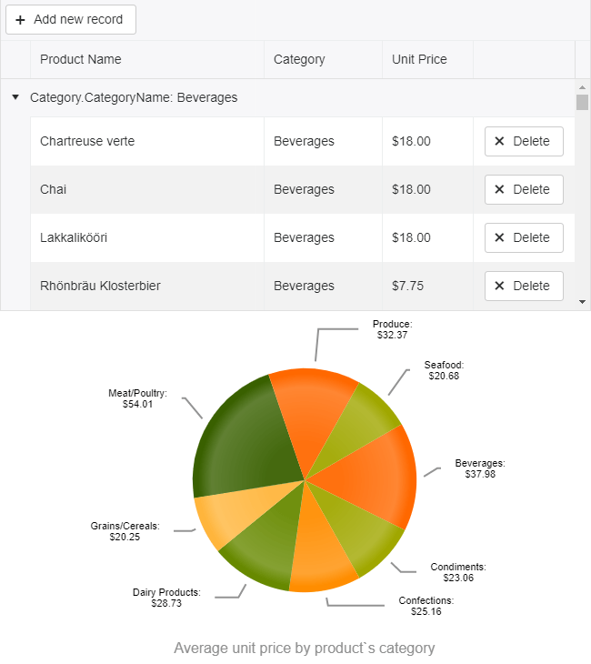
For this example, we will bind the Grid to products collection and will group the data by the product's category. We will configure the average aggregate for the unit price and will have an average for each category as a result. The grouped data and the aggregates will then be used to populate a Pie Chart.

Due to the custom editor for the Category field and the aggregates, the configuration of the Grid will be fairly complex:

<!DOCTYPE html>
<html>
<head>
    <style>html { font-size: 14px; font-family: Arial, Helvetica, sans-serif; }</style>
    <title></title>


</head>
<body>
        <scriptsrc="../content/shared/js/products.js"></script>
        <divid="example">
            <divid="grid"></div>
            <divid="chart"></div>
 
            <script>
 
                $(document).ready(function () {
                    var dataSource = new kendo.data.DataSource({
                       pageSize: 20,
                       data: products,
                       autoSync: true,
                      group: [
                        {field: "Category.CategoryName", aggregates: [
                             { field: "UnitPrice", aggregate: "average"}
                          ]}
                      ],
                      aggregates:[
                        { field: "UnitPrice", aggregate: "average" }
                      ],
                       schema: {
                           model: {
                             id: "ProductID",
                             fields: {
                                ProductID: { editable: false, nullable: true },
                                ProductName: { validation: { required: true } },
                                Category: { defaultValue: { CategoryID: 1, CategoryName: "Beverages"} },
                                UnitPrice: { type: "number", validation: { required: true, min: 1} }
                             }
                           }
                       }
                    });
 
                    $("#grid").kendoGrid({
                        dataSource: dataSource,
                        pageable: true,
                        height: 550,
                        toolbar: ["create"],
                        columns: [
                            { field:"ProductName",title:"Product Name" },
                            { field: "Category", title: "Category", width: "180px", editor: categoryDropDownEditor, template: "#=Category.CategoryName#"},
                            { field: "UnitPrice", title:"Unit Price", format: "{0:c}", width: "130px",groupFooterTemplate: "Average #=kendo.toString(average, 'n2')#", aggregates: ["average"] },
                            { command: "destroy", title: " ", width: "150px" }],
                        editable: true
                    });
                });
 
                function categoryDropDownEditor(container, options) {
                    $('<inputrequired name="' + options.field + '"/>')
                        .appendTo(container)
                        .kendoDropDownList({
                            autoBind: false,
                            dataTextField: "CategoryName",
                            dataValueField: "CategoryID",
                            dataSource: {
                                type: "odata",
                                transport: {
                                    read: "https://demos.telerik.com/kendo-ui/service/Northwind.svc/Categories"
                                }
                            }
                        });
                }
 
            </script>
        </div>
</body>
</html>

For the initial configuration of the Chart we'll set only the known variables, and leave the series data to be populated after the groups of the Grid are created:

$("#chart").kendoChart({
                        title: {
                            position: "bottom",
                            text: "Average unit price by product's category"
                        },
                        legend: {
                            visible: false
                        },
                        chartArea: {
                            background: ""
                        },
                        seriesDefaults: {
                            labels: {
                                visible: true,
                                background: "transparent",
                                template: "#= category #: \n $#= value#"
                            }
                        },
                        series: [{
                            type: "pie",
                            startAngle: 150
                        }],
                        tooltip: {
                            visible: true,
                            format: "${0}"
                        }
                    });

Once again, as in the first example, we will update the Chart within the “change” event of the dataSource:

var dataSource = new kendo.data.DataSource({
  change: function(e){
    updateChart(e.sender);
  },

And here is how we populate the data for the series by using the group value (the CategoryName of the group) and the average aggregate as a value:

function updateChart(dataSource){
   var dataItems = dataSource.view();                                        var data = [];
   dataItems.forEach(function(group){        
     var aggregateValue = group.aggregates["UnitPrice"].average.toFixed(2);
     data.push({category: group.value, value: aggregateValue});  
   })
 
   var chart = $("#chart").data("kendoChart");
   var options = chart.options;
   options.series[0].data = data;
   chart.setOptions(options); //re-initializing the Chart
}

Try Out the Code

The entire code of the example can be tested in the following dojo:

Endless Possibilities 

With a good understanding of the Grid and Chart widgets (or with a little help from our technical support officers team), you can enhance your apps in a number of ways by using the data from the Grid and visualizing it in the Chart. We'd note though that it is important to understand the data structure as well in order to create the series correctly. 

Try out the examples in the dojos above and let us know what you think. Happy coding!


Modernizing One Hybrid App at a Time—Free Telerik Platform Webinar

$
0
0

In this webinar, learn how to modernize your hybrid apps with our cross-platform native mobile app development framework, NativeScript. Register now to save your seat.

The mobile development landscape has evolved immensely over the last ten years. What used to be limited to native iOS and Android developers is now accessible for hybrid (Cordova) developers and native JavaScript (NativeScript) developers.

cordova-nativescript

And mobility continues to mature! Telerik Platform once had a laser focus on hybrid app development, but now offers a look at native app development with NativeScript. We know app performance and stability are critical to you, which is why we are helping to modernize mobility, one hybrid app at a time.

Join us on Thursday, October 26th at 10AM EDT as we demonstrate how you can modernize your hybrid mobile apps with NativeScript.

Telerik Platform has been an indispensable tool for all of us over the past three years. In this free online webinar, we will:

  • See how NativeScript benefits Telerik Platform users
  • Dive into some new NativeScript tooling options
  • Learn how to leverage (the newly free) professional NativeScript UI widgets
  • Take a peek at the latest in NativeScript framework improvements

Join us to learn all about how mobility is evolving and how you can modernize your hybrid mobile apps.

Seats are limited, so register for the free Telerik Platform webinar now!

Meet Dave Coffin, Developer Expert for NativeScript

$
0
0
Dave Coffin, Developer Expert for NativeScript, talks about building mobile apps with NativeScript from start to finish.

This post is part of a series featuring our Telerik Developer Experts, community members who represent the best of our products. Read about other featured experts here and meet more TDEs here.

dave_coffin_sm

What’s your background, professionally?

I'm a full stack web development and with a background in design. I've been doing primarily frontend development and design for almost ten years.

Where are you based and why?

I'm based in Dover, New Hampshire, because it's an awesome state to live in and raise kids in. I work mostly remotely.

With whom are you working?

I freelance a lot, but also have started my own company with my wife that aims to help the communication-related annoyances involved with both daycares and nannies.

What project are you working on now?

I am working on a few different apps, but the one I'm most excited about is an app for nannies that will simplify their shift management and payment tracking. It will allow nannies to track hours across families, send invoices, track expenses and more.

What’s the most interesting project you’ve done recently?

The most interesting project is an app I created called Daily Nanny. It gives parents instant access to important information about their kids, improves communication with their nanny, lets them share photos and more.

What are some challenges you are encountering now in your work?

It's a constant challenge trying to evolve the UX in your apps with new behaviors. There are a lot of devices out there, and making your apps efficient from a user experience perspective on devices of all sorts of sizes and OS versions is probably the biggest challenge for app developers these days.

Which of our products do you use and why?

I use NativeScript to develop apps exclusively. It makes it so easy to get started on app development and business logic, and makes it an enjoyable experience moving back and forth between web development and app development. For most of my apps I am creating the API, the database model, the marketing website, and web apps entirely myself. NativeScript lets me move between these technologies and languages seamlessly. I can be working on the backend business logic, the frontend website, and the app all literally at the same time without any mental overhead switching between development environments and languages.

What’s the biggest software pain point, in your opinion, in the mind of your partners or clients?

One of the biggest pain points in my mind is the process of distributing apps in the marketplace. Each platform has its own quirks, but in web, launching a website is incredibly easy. But there is quite an overhead in getting an app from development to even a simple testing phase.

Dynamic Data in the Kendo UI Grid

$
0
0

Learn how to create Kendo UI grids with dynamic data in this step by step recipe.

The moment you find yourself typing the same code over and over again, you know that something is off. You know that the code you are writing is getting WET (Write Everything Twice or We Enjoy Typing).

You need to stop, plan, modularize and DRY it off. You will thank yourself later when the next grid is up in seconds and you are sipping on that cup of coffee you have been thinking of all afternoon.

Creating editable Kendo UIGrids with dynamic data is like cooking an a-la-carte meal the easy way. As a Technical Support Engineer at Progress, I have seen plenty of our clients' "kitchens," helped resolve questions and given advice regarding dynamic data—and I am here to give you the recipe.

The Dynamic Data RecipeKendo UI Chef
Ready in about 1 hour
Medium level skills
Serves: 1 editable and 1 non-editable grid


Ingredients

1. Consistent Backend Service and API
2. One initial ajax request
3. Client Grid Configuration
4. Client Data Source Configuration

Method

1. Create a backend with consistent naming of the controller actions. For example:

  • READ
    http://domain/Orders
           http://domain/Customers       
  • CREATE
    http://domain/Orders/Create
      http://domain/Cutomers/Create  
  • UPDATE
    http://domain/Orders/Update
    http://domain/Customers/Update
  • DELETE
    http://domain/Orders/Destroy
    http://domain/Customers/Destroy

2. (This step applies to a read-only grid—for an editable grid, go to step 3.) Naturally, a read-only grid requires less complex logic. I created a simple function, called in the success handler of the initial ajax request. It adds some common options and its data source needs only the read operation.

    // add the grid options here 
    function populateGrid(response) {
        var columns = generateColumns(response);
        var gridOptions = {
          dataSource: {
            transport:{
              read:  function(options){
                options.success(response);
              }
            },
            pageSize: 10,
            page: 1
          },
          columns: columns,
          pageable: true,
          height:300
        };

        // reuse the same grid, swapping its options as needed
        var grid = $("#grid").data("kendoGrid");
        if(grid){
          grid.setOptions(gridOptions);
        } else {
          $("#grid").kendoGrid(gridOptions);
        } 
      }
  
Since I do not want the "ID" column to take up much space, I created another the generateColumns function so I can alter the columns configuration. You can customize all the columns properties at this point.
  function generateColumns(response){
        var columnNames = Object.keys(response[0]);
        return columnNames.map(function(name){
          var isIdColumn = name.indexOf("ID") > -1 || name.indexOf("Id") > -1;
          return { 
            field: name,
            width: isIdColumn ? 50 : 180,
            title: isIdColumn ? "Id" : name
          };
        })
      }

Voilà! The read-only Kendo UI Grids with dynamic data are ready to be thrown in the oven. To show you how easy it is to use the functions above, I added a Kendo UI ToolBar with three buttons. When each button is pressed, the click function populates the respective Kendo UI Grid.

To open as an editable Dojo, hover over the right hand top corner     ⬎ 

3. To create a dynamic editable Kendo UI Grid, we need to create the dataSource schema model before the dataSource. In the success callback of the initial ajax request, pass a sample dataItem to the generateModel function. The function accomplishes two very important tasks:

Checks the type of each property so the grid can initialize the correct editor. For example, the number type will create a Kendo UI NumericTextBox, the date type will be equipped with a Kendo UI DatePicker when in edit mode.
Finds the unique schema model id and makes it non-editable. The unique id is a prerequisite for the editing functionality.

The function can be extended to include other schema model settings such as validation and default value. Or you may collect the field names of date types, so they can be formatted in the column settings later on.

 
      var dateFields = [];
      
      function generateModel(sampleDataItem) {
        var model = {};
        var fields = {};
        for (var property in sampleDataItem) {
          if (property.indexOf("ID") !== -1) {
            model["id"] = property;
          }

          var propType = typeof sampleDataItem[property];
          if (propType === "number") {
            fields[property] = {
              type: "number"
            };
            if(model.id === property){
              fields[property].editable = false;
            }
          } else if (propType === "boolean") {
            fields[property] = {
              type: "boolean"
            };
          } else if (propType === "string") {
            var parsedDate = kendo.parseDate(sampleDataItem[property]);
            if (parsedDate) {
              fields[property] = {
                type: "date"
              };
              dateFields[property] = true;
            }
          }
        }

        model.fields = fields;

        return model;
      }
    

4. Now that we have the schema model, we can create the Kendo UI Data Source. The function should receive the base URL and the model as parameters. Since the services follow a naming convention, it is easy to create this dynamic data source with CRUD operations:

      
    function generateDataSource(baseURL, model) {
         var dataSource = {
          transport: {
            read: {
              url: baseURL
            },
            create:{
              url: baseURL + "Create"
            },
            update:{
              url: baseURL + "Update"
            },
            destroy:{
              url: baseURL + "Destroy"
            },
            parameterMap: function(options, operation) {
              if (operation !== "read" && options.models) {
                return {models: kendo.stringify(options.models)};
              }
            }
          },
          batch:true,
          schema: {
            model:model
          },
          pageSize: 10
        };

        return dataSource;
      }


5. Next in line are the grid columns. Use this function to customize the formatting, width or other columns settings

      
      function generateColumns(sampleDataItem) {
        var columnNames = Object.keys(sampleDataItem);
        return columnNames.map(function(name) {
          var isIdField = name.indexOf("ID") !== -1;
          return {
            field: name,
            width: (isIdField ? 40 : 200),
            title: (isIdField ? "Id" : name)
          };
        });
      }


6. This is the final step. The schema, data source and columns are known and we can initialize the dynamic Kendo UI Grid. In my function, I am passing the id of the element from which I will initialize the grid but you can extend the createGrid function and append the newly generated grid elsewhere.

      
      function createGrid(gridName, baseUrl) {
        $.ajax({
          url: baseUrl,
          success: function(response) {
            var sampleDataItem = response[0];
            var model = generateModel(sampleDataItem);
            var dataSource = generateDataSource(baseUrl, model, editable);
            var columns = generateColumns(sampleDataItem);
            var gridOptions = {
              toolbar: ["create", "save", "cancel"],
              dataSource: dataSource,
              columns: columns,
              pageable: true,
              editable: editable,
              height: 450
            };

            columns.push({ command: "destroy", title: " ", width: 170 });

            $("#" + gridName).kendoGrid(gridOptions);
          }
        });
      }
    
The result—initialization of a dynamic editable grid with a single line of code:

<div id="products"></div>
    <script>
      createGrid("products", "https://demos.telerik.com/kendo-ui/service/products/");</script>

To open as an editable Dojo, hover over the right hand top corner    

This is just a basic dynamic data in the Kendo UI Grid recipe. There is much more than that which can be done, extended and plugged in as required. The examples I created here can be reused, saving you time and effort. The investment that one needs to make is well worth the payback when many similar grids need to be created—a naming convention, an extra single ajax request and coding a more abstract backbone logic so it can be reused.

If you already have your own Kendo UI Grid with dynamic data, please share what you do differently in the comments section below.

Build Accessibility-Compliant Reports with Telerik Reporting

$
0
0

Producing accessible reports is essential for businesses that reach out to a wide audience. Telerik Reporting is ready to provide this valuable feature.

In this article, I will write about an often neglected, yet really important component of modern web applications—accessibility. When your business needs to reach a broader audience, it is vital to produce documents that are available for all users. This includes the people with motor control restrictions who experience difficulties working with a mouse or trackball, and the ones that need to use additional assistive technologies like screen readers to interpret the document content.

Fortunately, there are well-known standards and guidelines that specify how to make a document accessible. In the R3 2017 release of our product, we introduced accessibility support for our HTML5-based viewers, following the recommended practices from Section 508 of the Rehabilitation Act and Web Content Accessibility Guidelines (WCAG) 2.0. Now our users can effortlessly add accessible reports to any flavor of web applications that we support, producing content according to standards set by the WAI-ARIA specification. The process involves providing accessibility support for both report viewer and report content.

Accessible Report Viewer

The Report Viewer is the widget that allows users to preview the report and interact with the reporting engine when changing the parameters, browsing through the report pages or navigating in the document map. It now provides an option that switches its accessibility mode on or off. When the accessibility mode is enabled, the viewer activates the keyboard support, starts emitting dynamically generated descriptions for non-text items and instructs the reporting engine to render the reports according to the accessibility standards mentioned above.

Keyboard Support

Every part of the report viewer is dedicated to a different task. Based on that, it can be separated into four main areas:

  • Content—this is the main area where the currently rendered report is displayed
  • Menu—the menu bar that is used to navigate forth and back in history, go to a certain page and execute commands on the rendered report, like printing, exporting, etc.
  • Parameters—the panel where the report parameters (if any) are displayed, so the user can change them and preview the report with the new values
  • Document map—a tree view that reflects the report structure, providing a set of navigational links to the report items in the rendered report

In accessibility mode the viewer labels the areas as landmarks and allows using shortcut keys to directly focus on them and navigate within their content—menu buttons, parameter editors and document map nodes. When a report is rendered in accessibility mode, its content is marked as focusable and can be traversed with the keyboard. The keyboard can also be used to execute an interactive action if the focused report item has one set.

Dynamically Generated Descriptions

When the accessiblity mode is enabled, the focusable elements in the viewer areas provide labels that can be read by an assistive technology like a screen reader.

The menu area sets labels on its buttons and submenus, explaining the function they execute and their current state (enabled or disabled). The parameter area provides information about the parameters it contains, as does each parameter editor about its type, currently selected value and (if needed) a validation message. The document map area generates labels for its nodes so the screen reader can inform the user which navigational link currently has focus.

Accessible Report Content

When designing a report using Visual Studio or Standalone Report Designer, the user can provide additional information about every report item, setting an expression for its AccessibleDescription property. The evaluated expression will produce a WAI-ARIA compliant attributes, but it will be respected only when the report viewer has its accessibility mode enabled, so no redundant markup will be generated. This property is extremely useful when the report contains a non-textual item like a PictureBox or Graph, and helps provide valuable information to the user about the currently focused element.

By default, if the AccessibleDescription value is not set, the report item will produce an accessible label, based on its Value property, which would cover the most scenarios and no report refactoring will be needed. Additionally, the engine concatenates some meta information, related to the current report item, so the user will be given as much detail as possible. 

For example, if the report contains a table, its accessible label will automatically be appended with information about the rows and columns count. Each of the table cells will emit information about its position in the table—whether it is a header cell, and on which row and column it is placed. So if a report contains a TextBox with Value = "Sorts by Category," that performs a sorting action and is nested in a table's first (header) row and third column, the generated label value will be: Text box. Performs a sorting action. Column header. Column two, row zero. Sorts by Category.

Customization

The HTML5-based report viewers accessibility mode is disabled by default, so no excessive HTML markup will be generated. It can be set through the report viewer’s initialization script, using the enableAccessibility(true) option. When adding a report viewer to a project with the Item Template Wizard, its last page suggests setting the accessibility mode and generates the required option automatically. The texts, generated by the accessibility module, can be localized easily, and the default shortcut key mapping can be changed if it interferes with the default browser behavior.

Want to Learn More?

Having a report tool that produces content to meet accessibility standards can be a great benefit when striving to provide the best solution for the most people. The Telerik Reporting team at Progress will continue our efforts to introduce the accessibility support for the entirety of technologies covered by our report viewers. If you would like to learn more about the process, take a look at the new features, check the product roadmap or try it yourself for free!

Get Reporting in our Bundles

You can get Telerik Reporting as an individual product or as a part of our bundles. We bring the best of Telerik and Kendo UI together in convenient bundles, including a wide-range of UI, reporting and productivity tools for both .NET and JavaScript technologies and support that’s got your back in every step of your project. Thanks to our intuitive APIs, alongside thousands of demos with source code availability, comprehensive documentation and a full assortment of VS templates you will get up and running with our tools in no time and fully embrace your inner warrior (Kendoka/Ninja).

By leveraging the broad array of themes, skins, styling and customization options, your application will awe even the best front-end designers. Check it out!

Kendo UI Support for React & Vue Webinars

$
0
0

We're excited to bring React and Vue support to Kendo UI. Learn everything you need to know and watch as we showcase the components in our upcoming webinars.

We are very excited to announce that our Kendo UI component library will now have support for React and Vue applications! This includes awesome UI components like our Date Picker, PanelBar, TabStrip, Grid and more. You can check out the whole list here:

As always, our components give you the ability to code more robust apps faster!

Now with one Kendo UI license you can have the support for Angular, jQuery, React and Vue. So, if you change or migrate to a new technology environment, you're covered. Along with the many resources we provide, like great demos and the super handy Theme Builder, with these libraries you also get several different support options. When giving you the tools to build great with we want you to also have support you can count on.

Come Check it Out!

We can only fit so much in a blog post, so we decided to put on a webinar for you! Join us and we'll walk you through the easy setup and showcase a few awesome things the components can help you build. If you have any questions message us on Twitter at @KendoUI or with the hashtag #heyKendoUI and we can try to get them answered during the webinar.

Webinar Dates & Times

We're really excited to bring you more support for your favorite frameworks! Hope to see you there and in the meantime, get a free trial and try them out now:

Thanks & Happy Coding! ‍

4 Ways to Export from WPF and WinForms to Word and PDF Files

$
0
0

Looking to add functionality in your .NET apps to export data to Word and PDF? Learn four ways to do this with just a little code.

Building feature rich applications can often leave users asking to take visual elements off the screen to be used elsewhere. Being able to export from an application to Word or PDF opens up new possibilities, such as sharing, reporting or even satisfying Sarbanes–Oxley (SOX) audit requirements.

Getting data out of your application and into standard formats like Microsoft Word and Adobe PDF can be a daunting task. Especially when performance optimizations for large datasets, document customization & appearance, and supported platforms are taken into consideration.

However, with the right tools, adding this feature to your .NET application can be as simple as a few lines of code. Let's take a look at 4 ways we can include rich document functionality in our .NET apps with very little code and time investment.

For the examples we'll be using the Telerik Document Processing Library (DPL), which is distributed at no additional cost with the Progress Telerik UI libraries for WPF, Silverlight and WinForms. For the web developers out there, the DPL is also included with ASP.NET Web Forms and MVC. In addition, no MS Office licenses or dependencies are required to use the DPL.

If you’re using Telerik UI, you already have these capabilities in your toolbox and we’ll learn how to leverage them. If you’re not using Telerik UI yet, but would like to increase your developer productivity, learn more about it here.

1. Create New Word Document in .NET

Having the ability to create a new Word document from code provides a great deal of flexibility. With a just few dependencies we have access to Word document creation APIs that include text, image, and link generation. For this example, we'll use RadFlowDocument and RadFlowDocumentEditor to create a new Word document from a .NET console application.

We'll start with a few dependencies like System.IO to handle a file stream, and the necessary Telerik DPL assemblies.

usingSystem.IO;
usingTelerik.Windows.Documents.Flow.FormatProviders.Docx;
usingTelerik.Windows.Documents.Flow.Model;
usingTelerik.Windows.Documents.Flow.Model.Editing;

Next, we create a new RadFlowDocument and RadFlowDocumentEditor. The RadFlowDocumentEditor will allow us to insert new text, image and other elements to the document.

staticvoidMain(string[] args)
 
{
 
    RadFlowDocument document = newRadFlowDocument();
 
    RadFlowDocumentEditor editor = newRadFlowDocumentEditor(document);

Using the editor, we'll write some text to the document using the InsertText method. We also have additional methods available such as:

  • InsertFloatingImage
  • InsertParagraph
  • InsertTable
  • InsertHyperlink
  • and more
insert-methods
staticvoidMain(string[] args)
 
 
{
 
 
    RadFlowDocument document = newRadFlowDocument();
 
 
    RadFlowDocumentEditor editor = newRadFlowDocumentEditor(document);
 
 
    editor.InsertText("Hello Word!");

Once the document is complete, we just need to write it to the FileStream. For the RadFlowDocument we'll use the DocxFormatProvider to export to the DOCX format. Similarly, we could use a PdfFormatProvider to create a PDF document.

usingSystem.IO;
 
 
usingTelerik.Windows.Documents.Flow.FormatProviders.Docx;
 
 
usingTelerik.Windows.Documents.Flow.Model;
 
 
usingTelerik.Windows.Documents.Flow.Model.Editing;


namespaceDocProcessing
 
 
{
 
 
    classProgram
 
 
    {
 
 
        staticvoidMain(string[] args)
 
 
        {
 
 
            RadFlowDocument document = newRadFlowDocument();
 
 
            RadFlowDocumentEditor editor = newRadFlowDocumentEditor(document);
 
 
            editor.InsertText("Hello Word!");


            using(Stream output = newFileStream("output.docx", FileMode.OpenOrCreate))
 
 
            {
 
 
                DocxFormatProvider provider = newDocxFormatProvider();
 
 
                provider.Export(document, output);
 
 
            }


        }
 
 
    }
 
 
}

HelloWorld

In this example, files created using the Telerik DPL are saved directly to disk. However, any file created using the DPL can also be downloaded via the browser from UI for ASP.NET AJAX and UI for ASP.NET MVC applications.

2. Mail Merge from .NET

Creating a mail merge is an effective way of building a template and populating it with data for processing documents in batches. With the mail merge process, you can create a series of personalized documents based on your data source.

The mail merge process is one that is often manually performed inside of Microsoft Word. With the Telerik DPL this process can be completely automated and customized based on the needs of your application. The mail merge APIs can be used virtually anywhere in .NET. To see it in action we'll use an example of how a mail merge is executed in a WPF/WinForms application.

We'll create a new document containing our template message. To create a template field in the document we'll use the InsertField method and set the field code to MERGEFIELD with the variable name we wish to use, in this case FirstName. The variable name simply matches the property on an object that we'll supply to the MailMerge method.

privateRadFlowDocument CreateDocument()
 
 
{
 
 
    RadFlowDocument document = newRadFlowDocument();
 
 
    RadFlowDocumentEditor editor = newRadFlowDocumentEditor(document);


    editor.InsertText("Dear ");
 
 
    editor.InsertField("MERGEFIELD FirstName", "");
 
 
    editor.InsertText(" ");
 
 
    editor.InsertField("MERGEFIELD LastName", "");
 
 
    editor.InsertLine(",");
 
 
    editor.InsertLine("This is a sample Mail Merge");
 
 
    returndocument;
 
 
}

With the document created, the next step will be to perform the mail merge. The MailMerge method takes any IEnumerable as a parameter, in this case we'll use a predefined list of Person via GetRecipents. In this case Person has a FirstName and LastName property matching the MERGEFIELD variables.

protectedvoidbutton_Click(objectsender, EventArgs e)
 
 
{
 
 
    RadFlowDocument document = this.CreateDocument();
 
 
    RadFlowDocument mailMergeDocument = document.MailMerge(GetRecipients());
 
 
    //save the document
 
 
}

The document can be saved by setting up a MemoryStream and calling Export from a DocxFromatProvider. Once the memory stream is ready, we'll write it to a file.

protectedvoidbutton_Click(objectsender, EventArgs e)
 
 
{
 
 
    RadFlowDocument document = this.CreateDocument();
 
 
    RadFlowDocument mailMergeDocument = document.MailMerge(GetRecipients());
 
 
    byte[] renderedBytes = null;


     using(Stream output = newFileStream("output.docx", FileMode.OpenOrCreate))
 
 
     {
 
 
         DocxFormatProvider provider = newDocxFormatProvider();
 
 
         provider.Export(mailMergeDocument, output);
 
 
     }}

The result is a multi-page .DOCX file for each recipient provided to the mail merge. This type of document can easily be printed and sent to clients as physical mail. See demos.telerik.com/wpf and the UI for WinForms demos for a more comprehensive example that includes additional file types and document features.

mailMerge

3. Convert Word to PDF in .NET

One of the Telerik DPL strengths is its ability to import and export various file types like: DOCX, PDF (export only), HTML and RTF. Because of this ability, it can also be used to do file conversions between these types as well. Using the IFormatProvider we can utilize the various format providers within the Telerik DPL interchangeably. Let's take a look at a basic example of a console app that can import a DOCX file and export it to PDF.

We'll begin by creating a default provider using an IFormatProvider and setting it to an instance of DocxFormatProvider. A RadFlowDocument is used as our document in the conversion from DOCX to PDF.

IFormatProvider<RadFlowDocument> fileFormatProvider = newDocxFormatProvider();
 
 
RadFlowDocument documentToConvert = newRadFlowDocument();

The DOCX document is opened from disk using the DocxFormatProvider and streamed into memory.

using(FileStream input = newFileStream("input.docx", FileMode.Open))
 
{
 
documentToConvert = fileFormatProvider.Import(input);
 
}

With the document in memory as a RadFlowDocument we can change our provider from a DocxFormatProviderPdfFormatProvider. Now the document can be written back to disk as a PDF.

fileFormatProvider = newPdfFormatProvider();


    using(Stream output = newFileStream("output.pdf", FileMode.OpenOrCreate))
 
    {
 
        fileFormatProvider.Export(documentToConvert, output);
 
    }

Convert Doc PDF

As you can see in the complete example, in just a few short lines of code we're able to convert from DOCX to PDF.

staticvoidMain(string[] args)
 
{
 
    IFormatProvider<RadFlowDocument> fileFormatProvider = newDocxFormatProvider();
 
    RadFlowDocument documentToConvert = newRadFlowDocument();


    // Read DOCX
 
    using(FileStream input = newFileStream("input.docx", FileMode.Open))
 
    {
 
        documentToConvert = fileFormatProvider.Import(input);
 
    }


    // Write PDF
 
    fileFormatProvider = newPdfFormatProvider(); // change format provider to PDF


    using(Stream output = newFileStream("output.pdf", FileMode.OpenOrCreate))
 
    {
 
        fileFormatProvider.Export(documentToConvert, output);
 
    }
 
}

This method of importing and exporting documents can be used to convert between file formats. One caveat however is that there is no import functionality for PDF documents due to file format limitations. To deal with this limitation the IFormatProvider is equipped with a CanImport property that can be checked before the Import operation is performed.

See the UI for WPF and UI for WinForms WordsProcessing demos that includes additional file types and scenarios.

4. Edit Microsoft Word Docs in WPF and WinForms

Customers can sometimes ask for time-consuming project requirements, like the ability to edit Word Documents in the application without the need to leave the app and use external editors. On the surface this sounds like a feature that will take quite a bit of effort to accomplish; however, it's as simple as adding a rich text component to your application which comes with the Telerik UI for WPF and Telerik UI for WinForms suites.

rtb combined

Using UI for WPF and UI for WinForms, the ability to import and export right from the rich text editor control can be accomplished with few lines of code.

DocxFormatProvider provider = newDocxFormatProvider();


using(FileStream fileStream = newFileStream(@"input.docx", FileMode.Open))
 
{
 
    this.radRichTextBox1.Document = provider.Import(fileStream);
 
})

Exporting the content is just as simple. Simply pick the format provider for the desired format – PDF, DOCX, XAML, HTML, RTF, TXT and utilize its Export() method.

DocxFormatProvider provider = newDocxFormatProvider();
 
SaveFileDialog saveDialog = newSaveFileDialog() { DefaultExt = ".docx", Filter = "Documents|*.docx"};
 
DialogResult dialogResult = saveDialog.ShowDialog();
 
if(dialogResult == System.Windows.Forms.DialogResult.OK)
 
{
 
     using(Stream output = saveDialog.OpenFile())
 
     {
 
         provider.Export(radRichTextEditor1.Document, output);
 
     }
 
}

See the Telerik UI for WPF and Telerik UI for WinForms demos for more comprehensive examples that include additional editor features.

Conclusion

Whether you need to create documents from scratch or edit in the desktop app, the Telerik UI libraries make short work of any document export task for .NET developers. With the Telerik Document Processing Library new files can be created from scratch as DOCX, PDF, RTF, or TXT. Advanced features such as mail merge can reduce manual tasks with app driven automation. With the addition of Telerik UI libraries powered by UI for WPF and WinForms, documents can be edited on screen and custom export features empower users to export content with the click of a button.

Get access to the vast benefits of Telerik Document Processing and document exporting by downloading either the full Progress DevCraft bundle or any technology-specific library you need: Telerik UI for WPF or Telerik UI for WinForms.

Other Useful Resources

Telerik UI R3 2017 Release Webinar Wrap-Up

$
0
0

Join us for a recap of the latest release of our Telerik UI tools, updated and upgraded to help you develop better apps faster.

Earlier this week, Ed Charbeneau, Sam Basu, and I hosted the R3 2017 release webinar for our Telerik UI tools. We featured everything new in our latest release for Telerik UI for ASP.NET MVC, Telerik UI for Xamarin, Telerik UI for WPF, and many more. This blog post provides an overview of the webinar, a recording (in case you missed it), and a summary of the questions (with answers) that were posed during the webinar through #HeyTelerik on Twitter.

Webinar Recording

Don’t worry if you didn’t get a chance to watch the webinar. We’ve posted it to YouTube. You can watch it now.

Webinar Prize Winners

What would be a webinar without some cool prizes? Here are the winners of this webinar for asking great questions:

  • Koti Vuppalapati
  • Igor Soyfer
  • Shawn Hosp
  • Jennifer Bartolome
  • Peter Geiter

Congratulations! You’ve won a Holy Stone F181 RC Quadcopter Drone!

Questions and Answers

We received a wide range of questions during the webinar. Here’s a few of them that we had an opportunity to answer.

Kendo UI for jQuery

Are there plans to include the Material Theme in the jQuery version of Kendo UI?
A Material theme is available Kendo UI for jQuery, Kendo UI for Angular, Telerik UI for ASP.NET MVC, and Telerik UI for ASP.NET Core. This theme is a SCSS-based theme for the Kendo UI components which is based on the Material design guidelines.

What is the best way to get trained on Kendo UI and others and leverage the great potential of the product?
We offer training, here’s where you can read more: Kendo UI Training.

Telerik UI for ASP.NET MVC

When will this release appear on your private NuGet server?
Our release is available now.

Why RadVirtualGrid doesn’t include built-in filter/sorting like RadGridView?
I would take a look at our virtualization demo with the RadGrid. If that won’t help you achieve what your looking for, please let us know: Feedback & Feature Requests.

Does the new infinite scrolling grid load data periodically similar to the “News Feed” on most social media platforms?
Yes, that’s the idea!

Are these grids updates available only on Kendo UI, or are comparable updates available in the Grid for ASP.NET AJAX for .NET?
They should be pretty close to feature-parity. Since the RadGrid is older, it often has existing features that are “new” to the Grid widget in Kendo UI for jQuery. That stated, we improved accessbility with the RadGrid in the R3 2017 release; we now offer WAI-ARIA support validated by WAVE.

Looking at the new grid, I notice that when clicking delete we still get a standard confirm alert. Will it ever be possible to plug in our own confirm box?
You should be able to use PreventDefault and implement your own dialog. There’s an example in our docs: Customize Confirmation Window.

When using Virtual Scrolling at what point is the Read action executed? Only at the beginning? Or, at page breaks? How much and when is the data sent from the controller to browser?
When the page loads, Read() is called. Upon reaching the end of the page, Read() is called. The page length can be adjusted via property.

For operations with the Grid, what client-side security is possible to prevent attacks?
First, never trust the client. And second, always validate on the server before committing any operations against data. The good news is that you can perform this validation quite easily with Telerik UI for ASP.NET MVC since you can control the what happens on the server side.

Is it easier for searching data with the Grid instead of having to tweak the control in order to perform a search after pressing the enter key?
We have several ways to filter the grid. One type allows the enter key to submit the filter. Filtering is one of the Grid’s best features. We’ve made it highly-customizable so you can build the kind of user experience you need.

Can a grid cell be edited like a Spreadsheet? For example, to automatically move the cursor to the next cell when enter key is pressed.
We have many inline and batch editing capabilities. We also added new keyboard shortcuts to Kendo UI for jQuery and Telerik UI for ASP.NET MVC for this latest release.

Can you add Drag & Drop controls to Telerik UI for ASP.NET MVC?
We have Drag & Drop functionality built into many of our controls. It’s supported through Kendo UI, which is the client-side library used by Telerik UI for ASP.NET MVC. Further details about the Keyboard, Section 508 and WAI-ARIA support of Telerik UI for ASP.NET MVC extensions can be found in the Accessibility Overview section of the documentation.

Does the Scheduler support CRON inputs?
No. The recurrence rule string for events in the Scheduler follows the RRULE format as outlined in the iCalendar specification (RFC 5545). You’d need a cron parser and converter in order to get this working with the Scheduler.

With Virtual Scrolling and Endless Scrolling, how does the Excel export work?
Great question. Virtual scrolling and endless scrolling operate in similar ways in that they load data on-demand. This means that the Grid will typically have only a subset of the entire underlying data source loaded in its view. When the user exports this data to Excel, only the data contained in the current view will be exported.

Telerik UI for Xamarin

For the busy indicator, what is the default timeout? If we have more data, will it spin until it’s done loading?
The Busy Indicator has a simple IsBusy property that you can turn it on/off programmatically as needed.

Is there anything planned like the Scheduler or the Gantt chart for Telerik UI for Xamarin?
We are talking about it. Please drop us a line: Feedback & Feature Requests. We’ll update the roadmap for Telerik UI for Xamarin very soon.

What packages and/or products do I need from Telerik to use the Xamarin tools?
I’d start with Telerik UI for Xamarin and learning resources from Microsoft such as Xamarin University.

Are you going to support bottom navigation (tabs) for Xamarin Android?
The RadTabView allows developers to create user interfaces similar to the Android tab view (view pager and app bar combo) that can be positioned on all four sides of the parent view (typically of the main view).

If using Xamarin forms, do Windows apps compile to UWP to work on xbox, desktop, and mobile?
Yes. Xamarin.Forms has full UWP support and Telerik UI for Xamarin can light up your apps everywhere.

Is there performance hit using paths in Xamarin vs doing the drawing natively?
It’s minimal. We’re using Skia. Drawing native isn’t for the faint-hearted.

Why is Grid showing as a CTP?
We have many grids, each written ground-up. The one in Telerik UI for Xamarin is new and customized for cross-platform mobile. Hence, the CTP. It should be final soon.

When do you expect the DataGrid in Telerik UI for Xamarin to be fully-released?
Soon. We’ll likely do a couple of updates before final release. ETA R1 2018.

Telerik UI for UWP

How does UWP OSS work? Surely if all source is available then developers could do anything without a proper license?
It is completely free & OSS under MIT licensing. We do offer support. Sharing the love :)

With the recent news about Windows Mobile, is it worth writing UWP apps that target mobile?
I would suggest using Xamarin and Telerik UI for Xamarin if you’re looking to build mobile applications. That stated, UWP and Telerik UI for UWP helps you to build applications that run on all types of Windows-based devices. This includes the Xbox, HoloLens, IoT, and more.

Do you have anything with ink on Windows 10?
We had a demo with our UWP grid at Microsoft Build earlier this year showing how to use ink. Here is the moment from the keynote address where the Grid control was demonstrated with ink support:

Is there something for holographic apps? I know, it’s basicly like a UWP or Xamarin app, but maybe you got something more.
Telerik UI for UWP is open source and works in applications built for HoloLens.

Telerik UI for WPF

When should I use GridView vs (new) VirtualGrid for WPF? Is the GridView going to be replaced in the future with the VirtualGrid?
These controls are similar but they serve two very different purposes. The GridView displays data in a tabular format and supports many operations against this data. It’s ideal for displaying small-to-large sets of data. The VirtualGrid—on the other hand—is best suited for displaying massive data sets with a minimal in-memory footprint. The GridView is here to stay. It’s packed with features and is one of our most popular controls.

Telerik Reporting

We use Telerik Reporting in a WebForms application. Our large reports that have included controls (icons) fail to render. Is there a solution?
This sounds like you have a broken resource somewhere in your application. I’d recommend firing up your browser’s developer tools or Telerik Fiddler. Look for HTTP 404s (File Not Found) occurring for requests in stylesheets or for images. If any 404s are present then you need to resolve them.

What improvements have you made to the Standalone Report Designer in R3?
You’ll find a summary of the improvements we’ve made in the R3 2017 release: Telerik Reporting – Release History.

Did you think about a R interface or integration for your charts?
Nice suggestion! Please drop us a line and let us know what you’d like to see: Feedback & Feature Requests.


Automation Testing and More in Test Studio R3

$
0
0

With the latest release, the Test Studio team delivers some great, customer-requested features and focuses on making the product even more stable.

Test Studio R3 2017 has just arrived. The update adds some great new features and improvements for Web UI and API automated testing. Download a free 30-day trial of Test Studio and check out the new release for yourself.

"In Development" State

Enough with unfinished tests interrupting your test list or quick execute runs. Now you can flag a test or code file as "In Development," which will exclude them from project compilation and test list execution. So, if you have unfinished tests or tests that are being fixed, you can mark them as "In Development," and even if they are in a test list, they will be skipped and won't interrupt the run.

Support for the new WebExtensions in Firefox 57

As of this Test Studio release, new Chrome and Firefox extensions kick in, supporting the latest browser versions. It is important to know that the upcoming Firefox 57 transitions to a new framework for developing extensions, and only extensions built with this new technology will work in Firefox.

One of our most important goals is to support the latest browsers, which is essential for successful web automation. That's why the new extension is compatible with Firefox 57!
In addition the extension is now one per browser and contains the needed pieces for test recording and execution.

FFExtension

TFS 2017 Support

In addition to the VS 2017 support that we added in the previous release, Test Studio now supports Team Foundation Server 2017 for source control and bug tracking.

Test Ordering inside Test Studio for APIs

Test Ordering is now available in our API testing solution. You can order tests in the project and in the folders and they will be executed according to this order.

In addition there are many fixes and optimizations. For example, one key improvement to the Scheduling feature has been made so that whenever you change a test which is a part of a scheduled test list, Test Studio will update this scheduled test list with the latest changes upon save.

We would love to hear your opinion, so don't hesitate to let us know what you think. Happy testing!

Try Test Studio

Official RadSpreadsheet in UI for WinForms R3 2017 SP1

$
0
0

In the 2017 R3 SP1 for UI for WinForms, we debut the official RadSpreadsheet, a new demo app showcasing Material theme, and more.

In this service pack release of the Telerik UI for WinForms suite, we are thrilled to announce the official version of the most requested control, RadSpreadsheet. It is now fully featured and supports a variety of new capabilities.

What's New in the Official RadSpreadsheet

Filtering

Filtering allows the user to hide and show certain rows of a range, based on different criteria:

img1

Printing

Prepare and display spreadsheet data in the most suitable way depending on your needs. Using different print options—such as defining print page, the scale factor or whether to print grid-lines—you may customize the way you present your data.

img2

Headers and Footers

Add rich text content in the page margins when laying out a worksheet to pages.

Images

Add a kind of a shape which is characterized by having an image source.

Hyperlinks

Hyperlinks give you quick access to web pages, places in the workbook or email addresses. 

img3

Material Look from End to End in the New Hotel Application

We have created a real-life demo application mimicking a hotel reservation system. It comes with all color variations of the Material theme. You can find it in the integration examples in our demo application. Here is a screenshot of it: 

img4

In addition to all these great features, R3 2017 SP1 addresses a long list list of issues based on your feedback.

Try it Out and Share Your Feedback

The latest bits of Telerik UI for WinForms are already available in your account. If you don’t have one, you can try it out with a free trial.

Thank you as always for your feedback! As always, feel free to use our Feedback portal to share your ideas and/or vote for existing ones—we'd love to hear from you.

Improved DataGrid, Autocomplete in UI for Xamarin R3 SP1

$
0
0

With the service pack revision of our R3 2017 release, we improve AutoComplete, DataGrid, ListView and more in Telerik UI for Xamarin.

DataGrid CTP Performance 

With this release of Telerik UI for Xamarin, we have introduced our CTP version of cross-platform DataGrid, now packed with features bringing data shaping capabilities and customizations. However, features alone do not make a control great. We have worked hard to make the control much faster as well, ensuring smooth performance even on the slowest device.

Going forward we'll continue to work on covering the wide range of scenarios which you'd expect from this control. We would like also to hear from you what feature you would like to see for your scenarios.

Right now, you can take advantage of the rich API supporting features like grouping, sorting, filtering, styling and real-time updates.

DataGrid Live Data Update

AutoComplete Enhancements

With our latest release, we have enhanced our AutoComplete, adding demanded features. Now, one can control its clear button visibility and customize the “no results” message. 

Auto Complete features

Performance and Stability Improvements

We have also worked on performance improvements within the suite—bringing optimizations to ListView dealing with images and improvements in Autocomplete, SideDrawer, Chart, Calendar and MaskedInput.

Are You Ready to Try it?

Before you decide, let me just add that with R3 2017 we will offer an even better sales offering called Telerik UI for Xamarin, which includes the Xamarin Forms, Xamarin.iOS and Xamarin.Android wrappers in a single package. It comes in two flavors with your choice of Lite and Standard support for $899/$999. You can find out more about this here.

Don't wait! We are eager for you to give the R3 2017 release of Telerik UI for Xamarin a spin, and we look forward for your feedback.

You can read about all the improvements we've made in our Release History. You can also find more tips & tricks on how to use the controls in our Documentation, at the SDK demos and at the Telerik Developer Network.

RadFileDialogs, RadWindow & More Improvements in UI for WPF

$
0
0

New features for RadFileDialogs, RadWindow and more - check what's new in Telerik UI for WPF and Telerik UI for Silverlight with the recent R3 2017 Service Pack.

FileDialogs (beta) Get Filtering

We are introducing filtering support for RadOpenFileDialog and RadSaveFileDialog. They will support the same filter API as MS file dialogs, so if you need consistent and appealing UI and you are planing to migrate from MS file dialogs - this will definitely smooth the transition process. In other words, you can now set the Filter and FilterIndex properties as shown below in order to initially show all files:

var dialog = newRadOpenFileDialog();
dialog.Filter =
"Word Documents (*.doc)|*.doc|"+
"Excel Worksheets (*.xls;*.xlsx)|*.xls;*.xlsx|"+
"PowerPoint Presentations (*.ppt)|*.ppt|"+
"Office Files (*.doc;*.xls;*.ppt)|*.doc;*.xls;*.ppt|"+
"All Files (*.*)|*.*";
dialog.FilterIndex = 5;
dialog.ShowDialog();

See RadOpenFileDialog filterin action:

OpenFileDialog - Filter

For RadSaveFileDialog the code is the same, however the dialog would have a slightly different appearance and behavior (the file extension will change when a dialog is being filtered):

SaveFileDialogFilter

For more details about this feature please check the Filtering help article from our online documentation here.

Window Active/Inactive Visual State

RadWindow will now change visually when inactivated. Before today RadWindow looked the same, no matter if active or inactive. The feature is turned on by default and affects modal and non-modal windows. If you have a modal window and its owner is clicked you will receive the following blinking effect:  

RadWindow - Flickering

If you prefer the previous visual appearance (to appear always active), you can simply set the ShouldUpdateActiveState property of RadWindow to False.

Other Features

  • Helper class for RadComboBox that allows showing the attached ToolTip only when its text is trimmed. For more, check out this How-To article.
  • RadGridView gets new option for coping to clipboard (SkipEmptyColumns).

Improvements

As always we are packing the UI for WPF Service Pack with many other improvements for the most used controls. I will only say the most fixes are for RadGridView, RadVirtualGrid and RadRichTextBox. For full list of updates and improvements, check the release notes for this release here.

Share Your Feedback

We would love to hear from you, so please drop a comment below sharing your thoughts about Telerik UI for WPF. You could also visit our Feedback portals about UI for WPF/Silverlight and Document Processing Libraries and let us know if you have any suggestions or if you need any particular features/controls.

Make sure to try the latest:

UI for WPFUI for Silverlight

If you missed our last official release (R3 2017), you can find some of major updates here.

Telerik Platform Webinar Recap—Modernizing One Hybrid App at a Time

$
0
0

The latest Telerik Platform webinar—Modernizing One Hybrid App at a Time—wrapped up yesterday. You may now view the recording in its entirety on YouTube.

On the off chance you missed the Telerik Platform webinar yesterday, you missed some great insight into how we are helping to modernize one hybrid app at a time, with NativeScript:

ICYMI

In case you missed it, the full webinar is now available on YouTube for you to view:


Thank You!

Thanks to all who attended and thanks to everyone else who has been a longtime supporter of Telerik Platform. If you're confused as to where to go next, don't be:

Viewing all 737 articles
Browse latest View live


<script src="https://jsc.adskeeper.com/r/s/rssing.com.1596347.js" async> </script>