Quantcast
Viewing all 737 articles
Browse latest View live

.NET DevChat: Structuring JavaScript Code in ASP.NET MVC Apps

In this .NET DevChat Recap, we dive into how you can most effectively structure your JavaScript code when developing ASP.NET MVC applications.

Another exciting .NET DevChat is behind us and will remain for posterity—if you missed it, you can watch it below. This past week we covered Structuring JavaScript Code in ASP.NET MVC Applications.

If you are happy with the powerful ASP.NET MVC framework and see no need to embrace an opinionated client-side framework such as Angular, Vue or React, this resource is for you. Modern applications will undoubtedly need JavaScript so even if you are sticking with the traditional, server-rendered Razor-based approach of building MVC apps, it is important that you structure your code comprehensively so that your client-side code does not get impossible to maintain. That’s exactly what we wanted to achieve with the live demo.

What We Covered

We started off going over what comes out of the box with the Visual Studio MVC templates. In particular, the MVC layout support for sections, which allows you to get full control over where specific pieces of markup you add to the view actually end up in the finalized rendered HTML. This is quite handy when dealing with JavaScript that’s specific to certain pages of your app.

We added Telerik UI for ASP.NET MVC widgets by using the Visual Studio Wizard. We relied on the Deferred functionality to fully separate markup generation from JavaScript generation. We then added the very helpful Garber-Irish implementation pattern to provide a sound structure for simple and predictable execution of JavaScript based on controller and action names, by creating a logical bridge between the MVC context and the JavaScript execution context.

As promised, here’s the source code of the application we built during the presentation.

Questions and Answers

Is the position of the JavaScript in the DOM relevant?

Yes. According to W3 schools, “Placing scripts at the bottom of the element improves the display speed, because script compilation slows down the display.” This is also recommended by the Exceptional Performance team at Yahoo.

How to deal with JavaScript code that belongs to a partial page that gets loaded via AJAX?

In general I would recommend against loading JavaScript code as part of an AJAX response. This is in essence adding extra code to an application during its runtime. Loading data (JSON, JSONP, XML) or simple markup (HTML) is going to be much easier to maintain than loading JavaScript, which will have to be executed at some point, potentially conflicting with the already loaded application code.

Other Questions?

Do you have a question you couldn’t ask during the demo? We want to hear it—just write it in the comments.


What's New in Telerik Reporting and Report Server R3 2017 SP1

The latest service pack revision of Telerik Reporting and Report Server release is now live—we can't wait to share all the goodies with you.

We have so much to share with you—report revision control, Extended Query Designer DB support, updated WPF report viewer toolbar buttons, better handling of UI user preferences, DocumentMap improvements, enhanced image rendering, and last but not least a few bug fixes will tempt you to check the new R3 2017 SP1 release of Telerik Reporting and Report Server. The release is now live and we can't wait to dive into all the goodies we packed into it with you.

Report Revision Control

As reports are designed, it is common for multiple versions of the same report to be deployed in and for the users to be working simultaneously while they are offline. Managing such report changes is now easier with the new option to upload a revision to an existing report on the Report Server. This can be achieved via the Report Server Manager web application or the Standalone Report Designer, and the report revision could be in TRDP or TRDX format.

Query Designer Extended DB Support

Now the Query Designer supports data schema retrieval for any ADO.NET/ODBC/OLEDB data provider that provides a working implementation of GetSchema() method with COLUMN collection support. Automatic relations are provided for databases that are supported by the Telerik Data Access and for Progress OpenEdge DBMS.

WPF Report Viewer Themes Refresh

Almost every new device today ships with a high DPI screen. That trend has started branching out to laptops, and it's only a matter of time until every device we use is high DPI. We are working hard to optimize our report viewers so they look great on any device and provide the best experience for the users. This time the step was to change all toolbar buttons in all themes to use glyphs instead of raster images so that the WPF report viewer provides superior high-DPI display support.

Enhanced Wizards

All wizard dialog windows now preserve their size and location. The settings storage depends on the current user, so you will be able to switch between user accounts and start working with a UI which is familiar and comfortable to use, exactly as you left it the last time you logged in.

DocumentMap Improvement

The document map provides a set of navigational links to report items in the rendered report but is not part of the report itself. A user can click on links in the document map to jump to the report page that displays that item much like a table of contents. This works wonderfully when the groups and details in the report are well-defined and visible.

However, there are some complex Table and Crosstab layouts which can break the hierarchy of the DocumentMap links. We have improved the DocumentMap generation algorithm so the set of navigational links is still displayed hierarchically, even in the complex scenarios mentioned above.

Precise Image Rendering

To display images in a report from a PictureBox or a BackgroundImage property we depend on the image's meta information, such as DPI. When this information is not reported correctly the image might appear blurred. Now we have improved the error correction algorithms to provide crisply rendered images.

Eliminated Bugs

For the full list of all the bug fixes, check the release notes for Telerik Reporting and Telerik Report Server.

Try it Out and Share Feedback

We want to know what you think—you can download a free trial today and share your thoughts in our Feedback Portal, or right in the comments below.

Introducing Telerik Tagit

Telerik Tagit. Source code and coding walkthrough for a full-featured Xamarin app using computer vision and a beautiful UI. It’s all yours and it’s free.

I am really excited to share with you all the brand new Telerik Tagit.

Telerik Tagit is a slick cross-platform native mobile Xamarin app designed to turn the photo collection on your phone into a database that you can search and sort by the content contained in the individual images. It uses Progress Telerik UI for Xamarin controls for the front end, offering a stunning, high-performant UI. Microsoft Azure's Computer Vision API (part of the Cognitive Services suite) is in use on the backend to caption images and tag them with search keywords. The app is available for Andriod, iOS, and UWP.

Step Through the Source Code

But we aren’t just giving you this full-featured app. We’re giving you the source code and a six-part walkthrough to guide you through how the code works. You can download it and access the articles here.

Use the source code as a starting point for creating your own Xamarin app or expand it into something new. Either way, let us know what you think and how you’re using it via Twitter with hashtag #heyTelerik.

Learn More in Our Next DevChat

And, since we want to make sure you get the most of Tagit Source Code, we’ve also scheduled a live demo. Join us for a live DevChat on Tuesday, November 21 at 11:00 AM ET with Sam Basu, who will walk you through the development process of the app and help you get started on your own project.

We hope you have as much fun using with it as we had creating it.

Happy coding!

Check out Tagit

Angular 5 is Here!

The latest release of Angular has landed (and of course, Kendo UI is fully compatible). Check out the best of what's new in Angular 5.

As some of you may be aware, Angular 5 quietly released on November 1st. Originally the Angular team had planned to release this on October 23rd, but just eight days later isn't too bad for a large open source framework like Angular. For those of you worried about upgrading there's not too much to be afraid of; the jump from 4.x to 5 is not as big as going from 2.x to 4!

Release Highlights

I won't dive in to every feature in-depth as we'd be here all day. That being said, here are some of the highlights for why you should care about the Angular 5 release and potentially some items to watch out for.

Optimization of Bundle Sizes (aka smaller bundles)

Angular's Build Optimizer now makes your application bundles even smaller. For those of you unfamiliar with this tool, it's a CLI tool that helps optimize (duh) the bundles that your application creates. You don't need to do anything to take advantage of this aside from upgrading to Angular 5 and using the CLI tool to reduce your packages—super easy!

AoT Compilation Enabled by Default

Ahead of Time (AoT) Compilation is now enabled by default for production builds of your application. This is a great feature of Angular that ensures a more performant app across the board. This is pretty crucial because a framework like Angular does bring a certain amount of overhead (whether we like to admit it or not) and AoT aims to reduce this overhead as much as possible (along with Tree Shaking and such). It seems like developers weren't taking advantage of this great part of the Angular framework, so now its enabled by default.

P.S. Kendo UI supports AoT compilation D.S.

Progressive Web Apps (PWAs)

With Angular 5 the Angular team introduced the @angular/service-worker package to help add service workers, the heart of Progressive Web Apps, to any Angular application. Previously this had to be done manually, or with other packages, but now it is available out-of-the-box with Angular 5. This is a great step towards making your Angular applications a little more native on mobile.

Miscellaneous Changes

While I could write about even more changes, here are some other highlights around performance and positive changes to look out for:

  • Angular Universal now offers an API to transfer state from the server
  • Angular Universal provides a DOM implementation on the server
  • Angular 5 now uses the native addEventListener to speed up rendering
  • The Router library now has events that allow you to track individual routes, specifically ActivationStart and ActivationEnd events.
  • Angular CLI is now on version 1.5

For more in-depth information around the release and what it contains you can refer to the official Angular 5.0.0 changelog file on GitHub.

Breaking Changes

There are some breaking changes to watch out for, mainly that Angular now requires TypeScript 2.4.x. Outside of that any breaking changes will only affect you if you implemented certain parts of Angular, so here's a list of some of the breaking changes to be aware of:

  • Angular 5 requires TypeScript 2.4.x.
  • Angular Universal (@angular/platform-server) depends on @angular/platform-browser-dynamic as a peer dependency.
  • Angular 5 only contains locale data for en-US (by default). Any other locale data will have to be imported (related to i18n)
  • The default value for symbolDisplay is now a symbol instead of code ($ vs USD)
  • There have been quite a lot of updates to how dates are handled. For more information you can visit this section of the changelog file.
  • There's of course some deprecated code to watch out for. Rather than listing it all here I recommend reading over the deprecated code section of the changelog.

As mentioned before, for even more information you can refer to Angular's official changelog file on GitHub.

Kendo UI Supports Angular 5

That's right folks! Thanks to the work of the Kendo UI dev team, who followed the RC releases of Angular 5 closely, I can proudly say that Kendo UI supports Angular 5 today! In fact, we've had full support even before November 1st as all packages have been tested throughout the various RCs and passed tests against Angular 5 as well. So, feel free to upgrade to Angular 5 and keep on using (or start using—what are you waiting for?) Kendo UI in your applications!

Haven't tried Kendo UI in your Angular applications yet? What are you waiting for? Give it a try and add it to your applications today!

Build a Better UI with React and Kendo UI—Webinar Recap

We recap the news from the latest Kendo UI and React webinar and answer the questions we couldn't get to live. Missed the webinar? Check out the replay below.

Last week, we hosted the webinar on Kendo UI and React, which highlighted how to use the Kendo UI React library in a React application. This blog post summarizes the event and provides answers to the questions that were asked by attendees.

Webinar Recording

If you were unable to join us for the live webinar, don’t worry: we’ve posted the recording to the Kendo UI channel on YouTube.

Prize Winner

It’s a bit of a tradition for us to give away prizes to attendees who ask the best questions. This time is no different. The winner this time around will receive Bose Wireless Headphones!

Questions and Answers

Q: Can I use it with .net?

A: Yes - Check out Kendo UI for ASP.NET MVC

Q: How do we customize our own theme?

A: Check out our theme builder, and then choose to either import a theme or pick a pre-made one and you can customize it.

Q: Is the Kendo UI library fully compatible with React 16?

A: Yes, our components are compatible with the latest release of React.

Q: What is the purpose of selecting individual components for import? Does it reduce the size of the Kendo library?

A: This reduces your build size by only bringing in the components you've selected.

Q: Do the React wrappers use jQuery?

A: The @KendoUI React wrappers are based on the jQuery suite. Native React components are in our short term roadmap.

Q: Where do you recommend starting out with react?

A: @reactjs has some great getting started guides.

Q: Those imports seem a bit verbose unless I've missed something? I'm more used to: import { x, y, z } from 'kendoui'

A: For Kendo UI in this demo I went ahead and brought it all in. For the other modules I was more selective and only imported the parts I needed.

Q: Are hot code reloading and time-travel debugging supported?

A: Yes! You can still take advantage of hot code reloading and time-travel debugging.

Q: Are there other options to install other than NPM?

A: There is, you can use CDN instead. Check out the info here.

Q: So to understand, the #KendoUIlibraries for #React include all the regular components that I'm used to?

A: That's right! All of the same components but within React! We’re still working on wrapping a few remaining ones, but they’re mostly there and the rest will be available shortly.

Q: What's the license for your product?

A: Here's a little more information about our license: https://www.telerik.com/purchase/kendo-ui

Q: Is it possible you switch from React/Vue to Web Components in the future since it's based on existing web standards ?

A: For now the setup for these components is pretty different. We do offer wrapper support for both under the same license for if you switch.

We hope you enjoyed the webinar! Feel free to let us know if you have any questions we didn't address, and if you haven't tried it yet, you can get started right here.

Transcript

Prefer reading a transcript to watching a video? We've got you covered as usual—check out the full transcript below:

               Hey everyone. Thank you for joining us today. I'm very excited to be leading our webinar on how to build a better UI with React and Kendo UI. To start things off, let me introduce myself. My name is Tara Manicsic, and I'm a developer advocate for Progress. I work with the Kendo UI team to help bring information about the awesome things that they're coming out with; like what we're talking about today, the Kendo UI library support for React.

                I'm very excited to walk you through kind of getting ready to start your project for React, and get in your Kendo UI components so you could build your React apps much faster and more robust with our React wrappers. During the webinar, or even after, when you're building your own React app with our Kendo UI components, you may have some questions. Please feel free, if you have any questions or any comments, to hit us up on Twitter, at #HeyKendoUI. We'll be happy to answer any questions you have, but on top of that, we will be rewarding one of you curious listeners with these Bose SoundLink around ear wireless headphones. A lot to say, but it's just because these headphones are awesome. Get your questions  in there. We love to hear them. We love to get your feedback and give you any answers to any questions that you may have. We'd also love to give you these headphones.

                Without further ado, let's jump in. I want to start by taking you to the Kendo UI support for React website. If you're familiar with Kendo UI, you know that we are very passionate about delivering great UI components that suit your needs. That's why we support jQuery, Angular, and now React and View. With one license, you can get support for all four. If your framework path changes, as sometimes it does, your UI library doesn't have to. You can check out the road map to see what's coming down the line, and see what components we currently have available here. We also offer awesome technical support, and lots of other great sources.

                One resource I find super handy are our demos. You can check out these components plus the different iterations on how to implement them across different libraries. There are great code examples and if you want to dig in more, you can click 'edit this example' and open it up and plunker.

                Let's jump right in by creating a React app. We'll head to a directory our project can live in and globally install Create React app using NPM. Create React app is an awesome command line tool that lets you spin up a React app without worrying about your build configurations; which can be quite a tedious process. Looks like our NPM needs updated, and since it's always a good idea to keep it up-to-date, I'll do that now.

                Now that we have Create React app installed globally, we just need to use it to create a project by typing 'Create React app' and our project name. Once that is all built, we can head into the directory and see what we've got. The first thing we can do is run NPM start. This script is running React script start. When we head over to local host 3000, we can see there our sample React app is running exactly how it's supposed to. Yay.

                If we look inside our source directory, we can see we have our main app file's style and JavaScript, as well as the main project files index JS and index CSS. Before we start making any edits, though, let's actually go back to the terminal and run Git Init to make this a Git directory so we have version control. Then, we'll run Git Remote Add Origin and add our project directory on Git hub to put our code. Using GST or Git Status, you can see, we just have the new files that Create React app gave us. We'll push those up to the repository so that we have a nice place to go back if everything blows up in our face.

                [5:00] Now that we're all set, let's add some Kendo components. The first one we'll add is the buttons wrappers. You can install these all on a single line, but I want to walk  us through each one as we install them. The button is pretty self explanatory, but the next component we're adding is date inputs. That has a little more to it. Today, we'll be making a little form just to wrap our minds around just how easy it is to implement Kendo UI components into our React apps. We'll be adding a date picker from the date inputs module, but that also comes with a calendar, date input, date time picker, and a time picker component.

                Next for the form, we'll be adding the inputs module. ... Like the date inputs module, this comes with mass text box slider and numeric text box, which is the one we'll use today. I also wanted to install the chart module. Chart doesn't really have anything to do with the form that we're building, per se; but it's so ridiculously fast and easy to add a chart into your app, I had to show it off. You may want to add a chart to everything you build after this. Obviously I did. ... Second to last, we add the Kendo UI base library to make sure that everything runs and works swimmingly. ...

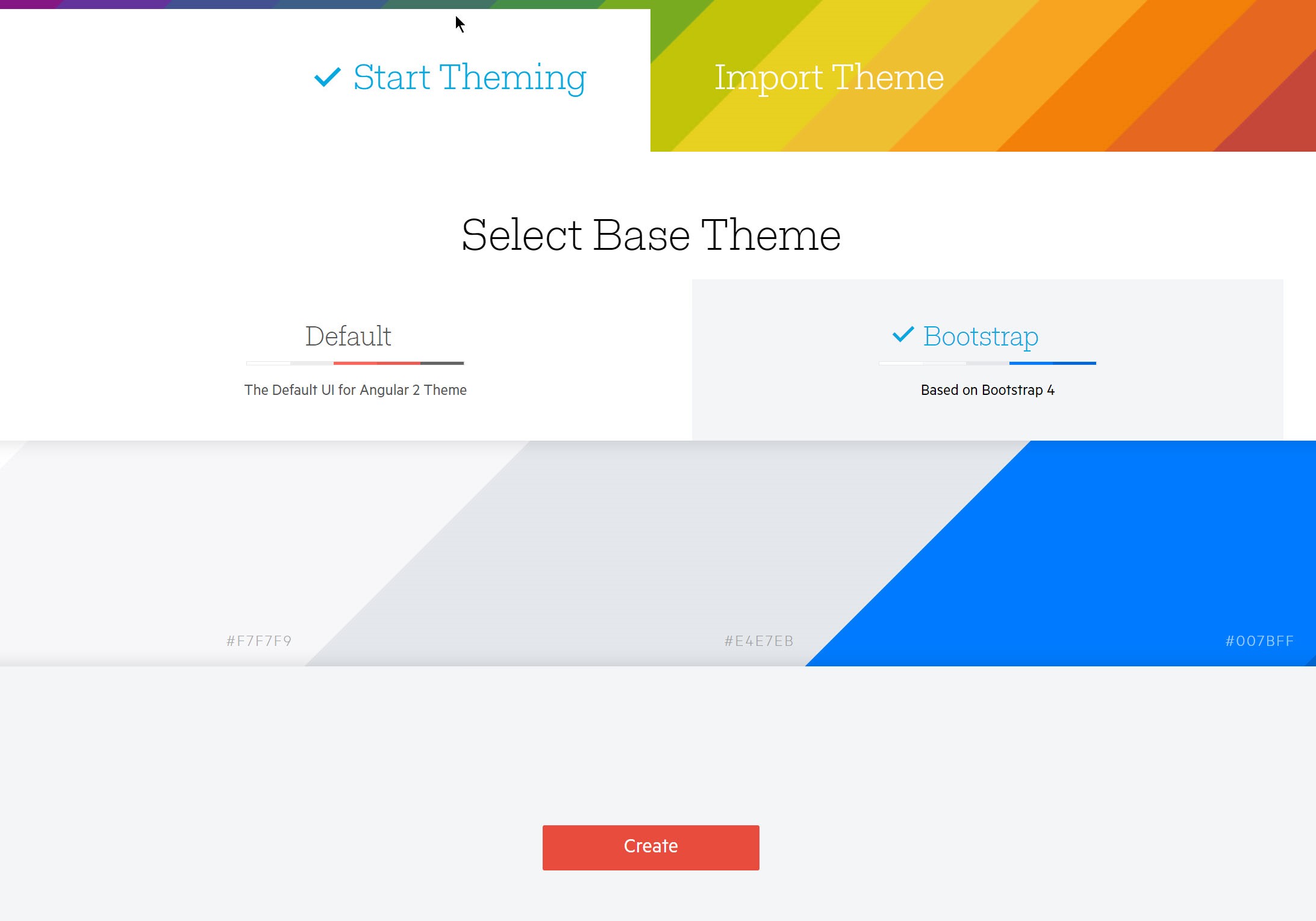
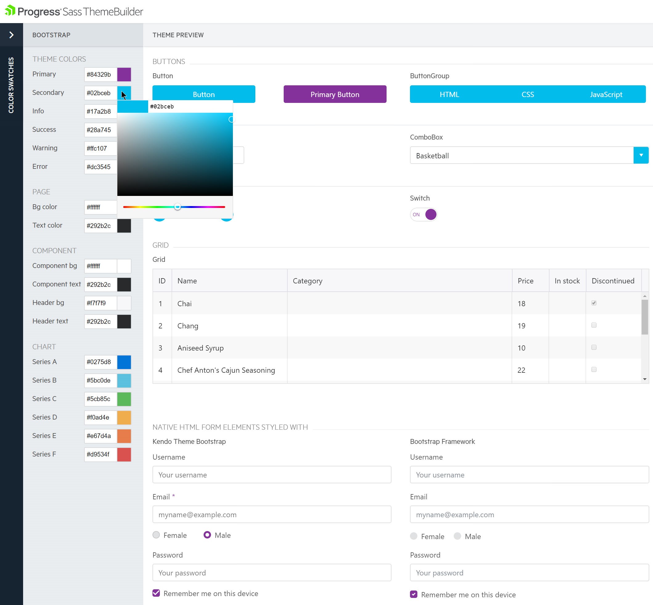
                Last but definitely not least, we are installing the Kendo UI default theme. I love having this default theme. I'm rubbish at styling, because CSS is hard. This default library does all the work of styling the components for you. I find it to be such a relief. ... While we're on the topic of styling, I want to remind you about the progress theme builder that you can use with your Kendo UI components. I am a big, big fan of this builder. You can start with your own theme, ... or our default theme, or bootstrap. Then, customize as your heart desires. You can look through all the components, make sure they're coming out the way you want them. ... When you're ready, you can hit the download button and get a nice bundle of style sheets. ... It just makes styling and customizations less of a stress. ...

                All right, who's ready to jump into code? I am. Here's a glimpse of what our project directory looks like. ... We're going to spend most of our time in the source directory today building up our app. Before we do that, let's open up our index.html file inside the public directory ... to add our bundle.js script inside some script tags. This file will contain the bundled scripts for our app, including our Kendo UI for React widgets. ... Okay. We'll close out that script tag and save and move on.

                Next, we'll open back up the file directory to move to the file that we will spend most of our time on today: the  js file. We don't need the logo anymore, so we'll get rid of that import. We'll start importing what we need from our Kendo UI libraries. ... First, we start with the main Kendo UI library. Then we can import the styling we need for our components by importing the default styling module. It's amazing how many times I have typed the word 'default,' yet the U always thinks it needs to go first. I'll get it one of these days. ...

                [10:00] Next, I'll add our first component: the date picker. As you can see, I'm only pulling in the date picker from the date inputs module instead of bringing in the whole library; because we're only using the date picker today. You can do this with all of the components. ... I will warn you, I am adding some mistakes as we go through so we can see what errors look like when they're coming from different sections. They're not big ones and we'll fix them later; but just to give you a heads up. ...

                For now, let's move inside our app component. We're add our constructor passing in props, ... and inside there, we'll add super, also passing in props. This lets us access this .props inside of our constructor. Then, we're going to attach a property date time to this .state. We're going to use this on our date picker. Initially, we'll assign it to a new date. Then, in order to make sure that we have the right instance of this attached to our change on change method, we'll bind this dot on change to this inside of our constructor. Thank goodness this is never confusing.

                Next, we need to create the on change function and pass the event, or E to it. ... Inside there, we'll just console log the value that the event is sending ... and we'll also use that event trigger that lets us know there has been a change to set date, time, and state to that same value; which will be the value our user clicked in the date picker as we shall see. ... Oops. I jumped all around. All around and wrong. Silly fingers.

                Okay, we are now headed into the HTML. Adding Kendo UI components is pretty straightforward. First, let's get rid of all this old stuff. Then, we'll add a div that the date picker can go inside. This isn't necessary for the component. You could just plop it straight in there, but I figure it may be good for styling later on. ... Inside of that div, we add our component by just putting the name of the component; in this case, date picker. ...

                Inside angle brackets. We want to add some parameters to our date picker, though. First, we'll set the value to this dot date time, which if you recall, first gets set to a new date. Then, when on change is triggered, gets set to whatever the user picked. Next, we'll add a min date value that the calendar will go down to. ... We'll also set a max date value that we'll set to your birthday. I'm just seeing if you're paying attention. I'm just kidding; but that could be right. If so, happy birthday to you. ...

                Okay. Next, I set the format to how the value date is displayed. ... Then, bind the change event to our on change function. ... We'll close out the date picker perimeters, and also add its self closing tag. Since we have that start script running in the background, on save, our app refreshes and we can see there's an error locating our theme script. If I were to look at my node modules folder inside and inside at progress, I would see that the CSS file I'm looking for is inside the dist, or distributables folder. I'll change that up here.

                [15:00] Now, the build is fine. We don't have that warning in the terminal, but still something seems to be wrong. Aha, there is no on change function because the on change function isn't camel case that we built. ... We will go into our code and fix these mistakes. Remember that everyone makes mistakes, because 'pobody's nerfect.' ...

                Let's see what we have now. Viola. We has a date picker. If you go in and click the calendar button, you get a lovely styled calendar that lets you scroll over and click dates. Oh, but look here. It seems I have formatted the year wrong. I feel like next time, we'll do this like a kids' show where you have to shout out what's wrong with the page. Let's go back into our app.js, find the format, and add that extra Y to get all four numbers of our year. ... Save and head back. We see that we have a date sans extra Y. Yay. If we fiddle around in here, we see all the functionality we can get out of just a few lines of code. ...

                Now, since we have something working well, let's go ahead and commit what we've added. Using GST or Git Status again, we see only the app js has changed. Then, if we check with GD or Git, we can see we got rid of the old stuff and added our new date picker. Everything looks good, so let's use Git Add period to edit all. Double check that we still just have the source app.js. Then, make a totally mundane commit message. ... Use GD push and alias for Git Push origin master, and send it up to our repo. Then we'll run NPM start again to keep our application up. ...

                There is our date picker. Now, let's add a bunch more components so our simple form starts to take shape. Going back to app.js, we start by importing the components we need to add. Again, we'll only grab the ones we're using, not the whole module. ... First, we add a numeric text box. ... Then, we get to add the chart, which in this case, will be a bar chart. ... Finally, a button for submitting our form. For now, it will just be a decoration so we can see how it looks and how we implement it.

                Now that we have all the tools we need, let's get to molding our application to include all the things. ... First, we add a div for the numeric text box component. ... A little [00:19:00] hard to say. Then, just like our date picker, add the numeric text box container inside. ... Now, that's all set. We can add the numeric text boxes perimeters. For this one, we're thinking dollars and cents. We'll give the user the ability to have up to two decimals. ... The format will be C zero, which as we'll see eventually, is to give the dollar sign. Treat it like money. ...

                [20:00] Then, we have our min and max, which are pretty self explanatory. ... We'll cap our max out at 500, just because. Next, I want to turn rounding on, so that we can have a whole number. That will be set to 'true.' ... We'll add loading spinners just in case, by setting spinners to 'true,' as well. Finally, we'll set the default value to 22, because it's my favorite number. ...

                Okay, we have everything here that we need. As you can see, we have a pattern here with Kendo UI components.  You add the initial component by putting its name in angle brackets. Then, you have the ability to bind its events and perimeters. You can check out the API to see all the ways you can customize your Kendo UI components. We're just previewing a few here today. I'm noticing that my formatting is a little off, so I'll go ahead and fix that before we add our next component. ...

                Now this I think is pretty awesome. Are you ready to write a bunch of code to add a chart to our app? A chart that you could bind some data to get some data visualizations? Here we go. First, we add the chart component. Next, we needed to have the information to display so we bind series of two objects that each have a data property containing an array of numbers. In the future, you could bind this to live data, files of data, or even user input. Today, it's just static data. We didn't even have to use more than one line. Yes, I was joking. There is not that much code that we needed to write. This one isn't complicated, but I wanted to show you just how easy it was. ... Add a self closing tag and we're on to the next component.

                Last but not least, we have to add a button. If you've added a button before, this should look pretty familiar. We just have to add the button's open and closing tags, plus the button message. Which in this case, is 'check rates.' Let's go look at what we have here. We have everything here now on the page. It didn't take long at all to get some components on the screen, but now let's make them look half decent. Okay, again, I am no designer; but here are the next steps we take. ...

                First we'll add a header so everyone knows what we're doing here. ... Then, we'll put all of our date pickers inside of a div to style them together. ... Next, we'll add some tags to our [00:24:00] date picker so the user knows why they're even picking dates. ... We'll copy our current date picker to make a second one that will act as the check out date. ... Next, we pretty much do the same thing for the numeric text boxes. Putting them together in a div and also letting them have labels, so we know what they're for. ...

                [25:00] Well, we've got labels. Let's dig into the styling. First things first, and also, one of my favorite parts, we copy and paste the link tag from Google fonts to add it to our public index.html file. ...  That means it will be applied across the whole project. ... Then, in the main index.css file, like index.html, the styles you set here will be applied to your whole project. We'll set the font family to the new Google font we chose. ...  We'll also set the background images to pineapples, because who doesn't enjoy looking at pineapples? ... Like I said, I'm not a designer. ...

                Now we have a more attractive app, but let's do better with the form. To do so, we'll go into app.css. ... To do this, we'll go into app.css, which here controls the main component of our app. I'm just going to paste all the style I used, but it's basically spacing everything out. If we go back into our app.js file, it looks like we may have accidentally removed the reference to our app.css file. Let's bring it back so that our changes take effect. ... Oops. We are only up one directory. ...

                Here we have a decent readable clean form to take a look at some of our awesome components that we can now use with our React apps. Before I go, I'd like to show you one more nifty thing. Whenever you build a project with Create React app, ... it starts you on your way to a progressive web app. A progressive web app or PWA is basically a process of taking advantage of modern day technologies to help your web app perform better on mobile networks via smart phones and act similar to native apps when used on a smart phone.

                If you look in the public folder, there's a manifest.json. Where it is supported, this file lets you set perimeters that help browsers display your app on your user's phone to look like a native app by setting a home screen icon, and displaying in full screen view without the browser chrome [00:28:30] on the top and bottom. If you look at this manifest.json, we'll just change the name so we can see the change. If you hosted this and saved it on your home screen on your phone, the short name would be what was written below your icon; which you can also set here in the manifest.json. For now, we'll just see the data in the browser.

                There's a script to register a service worker, but that's a whole other fun topic we can cover another time. Now, if we look in dev tools at the application tab, we can see our updated manifest.json information. Basically, this means that with Kendo UI and React, using Create React app, you are on your way not only to a fast, robust, and awesome web application, but since you have the ability to also add and make it a more progressive web app more PWA, you are starting to get into the ... web side of giving your users a great application that works both well on their mobile device and on the web on their laptops. Kendo UI can just help you make that responsive awesome website even faster. Just a fun tidbit.

                [30:00] I hope you had a great time learning how easy it is to add Kendo UI components to your React apps. You can check out the docks for lots more examples and information on these components. This is a great resource as you're getting started, and also as you're marking your way through utilizing everything these components can bring to your project. Remember to ping us at HeyKendoUI to ask any questions and add yourself to the running for those awesome Bose headphones. I cannot wait to see what you create with Kendo UI components and React. Have a great day and thanks for coding with me.

DevReach is Back!

Join us at DevReach to learn the latest developments in .NET, JavaScript and mobile. If you can’t make it in person, follow along on Facebook.

For all of you developers out there interested in .NET, JavaScript and mobile application development, I am pleased to share that the premier developer conference in Central and Eastern Europe—DevReach—is back! The two-day event, which takes place November 13 – 14, is sold out, but if you can’t make it you can still tune into our Facebook page. We will be streaming live at various times throughout the event.

Sessions and Talks

Image may be NSFW.
Clik here to view.
Ninja and Kendoka

Over the course of two days we will host over 30 sessions by 20 world-renowned speakers like Microsoft’s Burke Holland and our own Todd Anglin on various topics covering .NET and JavaScript, front-end and mobile application development and more. With some of the largest names in the industry going on stage, you will have a variety of options to choose from. Explore some of the topics you feel most passionate about from people who love sharing their knowledge in an engaging way.

For each day, the sessions are clustered in three different tracks: .NET & Windows; Mobile, IoT & Machine Learning; and Front End & JavaScript. Feel free to check out the session descriptions here.

For those of you who can’t make it, we will be recording all sessions and making them available on our channels for you to watch upon your convenience. And remember to follow our Facebook page and virtually join us here in Sofia.

SWAG Up for Grabs and Demos

Image may be NSFW.
Clik here to view.
Ninja T-Shirt

What would an event be without some cool swag? At the Progress booth, we will be demoing some of our products and giving away our latest t-shirts, stickers and more. Come by and see a demo and grab the goods. If you aren’t here in person, remember to tune into Facebook. We’ll show you the demos and give you a chance to walk away with some cool stuff as well!

See you next week!

Defending Angular Applications with a Content Security Policy

An effective CSP will provide you with a safety net against XSS attacks. Kendo UI for Angular components are fully compatible with strict CSPs.

We've got an important update for you on Kendo UI support for Angular and Content Security Policies (CSPs). For the quick version, you can skim the summary right here, or dive into the full content below.

TL;DR

  • A good policy makes cross-site script injection impossible 
  • 'unsafe-eval' compromises the policy effectiveness 
  • Kendo UI for Angular components no longer use 'eval' 

What is a Content Security Policy?

Content Security Policy is a browser feature for protecting against cross-site scripting attacks (XSS), one of the most common attack vectors on the web. It is a useful layer to have in your defense-in-depth strategy.

But it's just that—a layer, not a complete solution in itself. Not all browsers support it, the most notable exception being IE prior to Edge.

How to make a policy effective?

  • Restrict script execution to whitelisted sources, most commonly the application itself
  • Disallow unsafe inline scripts and dynamic evaluation (no "unsafe-eval" and "unsafe-inline")
  • Disallow or whitelist object (embed, object, applet) sources

An example policy that satisfies the rules above is: "script-src 'self'; object-src 'none'"

The CSP Evaluator tool can be used to identify problems with your policy. An extensive research on the real-world effectiveness of different policies is available in the CSP Is Dead, Long Live CSP! research paper.

How to use a strict policy in an Angular application?

Your application has to use Ahead of Time Compilation (AOT). The JIT compiler is not suitable as it must generate dynamic scripts at runtime.

What are the restrictions to the CSP when using Kendo UI with Angular?

As of this week—none. The @progress/kendo-data-query has dropped the use of "eval" in version 1.1.0, making the suite fully compatible with a strict CSP. A sample application is available on GitHub.

What about Kendo UI and jQuery?

The template engine in Kendo UI support for jQuery requires `script-src: "unsafe-eval"` due to the use of dynamic code generation, much like the Angular JIT compiler. A pure client-side framework doesn't have the luxury of server-side template compilation. That said, we actively manage XSS vectors by sanitizing input data.

Further Reading

For more details on CSP, you may want to review the articles on Web Fundamentals and on MDN.

In the context of Angular applications, the Intro to Web Security by Dominik Kundel (slides) talk from Angular Connect '17 talk is definitely worth your time. Last, but not least, you can check out the Security topic from the Angular documentation.

Meet Sean Perkins, Developer Expert for NativeScript

Sean Perkins, Developer Expert for NativeScript, talks about building exciting products with NativeScript while sharing code between web and mobile apps.

This post is part of a series featuring our Developer Experts, community members who represent the best of our products. Read about other featured experts here and meet more DEs here.

Image may be NSFW.
Clik here to view.
sean-perkins

What’s your background, professionally?

I started tinkering with development when I was 12 with Java on private server forums for a popular game. I learned the ins and outs of packet communication, Netty networking and reflection. At 16, I started my first business job answering phones at a front desk of a manufacturing plant. While there, I noticed they had vendor software to print ID labels for the units they produced. They were paying $1.50 per sheet to print. I went home that evening and developed a label maker utility in Java to reduce that cost, bringing it down to $0.10 for the sheet and ink. Soon after I was transferred over to their marketing department where I had the ability to work on higher level applications and websites.

I played in the marketing space for about 2 years, learning the fundamentals and strategies behind proper search engine optimization and digital marketing. At 19, I was transferred to their IT department as an Application Developer and worked on building an internal CRM with PHP/Laravel and other utilities in C#. After a period of time, I went to work at Maestro as a Software Engineer. At first, I was working on Salesforce Frontend applications, Java Spring micro-services and Angular applications. I’m now the Lead R&D Engineer and handle the development of critical integration libraries and tools for our engineering team.

Where are you based and why?

I live in Kalamazoo, in the lower-left hand of the mitten state (Michigan). My family owns and operates a large farming operation here, so it's where I grew up. I often ask myself "why," but who can say no to short sleeve weather one day and a winter jacket the next?

What project are you working on now?

We are currently in the final stages of launching a large enterprise learning application built in NativeScript Angular with complete code sharing to an Angular web app. Outside of that, I have been operating my own business for the last 5 years building anything from web sites, web apps, digital marketing, to process automations. I’ve been involved with a lot of great local companies as well as a few large corporate companies.

What’s the most interesting project you’ve done recently?

I currently work at Maestro as well as operate my own business called Devonite (dev-on-it - play on words). It allows me to interface with a lot of different talents and share knowledge from corporate projects to small businesses wanting to grow. Some interesting projects include:

Loop: Learning management system built in {N} and Angular for coaching employees.

Academy: Course authoring tool built in Angular and on Firebase, for allowing a client to author certification programs for service companies on their products.

Discourse Client: React electron app to manage your favorite sites in a Slack-inspired design.

Two marketing websites, one e-commerce site, a few training courses and a few libraries to handle offline synchronous apps for Angular + {N}.

In short, I'm pretty occupied these next few months.I had started to build a real-time game called "What The Meme", basically Cards Against Humanity, but in an app and with memes. I'm not finished yet, but it's a pretty fun idea and pulls in a lot of different technology challenges that I had to really get at the bare bones of Firebase and Angular to solve.

What are some challenges you are encountering now in your work?

We are pretty hungry to accomplish a lot of large-scale applications, which require a lot of code re-use. This has required us to really abstract a lot of implementations for common things like: Auth, Forms, Offline, etc. It's been challenging, but also rewarding to share one module across 3-4 different applications with minimal extensions.

Which of our products do you use and why?

NativeScript - because Progress took a broken sector (hybrid apps) and built a powerful, extendable and SOLID framework that completely changes the game for true native development. Also the plugin development for NativeScript is unparalleled. I've researched Cordova plugins and React native plugins and their development strategy is painful compared to what {N} gives you.

What’s the biggest software pain point, in your opinion, in the mind of your partners or clients?

The biggest software pain point that I’ve found is that individuals and businesses alike have a near impossible time staying focused on the problem they are trying to solve. Take shopping, for instance. You go to the grocery store for milk, yet you come home with cookies, a new dog and sometimes you even forget to buy the milk altogether. What happened? You were too caught up in the buzz to focus on why you were even at the store in the first place. This is also true of business. Organizations often have a problem they are trying to solve. They then get so caught up in the buzz of design, “cool” features and scope creep, that their final product falls short and under delivers on their original problem.

To solve this, I have started onboarding clients with the idea of the core problem principal. Features are only scoped around problems. We do not add features unless it contributes to our core reason for starting the project. The end result is a product that solves the problem and only after that, do you start adding features that enhance the applications workflow. Steve Jobs believed that you had to give people something that they did not even realize they needed. The truth behind that is people do not know what they need; you have to figure that out for them.


Build a Better UI with Vue and Kendo UI—Webinar Recap

We recap the news from the latest Kendo UI and Vue webinar and answer the questions we couldn't get to live. Missed the webinar? Check out the replay below.

Last week, we hosted the webinar on Kendo UI and Vue, which highlighted how to use the Kendo UI Vue library in a Vue application. This blog post summarizes the event and provides answers to the questions that were asked by attendees.

Webinar Recording

If you were unable to join us for the live webinar, don’t worry: we’ve posted the recording to the Kendo UI channel on YouTube.

Prize Winner

It’s a bit of a tradition for us to give away prizes to attendees who ask the best questions. This time is no different. The winner this time around will receive Bose Wireless Headphones!

Questions and Answers

Q: Is it possible to bind current state of grid grouping/filtering/column ordering etc to model?

A: It takes a little work with our API, but this sample should show how it can be done: http://dojo.telerik.com/@zdravkov/odUmO

Q: Why is there such a mix of conventions in the use of single and double quotes? Then the use of single within double quotes? The docs use it but don't explain why we are needing to map string types.

A: This comes from the props used to having strings for the jQuery widgets, usually configured with a jQuery object. Setting this in templates requires the use of double and single quotes. We can try to make this more clear in the documentation.

Q: Any type of formatting types for columns in grid like date, currency..?

A: Yes. The format is as follows: format: "{0:c}".

Q: What is the advantage of Vue over Angular? Why should one use Vue when the Angular Kendo UI library is more mature?

A: This is definitely just a matter of personal preference for using Angular or Vue. We just want to help you build with whichever you chose.

Q: Is it possible to implement Vue with ASP .NET  4.6 Kendo web apps?

A: You can utilise the wrappers with http://ASP.NET, yes.

Q: What editor were you using?

A: For this webinar we used Visual Studio Code: @code

Q: How long is your trial license?

A: 30 days—fully functional

Q: Are there any plans for a GUI tool (web, etc) to configure some of the more complex components like the awesome grid?

A: Nothing planned at the moment. However, we’re open to new ideas.

Q: Since Vue.js is considered an extremely lightweight framework how does Kendo UI affect its performance?

A: The performance of Vue isn't affected; we provide Vue wrappers to make it easier for you to build applications with Kendo UI.

Q: Why do not you remove the dependence on Jquery?

A: This is what we've done in our @angular, and soon our @reactjs components. Currently looking at the needs of our @vuejs devs and how jQuery fits (or doesn't).

Q: Any issues with Vue, TypeScript, Electron and Kendo UI?

A: That's quite a combo. It should work. Emphasis on SHOULD. :)

Q: Looking at your Vue presentation, how do you deal with an async transport read on your datasource?

A: There's an async property on the DataSource. That's because it uses jQuery.ajax under-the-covers. You can set the async property on this if you like. By default, it's true.

Q: Does the new Vue integration natively work with/know about Vuex?

A: We don't have a sample quite yet, but we're working on ensuring official support for Vuex (with sample projects) in the future!

Q: Is it possible to have Vue components as editors/custom renderers inside kendo-grid-column or are we stuck with jQuery powered templates?

A: Right now we do not support Vue templates, but we are actively working on seeing what we can do there in the wrappers.

Q: Are Vue components kendo-datasource, kendo-grid and kendo-grid-column reactive? Will the grid rerender itself if model bound to those components changes?

A: Yes, they are  https://docs.telerik.com/kendo-ui-wrappers-vue/getting-started/model-binding

There was also a request for better MVVM documentation

And a request to shorten the component names

Transcript

Hey everybody. Thank you so much for joining us today for our build a better UI with Vue webinar. Here at Progress we are very excited to be announcing the Kendo UI component library support for Vue JS. It's a great library, a great framework, and we are excited to help you build more robust apps faster with our component library.

Before we dig in, let me introduce myself. My name is Tara Manicsic. You can find me on Twitter @tzmanics. And I'm a developer advocate for the Progress team. And I mostly focus on Kendo UI and I have learned so much about how awesome and easy it could be to have somebody writing this code for you that builds your front end UI components. It's fantastic. I started as a node engineer and coming to the front end was always very daunting for me because CSS is scary. But fortunately, on the Kendo UI team I've been able to learn how to have somebody else do that work for me. And that is what Kendo UI brings you.

And before we really jump in, I also want to bring your attention to our hashtag HeyKendoUI. So at any point in this webinar or after this webinar, if you have any questions, any comments, anything that pops into your mind that you want to know more about, hit us up at this hashtag, HeyKendoUI, to ask us any questions. And after this webinar we will actually pick one of the questions as a lucky winner of these awesome Bose headphones. So make sure to hit us up if you have any questions at all, either during the webinar or after.

                  And now, with all of that out of the way, let's go ahead and jump in. I introduced you to me, and now I'd like to introduce you to Kendo UI. And one of the best sites to go to if you have any questions is kendoui.com, which will take you to telerik.com. So, Kendo UI, that team has been building UI components for over 15 years. So they really understand what it takes to make great component libraries, ones that are actually helpful and easy to use, and really robust. So we actually support jQuery, React, Angular, and Vue right now. And what's really great is getting the license for Kendo UI means you get the support for all four of those libraries, for all four of those tools. So, if for some reason you change your mind about how you want to build your project, which we tend to do sometimes, you have the support built in to that license you get from Kendo UI.

                  The Kendo UI library is awesome in the ways that are quite obvious. You get these amazing components from your everyday things like drop down menus and auto completion inputs, buttons, and all those things that you use in forms like what you use every day. And also, the robust things like data visualization charts and grids that give you the ability to in-line edit and do crub methods inside of your grid. But on top of that, you also have the reliability of the components with their accessibility and that is like keyboard support for the components, section 508 support for accessibility, and aria support, and WCAG 2.0 compliance.

                  So, you have all these great things and on top of that, you even get really great support with Kendo UI that's dedicated to the product that you're working on. So you have technical people looking at your problem and trying to help you work through your problem with you.

                  A little while back we announced our support for the Vue library and bringing our components to Vue, which I am extremely excited about because I really love Vue. I use it for almost all of my side projects. And I wanted to show you this page first. This is our getting started with Kendo UI for Vue page. So, we're going to be covering a few of these things in today in the webinar, but this actually has a different approach of how to set up your project. And here, you see that we talk about integrating Kendo UI using CDN files. So here's a list of the files that you can use as NPM packages. And you can also use the CDN files to include this in your project.

                  [00:05:00] So now I also want to show you that we have demos for all of these things. If you go onto the demos page, it's at Telerik.com support demos. And you can go down and find the Kendo UI page. So what we're going to look at are the jQuery demos. And in this list of demos, we have all of our components. So this demo's at Telerik.com. You can look at all of our other things, but let's focus on Kendo UI today.

                  So one of the things we're going to be building out today is the grid. And you can use this once you, obviously follow along with me and build a grid of your own, when you want to go back and get more information, maybe do some more things with the grid, you can go to this page and there's actually a section that breaks down how to do it in view. And we'll be going at it in a different. So this will show you another approach to take and it's a great resource for the next step after this webinar.

                  So, I wanted to give you this resource first so you could see all these things that you can do inside of the grid as far as editing and updating and even deleting the things that you have in your grid. It's a very powerful tool, so we are going to be covering that today to at least get our hands on it and see what it's like to integrate it into your Vue project.

                  So here I just wanted to point out the pagination, which we will be doing with our grid today as well. And if we scroll down to the bottom, there is just more information and you have your sample files. You can see what the code looks like. You can dig into the code more.

                  So today, when we build out our project, we're going to be using the Kendo UI default theme. And I wanted to show you first the Kendo UI theme builder. This is a really great tool. Like I said before, I am not what one would call very good at CSS, so tools like this, this theme builder, a Sass theme builder that Progress has, I lean on these heavily. And we have a specific one for Kendo UI and you can start with a theme that already exists. So I like to use the Kendo UI default theme. I like the colors and I think that they did a really good job. People that actually know design well figured these things out so I don't stray from it too much. But you can use Bootstrap. And then we also have a beta material design for all of our components.

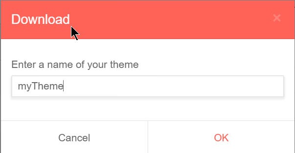
                  So the way this works is you go in here and you can click either the default like I did or the other option is the Bootstrap. And it will show you what all of the components look like with that styling. So you can interact with these components, you can see how the colors change and what happens when your user is interacting with this UI. And then, you have the option to customize it by changing these different colors in the color swatch area on the left. And as you do that, you get a live update, right there, to show you what it looks like. I like this a lot because I can see what the changes look like, if it's good or bad. And then you just click this download arrow and name your theme. And when you hit okay, it will give you a nice little zip file of everything you need.

                  So I'm a big fan of that, but moving on to what we'll be doing today. We'll be using the Vue CLI to create our project. And the Vue CLI is a great tool from the command line to build a simple scaffolding of your Vue JS project. I am not very good at saying that word. Scaffolding. All right. I'll get it. I swear. So you see here, the usage is basically doing Vue init and then picking a template.

                  So there are a lot of really great templates, like webpack and browserify and simple, but today I want to be doing our PWA, or our progressive web app template. I'm a big fan of progressive web app and it give you the opportunity basically to create your web app and also make it look and interact real nice in a mobile device, as well, which our components are responsive, but progressive web apps gives you the opportunity to take it even a step further.

                  [00:10:00] So just a quick glimpse into progressive web apps. They are basically a way to use modern technology to make your website more accessible and more reliable and more engaging. And the big thing that I like to point out about this, these are the top ... these are the things that Chrome tends to consider making your web app progressive, but one of the biggest thing is, is Progressive. So any changes you make won't break anything if it's not supported in the browser you're using.

                  So let's jump right in. Inside our terminal, we'll go ahead and globally install the Vue CLI with NPM I for install and the dash G for global. And that's basically saying anywhere I am in all of my folders, make it so that I can use the Vue CLI because I want to create Vue projects in every single folder that I have. Maybe you do. I kind of do that.

                  So the first thing we want to do after we have that installed is change into a directory where we want our project to live. So CD in my whole long list of getting to where I want it to be, which is in my webinar's folder. And once we're in that folder, we run the command Vue init PWA, which is our template, and then the name of your project, which today for us will be Kendo UI-vue.

                  So it's basically walking us through these different questions of to describe our application. And that project short name it's asking you for right there is for the progressive web app part of your application. That is, progressive web apps have the ability with a manifest.json to save an icon on your home screen, and that short name is what shows up under your icon. And we'll give it a fun project description. The author is me, Tara Manicsic, and we're going to do a Vue build of stand alone. And then we follow the other questions and ... So we're going to keep it pretty simple today besides our awesome components in making a PWA, and not include the router. We will lint, because linting is awesome and I love the standard library. I'm a big fan, so we'll keep it that. But with the testing and end-to-end testing, we won't include that today. But you can if you want to in the future.

                  So then we want to change into our projects directory and run NPM install. And this is basically downloading all of the dependencies from NPM that we need to get our project running, to make sure everything works really well and we have all the supplies needed to get it going and check out what we have. In this case, you can also run NPM I, which is just the shortcut or the nickname for NPM install.

                  All right. So, we are have all of those, 11 hundred and 56 packages installed. And we can go ahead and clear that out. And then run NPM start, which is our NPM script telling it to run our Vue file. And if we go to local host 8080, we can see that we do in fact have a working Vue JS application, with all these fun links to get any information that you need on your Vue application.

                  So since we have that running well and we know it's a good starting point where everything works, we'll go ahead and initiate this as a git directory so that we have version control. So I'll do git remote add origin. And that origin is actually a repo that I made for this project and I will make a commit for every code change that we make today as we go along. And that way you can check out the diff and see what's changed, see if you have all of the same changes to make everything work correctly, because we all want a working project, right?

                  [00:15:00] So here we see that everything has changed because we just added all these things. So we'll go ahead and do git add all the things. And then go ahead and ... Oh, take a look and see, yes, new things. Then we'll make a commit basically stating the fact that these are the initial files of the, that the Vue CLI gave us to create the scaffolding of our project. See, I said it right that time.

                  All right. So I'm going to push this up so it all exists in that repo. Again, I'm tzmanics on GitHub and you'll see it's KendoUI-vue on GitHub as well.

                  Okay. So let's go ahead and take a look at these files. Inside here we have a whole list of fun things. And the build directory that basically has everything that we'll build out for your application. Then you have some config files, your node modules, which is a pretty long list as we remember from installing all of these modules. We don't need to look at all of them. And then the static folder that has our manifest.json, which is that file that I talked about earlier that gives the meta data to have people open things on their home screen or add your app to their home screen and show them full screen views.

                  Then we have our source folder, where we'll be doing most all of our work today. Inside there we have an assets folder with a logo image, a logo PNG, that we will not be using today so we can go ahead and delete that by pressing the delete button. Or I guess we're recycling it.

                  And then we have this component of the hello.vue. We're going to stick with working inside of this component today. And so, if you recall what we opened up in the app that we looked at at Local Host 8080, these are the links that we saw there, the links to give us more information on our Vue project.

                  So that was the whole template. And now we see in the script we have some information that we're passing to the template, and we have some styling in here.

                  For today, though, we will not be using any of these things. We'll probably keep the nice little header but for as for all of these links, we're going to put our own things in here. So we'll go ahead and delete all of these things.

                  And inside of our script section, we don't need the name and we don't need the message, so we'll go ahead and delete that. And really, all of this styling, we're going to be using the default styling, so a lot of these things we do not need. We actually won't have any lists, either ordered or unordered, and so we won't have any list items either. So we'll go ahead and delete those, as well.

                  So we'll go ahead save that file. And then we'll take a look at the app Vue file. This is the component, this is what's basically holding everything that is inside the hello.vue. Forgive me for my funny navigation throughout here. It turns out when you use Windows and the vim mode inside of visual studio code, you can't use some of the keyboard shortcuts. It's a funny little thing. Has me moving quite slowly through here.

                  So again, we'll delete these things that we don't need today or that we basically won't be using today, like the logo. But everything else, we're going to be keeping that component name, hello, the same, so we'll keep that in there. And going through here, we do know that we're going to keep the header so I am actually just not going to touch any of this styling and just leave it all in there. If we were sending this to production, we would definitely try to get rid of all the code we're not using. But this is just our fun app for today.

                  [00:20:00] So let's go ahead and make sure that all of the changes we made didn't break anything by running NPM start, taking a look at Local Host, and seeing that everything is gone besides that pretty little header. And we are good to push another commit with the changes of removing everything. And that way, we know the next stopping point that we can go back to if we make changes that don't come out how we expected.

                  So again, you can see that we removed some assets and just changed those to files, those two Vue files. So we'll add those, make sure that's the only things that we were adding. And then make a commit simply stating that we removed things. And then, once that commit is made, we'll go ahead and push it up to GitHub.

                  Okay. So now that we have a clean slate, the first thing that I want to show you is basically how we include the components into your project. And all of these can be installed with NPM. So first, we'll install Kendo UI. So this is the base library, the base module that we need in order to have Kendo UI functioning properly in your application. So this is the one file that has to be in there for in order for you to use the Kendo UI components. So yay. We have that installed. Fantastic.

                  So let's go ahead and open up the files where we need to include that Kendo UI module. So this is when we're going to go into our main dot JS file. So in here, you see that this is where we're importing Vue and we're importing that app.vue file. So we'll just go ahead and import @progress/kendo-ui. And that's basically all you need to do to have your project pull the Kendo UI library in. So we'll save that.

                  And then, while we're jumping around, we'll go ahead and go to our main HTML file. It's a little bit down the list. And in here, in the index.html, we're going to add the files we need to include the Kendo UI default theme. So just right under the title before the icons, I'm going to paste these here. And you can find these in the resources page in the getting started pages. And it's basically just giving you the way to make it look good in mobile and the default theme. So if we do NPM start, we're basically just taking a look and making sure that there's no errors, that we didn't break anything. So if we get our plain blank slate site up, that means that we didn't break anything. And there we go. There it is. Yay.

                  So since we did make changes, though, in the code, we'll again go ahead and terminate this job of running ... Because otherwise, if you leave that open, if you keep that running in the background, if you do NPM start and don't close it out, you will get that refresh. So when you're using the Vue CLI, it's nice to have that in the background, it just kind of keep getting those hot updates, keep getting those live updates of the changes that you're making to make sure that everything looks good.

                  So we added everything we changed and did a simple commit message, UI based library and styling. So we'll go ahead and push those up. Great. So now we're ready to get started and pulling in the actual components.

                  [00:25:00] So first I want to install with NPM the Kendo buttons library. So we will only be using one type of button. There are multiple buttons in the button library, and we're actually going to be using the Kendo buttons group. And that's basically kind of give you a tab-like kind of button. And this is a very simple component. I wanted to start with a simple one so you just see how easy it is to add these. So we installed it. And now we can just go ahead and go into our code, back into our code. And we'll go to our main JS file. Accidentally closed it. That is not what I meant to do. Okay.

                  So again, we'll go into our main JS file. And in here, we're basically just going to import the part of the library, of the buttons library, that we're going to use. So not the whole library, we're just importing what we want to use. So again, today we're just going to use the Kendo button group. But then we also, with the Vue framework, need to install the Kendo buttons installer. And all of that is coming from what we just installed with NPM, which is the Kendo buttons Vue wrapper.

                  So, once we bring those in with import, we also want to make sure that we do Vue.use in order to utilize and put into play that Kendo buttons installer that we need. These are very verbose hints that VS code is giving. I just have a new install of VS code, so getting all my settings just right. We're not there yet. So for these more tidbits, these very verbose tidbits fromVS code, I will remember to try and click the screen to get rid of those so you can actually see what you're writing.

                  So again, inside of this new Vue object that we're creating, we want to add inside the components the Kendo button group because that is the item that we will be using in our component. So if we go back to that main hello.vue component, inside of the template is where we'll be putting our Kendo UI component. And that's basically inside of the angle brackets, we do Kendo-button group. And this will be the main holder for the buttons in our Kendo button group. So, if it makes sense, it will be Kendo-button group-button.

                  And then, we just put the name of our button, like we do regularly with buttons. Being really creative with button one. And then close it out. And since it's a button group, I'm going to put two more buttons to just have three side by side buttons. And I'll be ... I'll stick with my originality of naming and do button two and button three.

                  So, that's actually all we have to do in that hello.vue file. So I'll run NPM start to take a look and see what this looks like. All right. So, see? We have three buttons all in a row. Button one, button three, button two. And see, that's the default styling that we're getting from Kendo UI that interaction of the hover over colors and that primary color unclick of that default salmon orange color.

                  So again, we have new things to that we added, so we'll go ahead and push those up. Commit those and push those up. But this was the way I wanted to show you just how easy it is to do these components. So basically, we installed it. We put it inside of our main JS file to import it into our component. And then, inside of our component, we basically  just called the component we needed inside of the angle brackets like we're used to doing with many tags in HTML in general.

                  [00:30:00] So we have that pushed up. Or it's pushing up. No, pushed up now. We'll go ahead and clear that out. And now, I want to step into a more robust component. The grid. So that's progress/kendo-grid-vue- wrapper. And this is our most popular component for a very good reason. The Kendo grid is very robust and they keep adding more and more awesome functionality to the grid. And we're going to be putting together a simple one today. And when I say simple, I mean simple about how we're setting it up but you'll see you get a lot of interactions of it right off the bat.

                  So we have that installed.  Per usual, we head to our main JS to get it included inside of our application. So I'm just going to copy what we have here for the Kendo button group. And switch it up to the Kendo grid and also the Kendo grid installer. And, of course, we have to change where that's coming from, which is just Kendo grid vue wrapper.

                  So just like with the buttons, or with the button group, we want to use the Kendo grid installer, have vue.use Kendo grid installer. And then, down below here we want to add the kendo grid inside of our components.

                  Now, one other thing that we're actually going to need in order to use our grid, is the data source. So Kendo-data source-vue-wrapper. And the data sources is basically how we're going to be feeding data into our grid. And there is an extensive documentation on everything that you can do with the data source. Today, we're just going to be bringing in O data. And it's a file that we have hosted online. But there are a ton of things that you can do with this data source. So I wanted to at least show you what it looks like to bring that in and use it in the most simple way.

                  So that will, again, be imported just like the grid and button group. We want to bring in Kendo data source and also the Kendo data source installer. And just as a reminder, there are a ton of resources to look more into the data source and see how everybody's using it and see all the things that you can do with it in the documentation. And a lot of that is in the demos.telerik.com that I previewed earlier.

                  So, just like with the Kendo grid and Kendo buttons, we want to do vue.use the kendo data source installer and also add it in our components list.

                  So one thing that we're also going to be using that I forgot to add right here is the Kendo grid column. And that's seemingly self-explanatory. So we use the Kendo grid column inside of our Kendo grid. So we want to add ... Oh, looks like we want to add Kendo grid inside there and also the Kendo grid column. And I just need to add a comma there. And then we'll go ahead and save that.  And then, go back over to our hell.vue component because we have everything that we need in our main dot JS file now.

                  [00:35:00] So inside here, we'll leave our button group there. And we'll start to add our grid component. So first, I want to go ahead just for styling purposes, separation, I'll add a new class called grid. And then, in here is where I will create the Kendo grid data source first. So this is where ... Sorry, Kendo data source. And this is where basically I give the parameters and the information about the data source. So the reference to the data source will be data source. Again, I'm not very original. And the type that we're using today will be O data.

                  Then, we need to set a page size. And here, this is the transport read. So this is where we're reading the data from. So I want you to take a look at what this file looks like. So if we put that link here in our browser ... You can see it's this SVC of this information that we have. And you see that there's the customer ID, the customer name, the customer title or the contact title, contact name, and the country. But there's more information in there, but we don't have to use all of it. So in our columns, as we'll see in a little bit, we're only going to use certain bits of that information. But we have all of it there if we need it.

                  So we'll go ahead and close out our Kendo data source and move on to the Kendo grid. And just like with the buttons and just like with the data source, you do the open bracket kendo- grid and then we start to set some values, some parameters to our grid. And there's a huge list of different things that you can set for your grid, but we're just going to use a handful of them here today.

                  So, height, just to make it fit on the page well. And then the data source ref, which is the data source that we just made and the ref that we chose was data source. And then, groupable. And this is a way to let users visualize the data by grouping it by a certain category. And I'll show you what that looks like later. Sortable is exactly what it sounds like. So you're able to sort your data on the grid. Pageable refresh. That just lets you refresh the page that you're currently on. Pageable page sizes, which can be set to a number or a boolean which is basically saying that you have the page menu at the bottom of your grid. And pageable button count, which basically says that if you have that menu, that pageable page menu at the bottom of your grid, how many buttons do you want there to be? So we'll set that to five.

                  So, those are all the setting that we'll set today for the Kendo grid. And inside here, this is when we start to do the grid columns. So this is a thing that we pulled in before and this is basically for each column, we'll set the field. So the first one that relates to our data is contact name. Then we'll set the title, which is the text that will be displayed, and we'll just put a space in there. Readability, you know? And then, it's optional, but we're going to go ahead and set the width here for this column.

                  [00:40:00] So, we're going to keep these columns pretty simple and just mostly put the field and the title, and on some of them or on maybe one other one, we'll put the width. But there are a lot more things that you can add to the columns, a lot more parameters that you can set in your columns. And again, these are really great resources in the demos and in the different APIs for the grid to tell you each thing that you can do, or for the grid column moreover, to show you each thing that you can customize and change inside of your grid columns.

                  So, the next one we'll put here is contact title. Again, our data has a contact title key in there. And we'll name it contact title. But we'll go ahead and get rid of the width for  this column. Oh, I just noticed that I did not close out my grid column. So I'll close this one out here. Copy that. And paste it in the right spot. And then I'll go ahead and do a few more columns just copy these four lines, paste it here. And the other fields that we will look at are the company name. And we again will not set the width for that. We'll go ahead and copy that again. And the last one we'll do here will be the country. So, we'll change the field. And that same thing can be used for the title.

                  So, we've closed ... We have the close of our column. We'll actually go ahead and do a width here, as well. And set it to 150. Pixels, that is. And then we can go ahead and close out our Kendo grid. And we're still inside that div that we had already made the closing tag for.

                  So, this is all done. I'm pretty sure I also spelled everything right, so let's run NPM start and see what we have served up. All right. So at Local Host 8080. Yay. We, in fact, have a working grid.

                  So you see, this is some of the default styling that we get with these zebra striped rows and the hover effects. That's the pagination that we set below before. And you see we can go all the way to the very last page and skip ahead to all of those. And they are paginated. And we can change the amount that belongs on each page. We still have our row of buttons up top, as well.

                  So you see, we have this scroll or the hover over function. And we can also pull these up here. This is the sortable. This is what we get when we want to ... The contact name wasn't good. We'll try the title. So if we just want to look at sales representatives, we can drag that up there and ... Or have them grouped by sales manager, sales representative, collapse them. And you see that color default that we have going on there  is the same primary color or accent color we're using here in our paging menu. So we have that consistency across our components and we didn't touch any styling. I mean, we added those links for our styling, but we did not touch any CSS besides deleting it, which is how I like to handle CSS.

                  So, there is a much more in-depth project that we have available for you to dig into the code here on GitHub @telerikvue-dashboard that you can install, mess around with it, and really dig into everything on this dashboard. And if you want to take a look, this is what it looks like. So it's sticking in data from GitHub, different issues and it's showing you the different data visualizations we have with the interactions. And there's that button group that we used in our project being used to give you the different time spans for the information on here.

                  [00:45:00] And so, we have many different types of graphs. And this is the donut graph. And who doesn't like donuts? And you can see that you get this interaction with these graphs. So I'm clicking here and I can see these data points, but also click here and remove different categories.

                  So, the next thing on here are the issues grid. So this is a much more in-depth kind of feature packed version of the grid. And this isn't even doing everything that we can do with the grid, but it's showcasing a lot of things that you can use the grid for, how you can use it, what can go inside of the grid, and how you can filter these things. So this is the filter menu here where you can set different things to look for and filter your grid down to make it even more useful and be more powerful for your user.

                  And then we can also see the components that work inside of this form. Or basically, how we can use these things altogether. So you see the data visualizations. You see the form. And you see the grid. So this is a great project, a very robust project to dip into and basically see all the code running together, see everything that you can do with this.

                  So, again, real quick, we'll jump back and I'll push this last piece of code up so that you have everything that you need to replicate the project that we made today. And again, inserting this grid, we basically just installed the module, and then we imported it in our main dot JS file, and then added those angle bracket components, those tags inside of our template, inside of our main component file.

                  So, it's three steps and that's basically what you do with all of the components. With our grid, we bound data to it, which was one other small step. But it's basically those three main steps.

                  So, all of our information is up there for that project. And I want to take you back real quick to KendoUI.com again. Because this is where you will find your most helpful resources. This will be your guide to going through Kendo UI components and seeing everything that you could take advantage of.

                  So, again, on this page, if you scroll down, you can check out all the different frameworks and libraries that we support, and really kind of dig in and see what you can use Kendo UI for. And if you go to Vue, go to try it, you can go to this getting started page that helps walk you through the process and also the demos. They give you a really rich library of tools and examples and a lot of these are also, you can open them in Plunker, which lets you mess around, break it, edit it, customize it, do all the things that you would do with your code that you would be using, which I usually break it.

                  So you can break it and then fix it. And there are just so many components that you can use. And later on, when this webinar is done, we will be posting it here on our YouTube channel. Excuse me. And you can actually find a bunch of our other webinars to see everything that we cover and just learn more in-depth about the different things that we offer that can help you build your awesome projects even faster.

                  So, thank you so very much, again, for joining me today. It was really fun coding with you. And I hope to see what you build with everything that you've learned today. And again, if you have any questions whatsoever, I can be found personally on Twitter @tzmanics and that amazing ball of weird right there is my dog Tosh My Gosh. You can find her at her hashtag if you have any questions for her, in particular.

                  [00:50:00] But more importantly, you can check us out at our hashtag, we're KendoUI on Twitter. You can tweet at that hashtag, HeyKendoUI, to ask us any questions about anything that you've learned today, anything that you want to learn in the future, or anything that you just have any questions about as well. And we're more than happy to get back to you. And on top of it, we will be choosing one lucky winner that is asking a question, an awesome question, at HeyKendoUI, and that winner will receive these awesome Bose headphones. So, submit a question, ask us anything that you like, and enter in the chance to win these headphones.

                  So again, thank you very, very much from me and Progress, the Kendo UI team. We really appreciate you coming out today and we cannot wait to see all the amazing things that you build with Kendo UI and Vue. Thanks so much for coding with me.

Planning an ASP.NET MVC Application: Working with Data

You have many decisions to make when building an ASP.NET MVC app. In this post, we explore options for working with data by covering topics like Entity Framework, LINQ and Object Mapping.

So you’re considering ASP.NET MVC for your next project? It’s fantastic that you’ve picked your framework of choice. Still, you have many more choices before you when planning your app—from tooling choices during development all the way through deployment and performance strategies. In this post, we’ll share some of developer advocate Ed Charbeneau’s recommendations for working with data (Entity Framework, LINQ and Object Mapping).If you’d like to read more on the topic, we recommend Ed’s recent whitepaper, Planning an ASP.NET MVC Application.

Let’s get started.

Entity Framework

When it comes to database access with ASP.NET, Microsoft’s Entity Framework (EF) is the go-to option. EF is an object-relational mapper that enables .NET developers to work with relational data using domain-specific objects. It eliminates the need for most of the data access code that developers usually need to write. If you work with EF to query data using LINQ, you don’t need to switch context between C# code and SQL.

While EF provides a robust infrastructure for working with databases in .NET, there are special scenarios where additional tooling can be helpful. The tools listed below will assist in speeding up the development process:

TOOL

PURPOSE

Entity Framework 6 Power Tools Community Edition

Useful design-time utilities for EF6


EntityFramework Reverse POCO Generator


Reverse-engineers an existing database and

generates EntityFramework Code First POCO classes,

configuration mappings and DbContext


Knowing LINQ

When LINQ was added to C# in ASP.NET 3.0, it changed the way that we work with data collections. When working with server-side data in ASP.NET applications, LINQ is an invaluable time saver. It makes short work of iterative functions by means of a simple syntax that is easy to read and understand. In addition, it enables developers to build queries in C# code, which are translated into SQL by Entity Framework. This means LINQ is not only a handy tool for operating on collections and arrays, but also for interacting with databases from .NET.

CATEGORY

METHODS

Quantify

All, Any, Contains

Filter

Where, OfType

Project/Transform

Select, SelectMany, Zip

Criteria/Set

Distinct, Except, Intersect, Union

Sorting

OrderBy, OrderByDecending, ThenBy,

ThenByDecending, Reverse


Object Mapping

When building web applications in ASP.NET MVC, typically there’s a rich domain model that’s bound to the database with Entity Framework. With this exists a general problem where backend objects are generally very rich and behavioral and the user interface is not. Mixing those two things together poses a challenge for developers. To solve this problem an object mapper can be used to copy that information from the rich backend objects to frontend data transfer objects (DTO). In doing so, a separation is clearly defined between database behaviors and frontend view models. Additionally, this approach will provide added security by solving mass-assignment vulnerabilities that can exist in MVC applications.

Automapper is one effective tool that can be used to handle object mapping in ASP.NET. Automapper, as the name suggests, can copy values between two like objects so mappings don’t need to be created by hand.

Learn More

For a more detailed view of key considerations—software management tools, development process and methodology, tooling and development, backend methodologies, testing methodologies and more—make sure you download Ed’s “Planning an ASP.NET MVC Application” whitepaper.

Download Ed's Whitepaper

While you’re at it, if you haven’t played with Telerik UI for ASP.NET MVC, consider downloading a free trial. Our UI library enables you to quickly and easily deliver a sleek UI and delightful UX, increasing your productivity and your app’s performance.

Start Your Free Trial

How to Seamlessly Integrate Telerik Reporting into Your App

Learn how to effortlessly integrate Telerik Reporting in your desktop or web application using the Visual Studio Item templates.

Are you developing a great application with both a desktop and web version, or migrating your Silverlight app to a more recent platform? If you're wondering how much time and effort it will take to make your reports work in these scenarios, we have good news for you—it’s next to nothing!

One of the advantages that makes Telerik Reporting stand out is its versatility, and specifically its ability to work with variety of technologies. It covers the well-established WebForms, WinForms and WPF platforms as well as modern web paradigms like MVC and Angular 2+. Migrating between these technologies is also a no-hassle process, since Telerik Reporting provides the tools and templates that will do the heavy-lifting for you.

As explained in a previous blog post, reusability is a substantial feature of our product—you create the reports once, using a report designer of your choice, store them in a class library, file storage or a database and then just load them in a report viewer. But configuring a report viewer may also take time, so we went a step further and decided to automate the process of adding a new report viewer to your project, regardless of the selected platform. We used Item templates—the Visual Studio’s common interface for adding and configuring a new item to a project through a wizard.

Item Template Wizards

The item templates that add a new report viewer come in two flavors, for both C# and VB developers. The templates share the same consistent look, but, depending on the selected project type, provide different configuration options and output files.

Initially the user has to select the reporting engine among three options: embedded, REST service or Report server. The “Embedded” option is only available for WinForms and WPF projects, because in these cases the reporting engine works locally—the report processing and rendering are performed by the same application. “REST service” and “Report server” options suggest that the viewer obtains its contents by an external service that can be hosted on another physical machine.

Image may be NSFW.
Clik here to view.
Image template page showing the Configure Reporting Engine dialog

On the next pages, the user is required to configure the report source, providing additional information related with the engine selection. Depending on the selected options, the wizard can traverse the solution structure, looking for report classes, or connect to a Telerik Report Server instance to obtain the list of categories and reports that can be displayed by the new viewer. The wizard can also add a new report or create a new report library project that contains a sample report definition.

Image may be NSFW.
Clik here to view.
Item template page showing Configure Report Source dialog

After pressing Finish, the wizard has gathered all the necessary information to successfully create and add the new item to the project. Depending on the selected options, a new report library can be added to the solution or a sample report can be included in an existing library. If needed, the wizard can download and install NuGet packages that are required to connect the viewer to a REST service or Report Server. The wizard maintains a detailed log for all the events that occurred during the process and displays it when finished.

When the wizard completes its work successfully, the initially selected project will be set up to work with Telerik Reporting and will have a report viewer, ready to display a report as previously configured. The report viewer can be hosted in a new form, window, cshtml view or an HTML/aspx page, depending on the project type.

HTML5-Based Item Templates

Image may be NSFW.
Clik here to view.
Item template page showing MVC report viewer setup dialog

The group contains three types of item templates—HTML5 Report Viewer Page, MVC Report Viewer View and WebForms Report Viewer Form, covering the most popular scenarios for presenting reports in a web application. Since the MVC Report Viewer and HTML5 WebForms Report Viewer are actually wrappers around the HTML5 Report Viewer, their item template wizards are similar, but in contrast of WPF and WinForms item templates, they lack the “Embedded” option when selecting the reporting engine. The wizard will automatically add and/or modify the required classes like ReportsController and Global.asax. Finally, the wizard will add a new HTML/aspx page or a cshtml view to the project, leaving to you to decide how and when to display them.

WinForms and WPF Item Templates

Image may be NSFW.
Clik here to view.
Image templates dialog showing WinForms and WPF item templates

The item template wizards for the so-called “desktop viewers” have the same configuration options, but the former produces a new System.Windows.Forms instance, and the latter a new System.Windows.Window, where the report viewer control is hosted. If the report viewer connects to a REST service or Report Server instance, the wizard will automatically add the NuGet packages to the project or configure them, if they already exist. The project’s startup form or window will not be changed, so the newly added item can be instantiated and shown when needed.

Angular

In case of Angular we provide a ready to use package, hosted on the npmjs.com public repository. The package can be included in your project with just one npm command. The report viewer is compatible both with Angular CLI and SystemJS projects, and to further ease the setup, we provide typescript definitions.

ASP.NET Core

We are no stranger to ASP.NET Core too. The HTML5 Report Viewer works flawlessly within ASP.NET Core 1.0+ (including 2.0). To simplify the setup the required Telerik Reporting REST Service can be not only hosted in MVC 4 and 5 applications, but with the provided NuGet packages you can host the REST Service with your ASP.NET Core .NET Framework enabled project.

Troubleshooting

Regardless of how carefully the item templates are designed and implemented, sometimes errors occur—and it’s crucial to provide detailed information about the problem and how to eliminate it. As mentioned above, the item template wizard displays a summary upon completion, which can be thoroughly examined to find the exact cause of the received error. The log itself is an HTML page that is saved in the selected project’s folder and can be reviewed later.

It’s Easy—Give It a Try

In this blog I explained how easy it is to add and set up a new report viewer to an existing application, regardless of the target platform, using the item template wizards in Visual Studio. The variety of options ensures that effectively no code is needed to display your reports and the detailed log information helps to quickly troubleshoot any error that might occur.

If you are curious see how Telerik Reporting can save you time and effort, start a free trial of Reporting and Report Server today.

Top 5 Line of Business Features in Report Management Solutions

Learn the top 5 line of business features in a Report Management Solution that are must-haves for any organization.

Reporting is an essential tool for managing Enterprise workflow. Upper-management at many companies require periodic fancy data-driven reports, sitting either on-premises or in cloud storage. In addition to stringent formatting, they usually require a safe place to manage reports and the ability to view them quickly from any device. Telerik Report Server was built with all these in mind. In this post, we share the Top 5 Line of Business features in report management solutions that we consider must-haves.

Designer

Reports are the essence of any report management solution. They are expected to crystallize the underlying causes of trends and results. Therefore, they should be richly formatted and highly stylized, be able to use a variety of data sources, and make delivery possible in multiple formats. These kinds of reports should be easily authored and previewed with a report designer. Ideally, the designer should be feature complete and intuitive for business non-developer users. Therefore, we provide a WYSIWYG user-friendly designer that is packed with all must-have features.

Scheduling

The reports should be prepared, stored in a safe place, and delivered on time to those they are intended for. With Telerik Report Server reports can be executed on a given date and time, optionally recurring, or upon satisfying a specific data condition. The execution will render the report in any of the supported export formats and email it to the scheduled task subscribers using mail merge. The targets could be users registered in Report Server or external one-time entries. Setting a scheduled task is very easy, and once set, you can track its execution history.

Image may be NSFW.
Clik here to view.
myServer_ScheduleTaskEdit

Storage and Caching

Reports should be securely stored, easily searched for and accessible for overview and modification. Telerik Report Server provides an easily accessed host repository to create and manage Telerik Reports. Currently, there are three storage types supported out-of-the-box:

  • File, indicating the file system of the operating system
  • Redis, indicating a Redis database
  • MsSql, indicating a Microsoft SQL Server database

The Telerik Report Server storage can be readily migrated with the provided out-of-the-box Storage Migration Tool, which can be used from a command line or a graphical user interface.

With potentially a myriad of reports, report discovery should be an intuitive and fast process. In Telerik Report Server reports can be arranged in categories, filtered and searched for by name, description and category.

Image may be NSFW.
Clik here to view.
myServer_Search_Filter

Report generation is sometimes a CPU and memory intensive process. Caching can significantly shorten the time to retrieve a report, especially if it is large or frequently accessed. Therefore, caching is also a must-have for every report management solution. Telerik Report Server's report preview functionality can cache the generated report and serve it when a user tries to preview the same report. For the user, the only evidence that the report is reused would be the rendering date and time.
Flexible Authentication with Fine-Grained Authorization

Many companies prefer their employees to use their domain credentials to log into any internal application. It’s more secure, easier to manage by IT and simpler for the end user as it won’t be necessary to remember separate accounts for each application. A widely used solution in this case is delegating user authentication to an external provider, forming a trust relationship between a Relying Party and an Identity Provider. Authenticated users should have access to all they need to do their jobs effectively. However, they should not be burdened with non-related features. Here comes the fine-grained authorization. It brings greater flexibility, accuracy, and security to the business environment.

Telerik Report Server supports authentication using the Web Services Federation (WS-Federation) specification. This allows you to leverage a previously configured system of users, roles, and trusts (like ActiveDirectory) for authentication against the Report Server user definitions. The WS-Federation standard is acquired by many service providers and it’s relatively easy to set up your own, so its support by Report Server adds to the product's versatility and effectiveness.

On the other hand, the fine-tuned role-based permissions in Telerik Report Server can limit access to features such as data source implementation, report creation and sharing to only authorized users. There are several built-in roles with different predefined permissions: System Administrator, Report Creator, Report Reader and Data Administrator. Other user roles can also be added. All user roles, except System Administrator, can be edited/deleted. A specific user is the Guest user that is created upon server initial setup. This user is not editable and has only permissions to read reports shared with him/her.

Image may be NSFW.
Clik here to view.
myServer_Users

Data Connectivity

Data that feeds reports often originates from a variety of sources: Databases, Business Objects, OLAP cubes or Web Services. Reports often need to merge data from one or more of these sources. Connections need to be easy to implement and carefully secured to ensure the safety of proprietary data.

Telerik Report Server delivers all the above out-of-the-box. In addition, our report server provides Data Connection Management that controls the relation between named connection strings and actual connection strings. By embedding named instead of actual connection strings in the report definitions, the location of the used database can be easily modified from a centralized place.
Get Started Today

Start managing your reports today. Get a free trial of Telerik Report Server and don’t forget that the free trial comes with free support.
Start Your Free Trial

Prototyping ASP.NET Core Data Grids

Save time when you create ASP.NET Core data grids by building prototypes first. In this tutorial, learn to do this quickly with Telerik UI for ASP.NET Core and GenFu.

Building prototypes is a process used to quickly introduce a working model of a product or feature. The benefit of prototyping is that there is little time or resources invested to create examples that can be used to collect feedback and iterate upon. Using this process, errors can be spotted early, user experience can be evaluated quickly, and less waste is created as a result.

In this article, we'll focus on rapidly building data grids; a popular user interface (UI) element used in many modern software applications. To reduce development time, we'll utilize GenFu. This is a tool that’s used to generate prototype data and wire-frames. We’ll also use Telerik UI for ASP.NET Core, which is a complete set of UI components that includes a fully-featured data grid.

Getting Started

Let's start with an idea of what's needed from our application's data grid and a blank canvas. Our goal is to create a page that contains a data grid that displays a list of people and their details. At this point, the exact properties of the data don't matter since we're simply trying to determine the layout of the page.

We'll begin with an empty Razor view and add a simple layout for where our data grid will be displayed. In this example, we'll use Bootstrap to mark up the layout. Bootstrap is provided by default with ASP.NET Core and has an excellent layout system.

<div class="row">
    <div class="col-sm-12">
            <!-- data grid -->
    </div>
</div>

To begin, we would like to display a data grid on the page so that we can determine if adjustments to the Bootstrap layout are needed. One option would be to copy a static data grid consisting of an HTML table. However, this approach would leave our page’s markup bloated with unnecessary filler. Instead, focus on the layout elements of the HTML by using GenFu to inject placeholder content at run-time.

GenFu consists of a core prototype data generation library and an optional set of wire-framing tools. To add this tooling, use NuGet to install GenFu.HtmlHelpers.Wireframes. This package includes the data generation library and optional wire-framing tools. Next, add the following references to the _ViewImports.cshtml file.

@*For prototyping*@
@using GenFu;
@using GenFu.HtmlHelpers.WireframeHelper
@using GenFu.Services;

Wire-frames

Once GenFu is installed, we have access to HTML helpers which will easily create placeholder content for our application. This content is defined by the HTML Helper @Html.GenFu() followed by the type of HTML we would like to generate, such as headings (H#), paragraphs (P), lists (UL/OL), tables (Table) and more. The methods can be chained, thus creating a fully-marked up page with a single line of code.

@Html.GenFu().H1().P().H2().Ul().P()
<!-- this example creates a fully marked up page of Heading, Paragraph, Heading 2, Unordered list, and Paragraph -->

Focusing on the task at hand, we'll create a placeholder for a table within our layout. We'll using the HTML Helper's Table() method. By default, the method will generate a table with 5 items.

<div class="row">
    <div class="col-sm-12">
            @Html.GenFu().Table()
    </div>
</div>

Image may be NSFW.
Clik here to view.
GenFu .NET Core Default Table

The Table() method isn’t very useful on its own. However, it is flexible and can be configured with a few parameters. For example, we can specify the number of rows to generate. Let’s set this to 25. The HTML attributes for the table can also be set. For this example, we'll create a visual style by leveraging Bootstrap's CSS classes. Setting the tableAttributes parameter to new { @class = "table table-striped table-responsive" } will give us a better representation of how our table should look in the final application.

@Html.GenFu().Table(rows: 25, tableAttributes: new { @class = "table table-striped table-responsive" })

Image may be NSFW.
Clik here to view.
GenFu .NET Core Styled Table

With these changes, our table starts to take shape on the page. This is a great opportunity to adjust the layout of the page and align other UI elements that may be part of the view such as menus, charts, or forms. We might want to show this view to an end-user, stakeholder, or designer at this point. Unfortunately, the Lorem Ipsum placeholder text might be a bit abstract for some people. Let's iterate on our table and display something more realistic.

Let's assume we have a preliminary specification for the data that will be displayed in the view. Without investing heavily in things like creating a database, controllers, and actions, we'll display something meaningful on the page. We'll start with a simple object and add just the properties displayed in the view.

public class Person
{
    public string FirstName { get; set; }

    public string LastName { get; set; }

    public string Address { get; set; }

    public string PhoneNumber { get; set; }
}

With the object created, we can instruct GenFu to fill the table using the object as a guide to generate data. By adding the Person type to the Table() method, we'll get an placeholder with realistic test data based on the property names of the object. GenFu understands different topics, such as "contact details" or "blog posts," and uses that understanding to populate commonly named properties using reflection.

@(Html.GenFu().Table<Person>(rows: 25, tableAttributes: new { @class = "table table-striped table-responsive" }))

Image may be NSFW.
Clik here to view.
GenFu .NET Core Filled Table

Outstanding UI

So far we've built a pretty impressive looking table without touching any underlying code. While this is a reasonable prototype of what our intentions are for the view, it doesn’t resemble our final product. Let's iterate again, by transforming our table into a robust data grid. This next step will allow us to present the view to users and collect feedback on how users would like to interact with the data grid.

To transition to a data grid, we'll need a data grid component that we can configure quickly and with minimal effort. We would also like to have the ability to quickly add features users typically expect from a data grid such as sorting, paging, filtering, accessibility, keyboard navigation, and inline CRUD operations. Telerik UI for ASP.NET Core has the Kendo UI data grid for all of this and more. Telerik UI for ASP.NET Core can be added to an existing project, or included from start via File > New Project > Telerik ASP.NET Core MVC Application templates. A 30-day free trial will give us enough time to build prototypes and test out features of the grid.

When using the Kendo UI data grid, we'll transition away from the GenFu wireframe helpers and utilize GenFu's core generation utilities. GenFu will allow us to continue building without creating additional databases, controllers, or actions. To generate data using GenFu, we'll use the A.ListOf<T> method. This method generates random data based on the type specified; the result as a List<T>.

Let's replace our wire-frame table with the Kendo UI data grid. Using the Kendo() HTML helper we'll add features using a fluent API chain. In this case we'll add the features: Pageable, Filterable, and Sortable. Finally, we'll specify the grid's data in the BindTo() method, which is used to bind the grid to an inline data source. In the BindTo() method, we'll generate our data using GenFu.

@(Html.Kendo().Grid<Person>().Name("myGrid")
            .Pageable()
            .Filterable()
            .Sortable()
            .BindTo(A.ListOf<Person>(25))
    )

Image may be NSFW.
Clik here to view.
GenFu .NET Core Table with Kendo UI

Our data grid is starting to take shape. We've enabled sorting, filtering, and paging so that the data can manipulated with ease. Let's assume that when this iteration of the prototype is presented to users, they request that a photo of the person be listed beside the information on the grid. Let's update our grid to include a photo. Again, we'll simulate this data using GenFu.

Since we're using Telerik UI for ASP.NET Core's Kendo UI grid, we can easily add custom templates to the grid. In this case, we'll be utilizing the column template to add an avatar column to display a photo for each person.

We'll need to define our columns in the grid using the Columns() method. This method defines a Template column which accepts a string representing the template. For its value, we'll add an image element and set the source to an image generated by GenFu's Services.PlaceholditUrlBuilder.UrlFor() method.

columns.Template("<img class='avatar' src='" + PlaceholditUrlBuilder.UrlFor(50, 50) + "'/>").Title("Avatar").Width(80);.

@(Html.Kendo().Grid<Person>().Name("myGrid")
      .Pageable()
      .Filterable()
      .Sortable()
      .Columns(columns =>
      {
          columns.Template("<img class='avatar' src='" + PlaceholditUrlBuilder.UrlFor(50, 50) + "'/>").Title("Avatar").Width(80);
          columns.Bound(c => c.FirstName);
          columns.Bound(c => c.LastName);
          columns.Bound(c => c.PhoneNumber);
          columns.Bound(c => c.Address);
      })
  .BindTo(A.ListOf<Person>())
)

Image may be NSFW.
Clik here to view.
GenFu .NET Core Table with Kendo UI and Avatars

The final result is a prototype grid that includes an avatar that represents each person.

Wrapping Up

Using a prototyping process enables us to build using rapid iteration with little investment. Since we're focused on a prototype of the user interface of the application, we can quickly make decisions, test ideas, and move to the next phase of development without wasted time building unused business logic. In this article, we focused on building a robust data grid prototype. We built iterations using GenFu wire-frames, and transitioned to Telerik UI for ASP.NET Core's Kendo UI populated with data from GenFu. These iterative steps assist in fine tuning layout, user experience (UX), and features. The prototyping process can be applied to other scenarios that include forms, dashboards, and much more.

A Brief User Guide on Fiddler Orchestra

This is a guide for getting to know and setting up Fiddler Orchestra, a new flavor of the Fiddler web debugger. Please note the guide is accurate as of Fiddler 5.0.

What is Fiddler Orchestra

Fiddler Orchestra is a new flavor of the world famous Fiddler web debugger that delivers the benefits of remote debugging and web UI. Find out more about Fiddler Orchestra.

Fiddler Orchestra Architecture Summary

Two roles are possible in Fiddler Orchestra – Controller and Client. The Controller harvests data from and controls any number of Clients. The Client reports data to and takes commands from any number of Controllers. It is only the Controller that keeps a port open and accepts incoming connections from the Clients. All Client-Controller communication is encrypted.

Fiddler Orchestra First Release

The first release of Fiddler Orchestra comes packaged in (WinForms) Fiddler 5.0 and consists of Fiddler Orchestra .NET Core Clients and Fiddler Orchestra Controller built in Fiddler 5.0. The .NET Core clients can run on MAC, Linux and Windows.

In this first release the Orchestra Controller is capable only of harvesting data in the first release. It lacks any client control capabilities. The .NET Core Clients can only connect to a single controller in this release.

Requirements (as of Fiddler 5.0)

Fiddler Orchestra runs on multiple platforms but most of its codebase is platform agnostic. That is, the same code with very minor changes runs on all platforms. That being the case, the core of Fiddler Orchestra is compiled as .NET Standard 2.0 assembly. Hence, Fiddler Orchestra clients and Controllers will run only on frameworks that support at least .NET Standard 2.0. At the time of writing this article these are:

  • .NET Framework 4.6.1
  • .NET Core 2.0
  •  Xamarin.iOS 10.14
  • Xamarin.Android 7.5

At the time of writing this article only WinForms Fiddler can be Orchestra controller. That functionality, however, will be available only on machines where .NET 4.6.1 or above is installed.

Setup

There are two steps to set up the connection between a Fiddler Orchestra .NET Core Client(s) and WinForms Fiddler Orchestra Controller (the only available Orchestra controller at the time of writing this article). In essence, one has to set up the controller to accept connections first and then one has to set up the client(s) to connect to the controller.

Setting up the WinForms Fiddler Orchestra Controller

In WinForms Fiddler 5.0 there is a new Fiddler Orchestra tab:

Image may be NSFW.
Clik here to view.
Fiddler Orchestra Tab

This is the starting point of Orchestra Controller configuration. It takes just a port and a private key to start a controller. The port must be open for external connections so that Orchestra Client(s) can connect. The private key is used to encrypt the communication with the clients. The clients must have the same private key set to be able to connect to this controller. The private key can be regenerated only when the controller is stopped.

Setting up the .NET Core Fiddler Orchestra Client (on MAC, Linux, Windows, etc.)

Background

The .NET Core Fiddler Orchestra Client has the full Fiddler capabilities built-in. Rather unfortunately, at the time of writing this article these are hidden behind a very limited Web UI that allows only setting up Fiddler to capture traffic and setting up a connection to a Fiddler Orchestra Controller.

The .NET Core Fiddler Orchestra Client captures traffic by acting as a proxy much like the good old WinForms Fiddler does. The WinForms Fiddler, however, is pretty good at hiding this proxy behavior by automagically setting itself as the system proxy at startup on Windows, i.e. the user not only does not have to do any manual proxy setup but also might not even be aware that Fiddler acts as a proxy.

At the time of writing this article Fiddler Orchestra Client does not have the automagical proxy set up capabilities. So, the user must take care of the proxy setup, i.e. the user must manually change the settings of browsers or any other applications to point to Fiddler Orchestra Client Proxy on startup and then revert the settings on exit. In future versions of Fiddler Orchestra the user will be able to provide a script to do that, which will get automatically executed on startup.

Setup

The .NET Core Fiddler Orchestra Client binaries come with WinForms Fiddler 5.0. A convenient shortcut is provided on the Fiddler Orchestra tab in Fiddler 5.0, as shown below.

Image may be NSFW.
Clik here to view.
Fiddler Orchestra Link

At the time of writing this article .NET Core Fiddler Orchestra Client is a vanilla ASP .NET Core application. So, its startup is quite simple:

Image may be NSFW.
Clik here to view.
Fiddler Orchestra Startup

At this point the Web UI is up and running at http://localhost:8800 and any combination of HTTP/HTTPS proxy/reverse proxy can be started to capture traffic. A connection to a Fiddler Orchestra Controller can also be set up and any traffic going through any of the proxies will be reported to the connected Controller.

A more detailed view of the proxy and Orchestra connection configuration follows.

The Proxy Page

The home page is the HTTP/HTTPS proxy setup page.

Image may be NSFW.
Clik here to view.
Fiddler Orchestra Proxy

The proxy settings are the same as in WinForms Fiddler.

Decrypt HTTPS enables MITM HTTPS traffic decryption by the proxy. Having mentioned MITM it is worth also mentioning that HTTPS traffic decryption will not work unless an HTTPS root certificate is either created or uploaded via the HTTPS Root Certificate tab.

Unless “Allow remote clients” to connect is checked, the proxy will accept connections only from the machine it is running on.

Specifying an upstream gateway allows all outgoing traffic to be funneled through another proxy.

The HTTP Reverse Proxy Page

A reverse proxy allows for intercepting incoming traffic to the machine where it is running. More often than not a reverse proxy will be used to intercept incoming traffic to a webserver, webservice, etc.

Image may be NSFW.
Clik here to view.
Fiddler Orchestra HTTP Reverse Proxy

The reverse proxy would position itself between the webserver/webservice and its clients. So, all the requests would reach the reverse proxy first and then it will redirect them to the actual recipient.

The “Listen on port” setting specifies the port at which the reverse proxy will be expecting incoming traffic to arrive. The “Host listens on port” setting specifies the port that the original webserver/webservice listens to. The reverse proxy will redirect any traffic it receives on the “Listen on port” to “Host listens on port.”

Unless “Allow remote clients” to connect is checked the proxy will accept connections only from the machine it is running on. Since this is rarely useful in a reverse proxy setup that option is checked by default.

HTTPS Reverse Proxy

The HTTPS reverse proxy follows the same logic as the HTTP reverse proxy. The only setting added is the Hostname. A certificate under that hostname will be generated and signed with the root certificate provided/generated in the HTTPS Root Certificate tab. That certificate will be used by the HTTPS reverse proxy to encrypt the responses to the incoming requests.

Consequently, the clients that send the requests should trust the root certificate provided/generated in the HTTPS Root Certificate tab. It is technically feasible that the actual certificate used by the proxied webserver/webservice gets used by the reverse proxy, but at the time of writing this functionality is not yet implemented.

Image may be NSFW.
Clik here to view.
Fiddler Orchestra HTTPS Reverse Proxy

HTTPS Root Certificate

The HTTPS root certificate presence is a prerequisite for running HTTPS (reverse) proxy. An existing certificate can be uploaded or a new one can be generated.

Image may be NSFW.
Clik here to view.
Fiddler Orchestra HTTP Root Certificate

The generated certificate file may be password protected. An alias name could also be added for the generated certificate.

Orchestra Connection

The Orchestra Connection tab allows for setting up a connection to a Fiddler Orchestra Controller. The Controller should be running prior to making connection attempts.


Image may be NSFW.
Clik here to view.
Fiddler Orchestra Connection

The connection setup is straightforward. The IP address and port of the Controller are needed. The Controller is set up to encrypt traffic using a specific private key. That private key should also be provided (it could be copied from the WinForms Fiddler Orchestra Controller setup tab).

Finally, filtering the Fiddler Orchestra configuration traffic will prevent the Fiddler Orchestra Web Client traffic from being sent to the Controller and displayed there. 

Bootstrap 4 and Angular: A Beginner’s Guide to Customizing a Theme

In this tutorial, learn how to quickly build and style new universal themes for your Angular apps using Bootstrap 4, as well as Saas and Kendo UI.

If you have created new Angular projects from the Angular CLI, you’ll know they come with a bare-bones UI layout. No UI framework or guidance is provided out-of-the-box. In this article, we'll look at how to add Bootstrap 4 in a new Angular project and style the application using Sass.

We'll install Bootstrap 4 using npm, wire up Bootstrap and highlight the differences between a CSS and Sass (.scss) configuration. We'll also install Kendo UI for Angular’s Bootstrap 4 theme and integrate our custom theme.

For details on what's new in Bootstrap 4, see the article What’s New and What’s Changed in Bootstrap 4 for an excellent overview.

ng new and Pre-processing

First, let's start with a new Angular project. If you haven't tried the Angular CLI tool yet, you may need to install it. The setup requires just a simple npm command, we’ll use the “-g” parameter to install the tool globally Note: This works on Mac, Windows, and Linux.

npm install -g @angular/cli

Once the Angular CLI is installed, it's time to create a new app. Creating a new app is as simple as running the ng new command, however there's a very important option here that needs to be highlighted. The ng new command supports CSS pre-processor integration and my recommendation is to take advantage by using Sass (.scss). Supporting Sass in your project gives you additional flexibility since any valid CSS is also valid Sass—this means you can use each interchangeably. Even if you're not familiar with Sass, it won't get in your way, and it can be used as little or as much as needed. Additionally, Sass leaves room for Bootstrap customization that is not otherwise available with CSS through Sass variables. Adding Sass is as simple as specifying the option from the CLI.

ng new <project name> --style=scss
cd scss-project

Installing and Wiring-up Bootstrap 4

There are quite a few methods for installing and setting up Bootstrap. Often the process changes from one platform to another, so for the scope of this article we'll focus on setting up Bootstrap with Angular using the Angular CLI.

The Sass Bits

Now that we have a new Angular project, we'll need to install Bootstrap 4. We'll use npm to load the dependencies. If you only intend to use the Bootstrap grid layout without its UI components, you can exclude the jquery@1.9.1 popper.js@^1.12.3 dependencies as these are mainly used with Bootstrap's UI components.

npm install bootstrap@4.0.0-beta.2 jquery@1.9.1 popper.js@^1.12.3

With Bootstrap installed, we'll need to reference it in the project. When we installed Bootstrap the package brought with it all of Bootstrap's CSS, Sass source code, and JavaScript files. Since we have a Sass-enabled project, we'll be making use of the Bootstrap source code (.scss). Using Sass will allow us to utilize built-in variables used for customization of the Bootstrap framework and theme. We'll be referencing the source code located in ~bootstrap/scss/.

In the Angular project open styles.scss and add a reference the bootstrap.scss file. Note: With Sass, the file extension isn't necessary when declaring a reference.

Alternatively, .scss files can be added in the angular-cli.json styles array. However, it's common practice to structure Sass using a single entry point, or manifest-like file. In this example, the styles.scss file will be used to reference all of our Sass imports, giving us a single point of configuration for Sass.

/* using Sass */
@import "~bootstrap/scss/bootstrap";

The js Bits

At this point Bootstrap is ready to use—unless you're interested in Bootstrap's UI components, in which case you'll need to reference Bootstrap's JavaScript dependencies. Let's add those to the project. Pay close attention to the paths for each module, as using the wrong path will cause the application to work improperly.

.angular-cli.json

  "scripts": [
    "../node_modules/jquery/jquery.min.js",
    "../node_modules/popper.js/dist/umd/popper.min.js",
    "../node_modules/bootstrap/dist/js/bootstrap.min.js"
  ],

Simple Customization

Bootstrap's Sass code is located in /node_modules/bootstrap/scss/, and it’s here you'll find all of the settings for the Bootstrap framework in the file _variables.scss. Digging through _variables we can see all of the values that can be used to customize the theme and behavior of Bootstrap. We'll focus on customizing the color variables found under // Color system at the top of the file. It's important to note that the _variables file should not be changed directly as it can and will be overwritten during future updates or installs. Instead, each variable is marked with a Sass !default keyword. The !default keyword can be considered the opposite of !important. This allows us to override the setting easily in our own code external to the _variables file.

//
// Color system
//

...
$blue: #007bff !default;

...
$primary: $blue !default;

...
$theme-colors: () !default;

Before we begin customizing our Bootstrap theme, let's add some code so we can see our changes take effect. In the main app component template, app.component.html, we'll add some HTML to render a Bootstrap badge, card and button. For the button, we'll set the class to btn btn-primary, which will give the button the primary theme color. The badge will use the badge badge-secondary class, thus giving it the secondary theme color. By default, the primary color is blue #007bff and secondary is gray #868e96.

<!-- app.component.html -->
<div class="container">
  <div class="row">
    <div class="col-4">
      <div class="card" style="width: 20rem;">
        <div class="card-body">
          <h4 class="card-title">Card title</h4>
          <p class="card-text">Some quick example text ...</p>
          <a href="#" class="btn btn-primary">Go somewhere</a>
        </div>
      </div>
    </div>
    <div class="col-8">
      <h1>Example heading
        <span class="badge badge-secondary">New</span>
      </h1>
    </div>
  </div>
</div>

The markup should render in the browser with a blue button and gray badge as seen below.

Image may be NSFW.
Clik here to view.
Blue Button, Gray Badge

Let's customize the theme using Sass variables so that every instance of the "primary" and "secondary" colors is changed throughout the theme. To do this we'll override the theme map variable.

We'll start by adding a new custom variables file to our project. Add a new folder named scss then add a new file to the folder named _myTheme.scss. The underscore in the file name identifies it as a "partial", a file that should be imported. In _myTheme, we'll add a theme map called $theme-colors(). The $theme-colors will override the default variables, allowing us to customize the "primary", "secondary", and other theme colors. In addition, completely custom theme colors can be defined here.

For this example, we'll use a purple tone for "primary" and a teal tone for "secondary". Adding the key/values "primary": rgb(132, 50, 155) and "secondary": rgb(2, 188, 235) to the theme map will override all instances of these colors in Bootstrap.

//_myTheme.scss

$theme-colors: (
    "primary": #84329b,
    "secondary": #02bceb
);

The custom variables are now defined but have yet to be added into our style sheet. We'll need to import _myTheme into our main Sass file styles.scss to complete the customization. In styles.scss we'll use an @import statement to bring in _myTheme. The import must be placed above the line importing Bootstrap to take effect. When using import, it's not necessary to include underscores—just as with .scss extensions, these are implied by the compiler.

//styles.scss
@import "scss/myTheme";
@import "~bootstrap/scss/bootstrap";

Once the import is in place, the CSS will recompile with the new values. The markup should render in the browser with our new theme colors as seen below.

Image may be NSFW.
Clik here to view.
New Theme Colors

Kendo UI for Angular Customization

Now that we have a custom Bootstrap theme, let's expand the UI capabilities of our application by adding the Kendo UI for Angular component library. When adding new components to our application, we would like them to integrate seamlessly into the design. Thankfully Kendo UI for Angular has the ability to match the style of the existing Bootstrap components, and it can also bridge the themes together. In addition, the Progress Sass ThemeBuilder, a graphical theme builder, provides an intuitive interface for creating custom themes.

To begin, we'll add the Kendo UI Bootstrap theme which applies to all Kendo UI components. The Kendo UI Bootstrap theme is installed using the same process as before with npm and then importing it into the styles.scss file.

First the theme is installed.

npm install --save @progress/kendo-theme-bootstrap

Next, the all.scss file is imported into styles.scss. We'll use the @import statement just as before, insuring that the imports are in the correct order. Custom variables should come first, followed by the Kendo UI theme, then finally Bootstrap.

/* using scss */
@import "scss/myTheme";
@import "~@progress/kendo-theme-bootstrap/scss/all";
@import "~bootstrap/scss/bootstrap";

We'll customize the theme using the Progress Sass ThemeBuilder. The ThemeBuilder provides an interactive experience for creating custom themes. Simply navigate to http://themebuilder.telerik.com/ and choose the Bootstrap 4 starting theme.

Image may be NSFW.
Clik here to view.
Progress Saas ThemeBuilder

Use the color pickers to fine-tune the color scheme.

Image may be NSFW.
Clik here to view.
Saas ThemeBuilder Color Picker

Once the colors have been chosen, we'll download the zipped theme files which contain our settings as Sass code in variables.scss.

Image may be NSFW.
Clik here to view.
Download Theme

Image may be NSFW.
Clik here to view.
myTheme.zip

To apply the theme to our project, simply copy the code from variables.scss to /scss/myTheme or add the file directly to the project and revise the myTheme import statement.

With the theme values added to our application, we might expect to additional steps to map the Kendo UI theme variables to Bootstrap. However, since we're already using the Kendo UI Bootstrap theme, this mapping is included for us. With the Kendo UI Bootstrap theme all components in the app, including Bootstrap components, share a single style and settings.

$base-theme:Bootstrap;
$skin-name:brand2018;
$accent: #84329b;
$secondary: #02bceb;
...
$series-f: #d9534f;

// Automatically mapped to Bootstrap
// $theme-colors: (
//     "primary": $accent:,
//     "secondary": $secondary
//   );

After saving the new theme, we can add any components from the Kendo UI for Angular library. The added components will receive the theme colors in myTheme without further customization. For installation instructions for each Kendo UI component, refer to the component's documentation page.

In this example, the button and calendar components are installed and rendered in the browser. The buttons, badge, and calendar all render with a unified color scheme.

Image may be NSFW.
Clik here to view.
Unified Color Scheme

Conclusion

Installing and setting up Bootstrap with Angular is a relatively simple task once you understand the process. Using Sass enables us to quickly theme our application by leveraging Bootstrap's variable system. Using Kendo UI for Angular expands the UIs available to us, while the addition of the Kendo UI Bootstrap theme enables us to leverage Sass and create a unified theme across all of the components in our application.

If the examples above make sense for your next Angular application, then consider taking Kendo UI for Angular for a spin. The Kendo UI for Angular free trial is right here waiting for you.


Choosing the JavaScript Framework for Your Next Enterprise-Grade App

Gain insight into choosing the right JavaScript framework for your next enterprise-grade app. Learn about Angular, React, Vue, Ember and Aurelia.

A couple of weeks ago I had the pleasure of hosting a webinar to help give insight in to today's popular JavaScript frameworks, including Angular, React, Vue, Ember and Aurelia. During the webinar we had limited time to discuss each framework and I had to get through a lot of content. So, this blog post serves as a way to find the recorded webinar as well as a quick breakdown of each framework.

As a quick disclaimer: as you read this, keep in mind that I am not necessarily an expert in each framework. There may be more efficient ways, or just other routes, to handle the same scenario that I set up for this project. Now, with that out of the way let's go ahead and get started.

Webinar recording and slides

First things first, if you weren't able to join the webinar, or if you'd just like a refresher of what I covered, here's a recording of the webinar.

As for the slides, you can find them right here. It's all driven through the web so no need to download anything!

Sample Code

During the webinar I covered a sample application for each technology. It's a fairly simple application that covers some of the basics for each framework. The app highlights:

  • How to bind a simple string (title of the page)
  • Binding and rendering an unordered list with list items
  • How to bind to an input element
  • Responding to a click event of a button
  • Adding an item to the unordered list

Here's a quick gif of the app in action.

Image may be NSFW.
Clik here to view.
app  logo

Figure 1: Sample application showing a list of items and adding an item through the input element and a simple button

If you'd like to follow along here's the GitHub repo for the sample project. You'll be able to use the readme of the project to set up each framework's app.

Now, let's dive in to each framework!

Angular

Image may be NSFW.
Clik here to view.
Angular logo

Angular is one of the more well-known libraries that I covered during the webinar. It doesn't need a ton of introduction, but Angular continues to receive regular updates and will soon see Angular 5 (currently in beta) go mainstream. Coming from a lot of history with AngularJS 1.x and Angular 2 and 4, this framework has been re-written to ensure that it is not held back by older versions and serves the modern JS dev far better.

Here are some quick stats of the current popularity of the framework.

  • 27K+ stars on GitHub
  • 1.7 million NPM downloads per month
  • 127,272 downloads of Augury, Developer Tools for Chrome

Angular has picked up a lot of steam within the enterprise, and for good reason. TypeScript tames JavaScript a bit by bringing in strong types, and Angular itself is very strict with how an application should be set up. TypeScript is very popular with developers coming from typed languages (for obvious reasons). There are also specific ways that components, routes, and services should be set up which means that the guidelines offered by Angular can be, and must be, adhered to. This all means that large teams have an easier time ensuring code quality and collaborating overall. Of course, smaller dev shops can benefit from this as well, but these factors tend to help Angular gain traction within larger organizations.

While it can be a bit cumbersome to work with from scratch, tooling like the Angular CLI makes it very easy to pick up and start working with Angular. It also means that taking advantage of features like Ahead of Time compilation and other features that speed up Angular applications—which we should all take advantage of—is quite easy.

React

Image may be NSFW.
Clik here to view.
React logo

React is the most-used library out of all the ones that I covered during the webinar. When it was initially released the idea of the Virtual DOM was pretty revolutionary. Nowadays React remains popular and has recently undergone a revamp of its core engine, dubbed React Fiber, that everyone can take advantage of since React 16. Impressively the React team managed to rewrite React without forcing huge sweeping changes or upgrade pains for their users.

Here are some quick stats of the current popularity of the framework.

  • 75K+ stars on GitHub
  • ~5 million NPM downloads per month
  • 720,848 downloads of React Developer Tools for Chrome

One thing I should mention right away is that the biggest reason for people not choosing React used to be the license associated with it. The BSD + patent license was something that scared away a lot of devs, but earlier this year Facebook got rid of this license and went with the standard MIT license. If you go with React 16+ you'll be safe.

Many people pick React due to its flexibility, all while still having some guard rails to make sure you stick to some sort of structure throughout your project. React offers everything that you need out-of-the-box, and if there's something that's missing generally it can be picked up directly from the React team's GitHub. One thing that comes with the territory with React is JSX, or "HTML in JS" as some call it. There is some debate around whether JSX is good or bad, but this is something that teams should decide before heading in to working with React.

Components rule within React, and while you can of course create helper files and models that can be included, whatever is being rendered is going to go through a component. Each component is in charge of its own state and functions attached to it, with passing of information happening through defining "props" and passing values down, or potentially bubbling up events to change state in a parent component.

Vue

Image may be NSFW.
Clik here to view.
Vue logo

Vue.js is the youngest of the libraries I highlighted, but is the fastest-growing out of all of them. Dubbed "The Progressive Framework" Vue starts off with the core library and developers add supplemental libraries to their project to expand coverage where needed. Developers love Vue for how easy it is to pick up and add in to any existing project while still remaining extremely powerful.

Like the other libraries, here are some stats for Vue.

  • 67K+ stars on GitHub
  • 680+ thousand NPM downloads per month
  • 258,207 downloads of Vue Developer Tools for Chrome

As mentioned, Vue has gained a ton of popularity since its original creation. One of the biggest reasons teams pick up Vue is because of how easy it is to get started. Just including Vue.js as a single JavaScript file on your page allows you to work with Vue without the need of complicated loaders or anything like that. This means that Vue works very well for teams trying to migrate existing applications to something more modern. Also, the entire page doesn't need to be Vue-specific either, you can add Vue-ified HTML and components as is needed rather than convert everything right away.

Vue also has an advantage with how minimalistic it starts, while having a very wide breadth of supporting framework libraries like loaders, the router, the CLI and many more. It supports standards-based templates (just using simple HTML templates) or even JSX (depending on what you've added to the project) so it's also easy for devs coming from other frameworks to keep their favored way of writing the view. All of this means developers get to pick and choose exactly what they want and build up the complexity of their projects as needed. Hence why it is referred to as the Progressive Framework.

Ember

Image may be NSFW.
Clik here to view.
Ember logo

Ember is the oldest of the frameworks that I covered during the webinar. A true MVVM framework, it originally was released during a time where the strict MVVM pattern was preferred for frontend frameworks. The Ember team has done a great job with keeping up with the latest ideas brought to us by Angular and the like, so with the 2.0 revamp there are features like components that help with modern JavaScript development.

Here are the stats for Ember.

  • 18K+ stars on GitHub
  • 340+ thousand NPM downloads per month
  • 69,383 downloads of Ember Developer Tools for Chrome

Ember has a lot of benefits that makes it a great fit for larger teams and enterprise companies. It's fairly strict with how an application should be structured and ensures that you stay within its guard rails so you're not being inefficient. Some may not like it, but for teams that have varying skill levels and have the need to follow stricter guidelines it's a perfect setup. It also follows the MVVM pattern closely which is a very popular methodology for structuring applications across web, desktop and even mobile.

Using the Ember CLI, we build out our application by defining routes, and each route has a data model. This model can then be used within the ViewModel of the View accompanying the route, and the models have a defined way that they can be queried and interacted with through CRUD operations. People that feel like dynamically adding fields etc., should not be done on the underlying data will love Ember's models since they are defined and cannot be changed outside the model.

Ember also has a pretty well-defined architecture out-of-the-box which means that we do not have to worry about looking up specific style guides. The Ember CLI takes care of all of this for us and there's no question of where to go to find a template, component or model.

Aurelia

Image may be NSFW.
Clik here to view.
Aurelia logo

Aurelia probably has one of the most passionate communities compared to the other frameworks that I approached here. No matter where you go you have passionate Aurelia fans that advocate for the library. The biggest point of attraction is the standardized approach that the framework takes. Everything you do in HTML and JS follows the latest standards, making the library very non-invasive.

Here are Aurelia's stats:

  • 10K+ stars on GitHub
  • 25+ thousand NPM downloads per month
  • 1,641 downloads of Aurelia Inspector for Chrome

Why should a team pick up and start using Aurelia? First off, the structure of an Aurelia application follows the MVVM pattern, with a tie between the View and ViewModel creating the idea of a component. This gives us a nice pattern to work with, something that desktop developers (from WPF mainly) as well as JavaScript developers that have been around for some time can enjoy.

Aurelia aims to not be a monolithic library, so it's super easy to drop it in an application and start kicking things off from there. There's no need to set up and work with a loader like Webpack (although you can if you'd like) and working with Aurelia can be as simple as adding in a reference to a single JS file.

As already mentioned, Aurelia is standards-based. You're not learning some unique flavor of JavaScript or HTML. Aurelia uses ESNext or TypeScript when writing all of its modules, which means we can use the ${ ... } syntax for interpolation within template tags when setting up all of our views for binding.

Wrapup

It's not easy having to pick between all of these frameworks, but hopefully what I covered in this blog post along with the sample projects can provide some assistance when evaluating which framework to pick with your future projects. Feel free to refer to each of the sample apps that my GitHub projects provide and play around with them to take each of them for a spin!

Related Article: JavaScript Developer Tools

Whether you build applications in jQuery and JavaScript or use AngularJS, Angular, React or Vue, you can count on our complete JavaScript UI component library, Kendo UI. It allows you to quickly build eye-catching, high-quality, high-performance responsive web apps using your framework of choice. Download your free 30-day trial today to see how quickly you can build your next frontend project.

The State of .NET in 2018: Better Web Apps with ASP.NET Core

Recently, our technical advocates authored a whitepaper that clearly lays out the state of .NET  as we enter 2018. In this post, we'll dive into an excerpt about ASP.NET Core.

I’ve been in this industry a long time – long enough to remember when .NET was first introduced – and I must say, it is an exciting time to be a developer in this space. Changes are being made to the offerings, additions are being made to the platform, and Microsoft is making different operating systems and competing devices first-class citizens in its own ecosystem.

While change in this case is good, it is a lot to keep up with. My colleagues, John Bristowe, Ed Charbeneau, and Sam Basu, have co-authored a whitepaper that summarizes the state of our industry. In “The State of .NET in 2018: How the New .NET Standard is Making You a Better Developer,” they give an expert’s overview of the new .NET, the what and the why behind .NET Standard and XAML Standard, the benefits of ASP.NET Core; the new mobile landscape and advancements in Xamarin; a deep dive into UWP; and more.

In this post, let’s zoom into ASP.NET Core 2.0 and break down some of the key findings from our developer advocates’ whitepaper.

Better Web Apps with ASP.NET Core

ASP.NET Core 2.0 is fresh off the press, with full support for .NET Core 2.0 and lots of tooling enhancements. ASP.NET Core 2.X provides .NET developers all of the tooling and framework features needed to build modern rich web applications. Here are some things to get excited about with ASP.NET Core 2.0:

  • One of the fastest full-featured Web frameworks, Web Framework Benchmarks by TechEmpower
  • Full support for .NET Core 2.0 and .NET Standard 2.0
  • Backward compatibility to run on .NET Framework 4.6.1
  • Combined MVC and Web API stack
  • Can act as super fast API backend for Mobile apps
  • New Razor Pages support
  • New project templates
  • Streamlined support for client-side JavaScript SPA frameworks
  • Improved Logging, App Insight & Azure tooling
  • CLI or Visual Tooling

Developers building web apps with ASP.NET Core 2.0 have a plethora of rich tooling to choose from - come as you are and choose your development tools. Here are your choices:

  • Visual Studio 2017 (15.3+): a fully-featured IDE, featuring templates and extensions that target ASP.NET Core 2.0
  • Visual Studio for Mac: a native macOS IDE with templates for ASP.NET Core 2.0
  • Visual Studio Code with the C# extension: a lightweight cross-platform text editor; provides a familiar coding experience and integrated terminal
  • Command line tools: truly cross-platform; has all ASP.NET Core 2.0 templates and supports every stage of web app development
  • A code text editor with code IntelliSense support through OmniSharp

The good news for developers is .NET tooling is consistent - no matter what be your development tooling. What CLI can do over commands is exactly what Visual Studio does visually. Take a look at some of the app templates supported by 'dotnet new' CLI tooling - you'll see corresponding similar templates on doing File | New in Visual Studio. Some of the app templates are what you expect from ASP.NET - some are unexpected; we'll break things down.

Image may be NSFW.
Clik here to view.
.NET App Template 1

Image may be NSFW.
Clik here to view.
.NET App Template 2

Easy Dependencies

The ASP.NET team has created one of the most streamlined ASP.NET application architectures yet. With ASP.NET Core 2.0, application dependencies are bundled into a single metapackage reference - Microsoft.AspNetCore.All. Each dependency in the metapackage can be referenced individually, however using the bundled approach offers additional benefits. All the features of ASP.NET Core 2.x and Entity Framework Core 2.x are included in the bundled Microsoft.AspNetCore.All package. In addition, applications using the Microsoft.AspNetCore.All metapackage automatically take advantage of the .NET Core Runtime Store. The Runtime Store contains all the runtime assets needed for the application, thus reducing overhead during build/deployments.

<ItemGroup>
<PackageReference Include="Microsoft.AspNetCore.All" Version="2.0.0" />
</ItemGroup>

Easy Portability

One of the nicest things about .NET Core 2.0 and ASP.NET Core 2.0 for developers is portability - the framework and tooling is consistent across all platforms. Developers' choice of development OS does not matter - Windows and Mac have an identical experience. Gone is the ASP.NET specific Project.json file for dependencies and configuration - the familiar .CSProj file is back, as shown below for a boilerplate ASP.NET Core 2.0 project. Whether the ASP.NET project is scaffolded from Visual Studio File | New Project or through the dotnet new CLI tools, the resulting project has the same exact .CSProj file - it simply points to the target runtime framework and pulls in the .NET dependencies.

This also means that developers can collaborate more easily and have ASP.NET projects be portable across machines. It is perfectly conceivable to have multiple developers work on the same ASP.NET project, but using different IDEs - one on Visual Studio on Windows, one on Visual Studio for Mac, and yet others on simple text editors. The .SLN and .CSProj files are perfectly portable and the code writing experience is the same everywhere.

<Project Sdk="Microsoft.NET.Sdk.Web">
<PropertyGroup>
<TargetFramework>netcoreapp2.0</TargetFramework>
</PropertyGroup>
<ItemGroup>
<PackageReference Include="Microsoft.AspNetCore.All" Version="2.0.0" />
</ItemGroup>
<ItemGroup>
<DotNetCliToolReference Include="Microsoft.VisualStudio.Web.CodeGeneration.Tools" Version="2.0.0" />
</ItemGroup>
</Project>

Easy Bootstrapping

ASP.NET Core 2.0 web apps support fast streamlined bootstrapping - this is especially true for setup and initialization routines. The granular details of creating the webhost for the app have been abstracted into the default CreateDefaultBuilder method. Developers retain the flexibility to use the default or create a custom webhost from scratch as needed.

public static IWebHost BuildWebHost(string[] args) =>
WebHost.CreateDefaultBuilder(args)
.UseStartup<Startup>()
.Build();

Before ASP.NET Core 2.0, Razor view files were published as .CSHTML files, which were compiled at runtime - this just-in-time compilation came at the expense of a performance hit. In older applications, developers could choose to manually precompile Razor views to reduce the published bundle and increase startup time. Now with ASP.NET Core 2.0 project templates, precompilation is enabled by default - this boosting app startup performance.

Razor Pages

There is a new programming model for simple web pages in ASP.NET Core - called Razor Pages. Sometimes, you just want to display some content on a page without going through much ceremony, and maybe do a page postback to server - this is exactly what Razor Pages are meant for. Here are few more pointers about Razor Pages to clear the air of mystery:

  • New feature baked into ASP.NET Core MVC
  • Auto-enabled for simple page-focused scenarios
  • Simple convention-based routing | Razor Pages are served up from Pages directory
  • A simple page-level Directive turns Pages into MVC Actions | They handle requests directly
  • Razor Pages skip the Controller orchestration | Sort of a simplified Model-View pattern
  • Razor Pages are CSHTML Views with optional Code-behind files
  • Razor Pages fully support Razor syntax, TagHelpers and MVC validations
  • The PageModel contains Handlers to support HTTP verbs
  • Razor Pages are not to be confused with WebForms | There is no ViewState between client/server

Here is what ASP.NET Core 2.0 project templates put out for a Razor Pages project - notice the simplicity of the Pages directory, as compared to a full MVC project:

Image may be NSFW.
Clik here to view.
ASP.NET Core 2.0 Razor Pages Project Templates

Let's look at a simple Razor Page view - a CSHTML file with a @page directive on top:

@page

@model AboutModel
@{
ViewData["Title"] = "About";
}

<h2>@ViewData["Title"]</h2>
<h3>@Model.CodeBehindModelMessage</h3>

<p>Use this area to provide additional information.</p>

Notice how the view points to a Model and pulls data out of the model. Turns out, the model is defined in a code-behind file - with the same name as the view with .CS at end, simply by convention:

using System;
using System.Collections.Generic;
using System.Linq;
using System.Threading.Tasks;
using Microsoft.AspNetCore.Mvc.RazorPages;

namespace AspNetCore2Razor.Pages
{
public class AboutModel : PageModel
{
public string CodeBehindModelMessage { get; set; }

public void OnGet()
{
CodeBehindModelMessage = "This is from the code-behind.";
}
}
}

Notice how the model implements a PageModel - a base class that binds together many of the Razor Pages features. The page models can define methods that correspond to HTTP verbs - like Get, Put, Delete and Post - for supporting CRUD operations when the Razor Page posts back to the server. You can see how this simple model helps support putting content out on Razor Pages and adding dynamic features through simple server roundtrips.

Now, here's a little variation to defining a PageModel for a Razor Page - this time in the View itself:

@page
@model ContactModel
@using Microsoft.AspNetCore.Mvc.RazorPages

@functions {
public class ContactModel : PageModel
{
public string InPageModelMessage { get; set; }

public void OnGet()
{
InPageModelMessage = "This is from the View.";
}
}
}

<h3>@Model.InPageModelMessage</h3>

<address>
One Microsoft Way<br />
Redmond, WA 98052-6399<br />
<abbr title="Phone">P:</abbr>
425.555.0100
</address>

<address>
<strong>Support:</strong> <a href="mailto:support@example.com">support@example.com</a><br />
<strong>Marketing:</strong> <a href="mailto:marketing@example.com">marketing@example.com</a>
</address>

Notice how the PageModel and server-side C# code can be written entirely within a Razor Page view - skipping the code-behind file altogether. While doable, this is not suggested for any complicated pages with substantial code in the PageModel - separation of concerns is always nice.

SPA Templates

Traditional ASP.NET web development mostly relies on server-side rendering with Razor and other view engines. However, browsers have come a long way and JavaScript is ubiquitous - one may argue that client-side web development is where things are headed. ASP.NET Core 2.0 is a modern web framework and in no way attempts to hold developers back from building their web apps however they see fit.

Developers have always been able to bring in JavaScript, CSS and other front-end web development artifacts into the ASP.NET stack. However modern full-featured JavaScript frameworks do a lot out of the box and it doesn't make much sense for developers to reinvent the wheel. There are several popular Single Page Application (SPA) type JavaScript frameworks that aid in building fully front-end web apps with navigation, state management, bundling and the works. Turns out, ASP.NET Core 2.0 works very nicely with these SPA frameworks.

Arguably, two of the most popular JavaScript SPA frameworks are Angular and React. And ASP.NET Core 2.0 offers built-in templates - both with dotnet CLI or the Visual Studio File | New Project route. If going the Angular route, below is a sample project as scaffolded by the ASP.NET Core 2.0 Angular template:

Image may be NSFW.
Clik here to view.
ASP.NET Core 2.0 Angular Template

Developers should notice a few differences right away, compared to traditional ASP.NET MVC projects:

  • The Model and View folders aren't there | The Controllers do bare minimum
  • The point is to build a true SPA | All of the app's functionality is client-side
  • Accordingly, the ClientApp folder is where most of the app's code lives
  • App features are built as reusable app components
  • npm is used to bring in app dependencies
  • WebPack is used for configurations and component bundling
  • Each component is commonly made up of HTML and CSS | JavaScript pulls it all together
  • App business logic is commonly written in TypeScript for Angular 2.0 forward

Below is a sample app component in TypeScript:

import { Component } from '@angular/core';

@Component({
selector: 'app',
templateUrl: './app.component.html',
styleUrls: ['./app.component.css']
})

export class AppComponent { }

Once the ASP.NET Core 2.0 Angular template is done scaffolding, developers have a familiar dotnet run or F5 experience to run the app - notice the app template being different from traditional ASP.NET apps. The experience when using the ASP.NET Core 2.0 React template is identical.

Image may be NSFW.
Clik here to view.
ASP.NET Core 2.0 React Template

The Angular/React templates in ASP.NET Core 2.0 are meant to get .NET developers to a good starting point with SPA projects. They also include abstractions to fast-track newcomers. Like any other project templates, these new SPA templates aren't required, but rather helpful. Development teams can always build two separate projects - a fully front-end SPA web app with JavaScript frameworks and an ASP.NET WebAPI project serving up data from the backend. ASP.NET is quite happy in this role and will support APIs for a variety of client apps. But most modern SPA/JavaScript web apps need a lot of orchestration - configuring services, bundlers and managing dependencies. This wild-west approach may be intimidating for many .NET developers and this is where the ASP.NET Core 2.0 Angular/React templates come in - they have pre-configured front-end tooling and hook up a bunch of things for developers behind the scenes.

Here's a handful of benefits that come with the SPA templates in ASP.NET Core 2.0:

  • Support for server-side pre-rendering of JavaScript components | Embeds NodeJS in ASP.NET runtime hosting
  • Webpack Hot Module Replacement | Speeds up dev/test cycles by automatically refreshing components on TypeScript/JavaScript/CSS edits
  • Node Module dependency management | All of what Angular/React need are referenced and managed
  • Webpack integration is built-in | Does bundling, minification and TypeScript compilation

For more of this .NET goodness, be sure to download the “The State of .NET in 2018: How the New .NET Standard is Making You a Better Developer” whitepaper.

Download the Whitepaper

Modern ASP.NET comes in variety of flavors - developers can mix/match server-side C# with client-side JavaScript. Regardless of how you build your web app, one thing remains constant - web apps need sleek UI to serve their purpose and developers should not reinvent the wheel. The Telerik UI suites (and DevCraft bundles for easily getting multiple suites) offer various ways to light up your web apps, no matter how you build them:

The Top 5 Benefits of React that Make Life Better

How do you compare ReactJS with other frameworks? Why pick one over the other? In this article, I’ll present my top 5 reasons why you should choose React for your next project.

The JavaScript ecosystem is very dynamic. New tools and libraries pop up regularly, each one a little different from the rest, and the user has a wide selection to pick from. Frameworks are no exception.

React has already hit the point of being mainstream and is used by a number of large companies including, of course, Facebook, but also Netflix, AirBNB, DropBox, IMDb, PayPal, Tesla Motors, Walmart and many others. Pretty good company to keep! There is a robust ecosystem to support it with tools, support, and experienced developers. And, of course, there is its Facebook parentage.

How do you compare React with other frameworks? They are not interchangeable and each one has pros and cons depending on what you are trying to achieve. Why pick one over the other? In this article, I’ll present my top five reasons why you should choose React for your next project.

Want to know more about how it stacks up against “the competition”? For a more detailed comparison between Angular, React, and Vue, take a look at this webinar "How to Choose the Right JavaScript Framework for Your Next Enterprise App (Angular, Vue, React)." You can also read our writeup of that webinar right here.

1. Easy to Learn, Easy to Use

Being able to do awesome things is great, but only if you don’t have to spend the rest of your life becoming proficient in a new technology. React is easy to learn and easy to use and comes with a good supply of documentation, tutorials and training resources. Anyone who comes from a JavaScript background can understand and start using React in a few days. This makes all the great things it does even greater because you can actually use them in short order.

Granted, that comes partly because it’s a very focused solution. It’s the V in the MVC – the view part. It is generally referred to as “one of the JavaScript frameworks”, but many would argue that it is not a real framework but rather just an open-source UI library. Of course, not everyone needs a full-blown framework solution, and React provides a lot of value to the right audience. And even if you do, there are other ways to fill in the rest of the MVC model.

If you want more support, there are many training options including formal classes and informal tutorials. There are a large number of books, including several O’Reilly books, and over 250 books about React listed on Amazon. Finally, there are over 64,000 questions tagged with “reactjs” on Stackoverflow, so there is no shortage of answers, suggestions and examples available to help you with your project.

2. Reusable Components

Components are wonderful and React is based on them. You start with small things, which you use to build bigger things, which you use to build apps. Each component has its own logic and controls its own rendering, and can be reused wherever you need them. Code re-use helps make your apps easier to develop and easier to maintain. They also help you implement a consistent look and feel across the whole project. This may be a short description, but using components provides a large advantage in your development efforts.

3. The Virtual DOM

One of the really cool parts of React is the virtual DOM. Normally, when you develop an app that has a lot of user interaction and data updates, you have to carefully consider how your app structure is going to impact performance. Even with fast client platforms and JavaScript engines, extensive DOM manipulation can be a performance bottle-neck and even result in an annoying user experience. Worse, because the DOM is tree-structured, simple changes at the top level can cause huge ripples to the user interface.

React solves this by using a virtual DOM. This is, as the name implies, a virtual representation of the DOM. Any new view changes are first performed on the virtual DOM, which lives in memory and not on your screen. An efficient algorithm then determines the changes made to the virtual DOM to identify the changes that need to be made to the real DOM. It then determines the most effective way to make these changes and then applies only those changes to the real DOM. This guarantees a minimum update time to the real DOM, providing higher performance and a cleaner user experience all around.

The actual process is a bit more complicated than that and you can read more about how React identifies the changes made to the virtual DOM and creates the list of changes that need to be made to the actual DOM. For more information, read the page on Reconciliation on the React website.

4. Great Developer Tools

New technologies can be fun, but only if you can actually use them in a development environment. That means having tools to help you design and debug the new technology, and React is well covered in terms of design and debugging tools. React Developer Tools, available for Chrome and Firefox, is a browser extension for React. It allows you to inspect the React component hierarchies in the virtual DOM. You can select individual components and examine and edit their current properties and state. You can also track the hierarchy of any component and discover both parent and child components. You can find them on Github, in the Chrome store, or the Firefox add-ons page.

If you are using Redux, there is a similar set of developer tools for Redux that allows you to observe dispatched actions and current state stores, and watch changes on those stores. You can also dispatch actions or modify stores and see the changes reflect right away. Updates are kept within the tool and you can return to previous states, so time travel is even possible without the use of a TARDIS

Note that although Redux itself didn’t make my top five, it certainly deserves honorable mention.There’s an interesting episode on Redux on the Eat Sleep Code podcast, featuring front-end developer Margaret James.

5. It’s Easier to Write with JSX

Yes, yes, I know… yet another syntax (YAS). But JSX is really just a mix of HTML and JavaScript. You don’t have to use it to use React, but you will want to. JSX lets you add bits of HTML to your JavaScript. It’s the Reeses’ Peanut Butter Cup of the React ecosystem–combining two great flavors that taste great together. This lets you come up with much simpler and cleaner code, and while we have mixed the chocolate and the peanut butter together in a new way, they are still just two familiar flavors.

JSX produces React “elements” and has a number of side benefits, including helping prevent injection attacks. To be fair, there are raging debates on whether JSX is a good thing because it makes coding easier, or a bad thing because it may or may not violate separation of concerns.

6. The Ecosystem

Yes, I know, I said top five. This isn’t really about React itself but more about the whole ecosystem around it. As mentioned above, there is a lot of training content, numerous posts, and lots of people whom you can draw on for help with any project. On top of that, there are many third-party tools that play in the React environment. Naturally, one of the first ones you should look at is the Kendo UI component library for React. Kendo UI gives you instant access to a sophisticated library of components ranging from feature-rich data grids and charts to basic buttons. Integration into your app is easy both for the code itself and for the theme support. Kendo UI comes with a library of existing themes, and provides an easy-to-use theme editor so you can quickly match any existing theme that you are using. Kendo UI is just one example of the many tools available to help you build out your web app using React.

That’s my top five (six), and your mileage may vary. There are certainly many other nice features about using React. Which brings me back to my #1 item – it’s quick and easy to learn. Give it a try, see if you like it.

Get Going with Kendo UI & React

In this short tutorial, learn how to install, create and style a React app quickly with Kendo UI.

I am extremely excited to announce our new wrappers for React.js! To help you get started I'm going to walk through how to get setup and create a React application with a date picker. Here's what we'll be covering:

Creating A React App

First, we need to create a React app with the aptly named create-react-app library by first installing the module with the -g flag to install it globally.

npm install create-react-app -g

Image may be NSFW.
Clik here to view.
installing create-react-app

Now, we can head to the directory where we want our project to live. Since we globally installed create-react-app we can just run create-react-app <project name here>.

create-react-app get-going-kendoui-react

Image may be NSFW.
Clik here to view.
creating a react app

In order to track our changes and have a good place to get back to if things go awry, we'll add git to version control our project by going into the project directory and running git init. Then we add all the new files by running git add . and assign a remote repo on Github.com with the command git remote add origin <url to repo>. I had already created an empty repository on GitHub, you can check out how to do that here or do it on GitLab. Once we have our repo set up we can make a commit for these files, git commit, edit the commit message, then push our changes to the repo on GitHub, git push origin master.

Image may be NSFW.
Clik here to view.
git'n ready

Yay, we have a safety net! The project listed here is also going to be our example project that we can follow along with each code change we make in this post. At the end of each section that we change some code, look for the emoji to find the link to the commit and see what was changed.

For instance:

Link to creating a react app commit.

Installing The Helpers

Alright, now we're cooking with gas! There are a few libraries that will help us build our robust, React app, so let's use npm to install those now. First, we install the Kendo UI library by running

npm i @progress/kendo-ui

Since we're using the latest version of npm (v5.5.1 at the time of this post), we don't need the --save flag to make sure this module is saved as one of our dependencies, npm does that by default.

Image may be NSFW.
Clik here to view.
installing kendo ui

Adding Styling

Now, on to one of my favorite helpers of all: Kendo UI default themes!! CSS is hard, thankfully Kendo UI has theme libraries to help take care of making things look good. Today, we'll be using the Kendo UI Material theme library (you can find all the variables for customizing here). To install it we just need to use npm:

npm i @progress/kendo-theme-material

Image may be NSFW.
Clik here to view.
installing the theme

To include the styling in our application we just need to edit the src/App.js file. Inside there we'll delete some old styling and import the Kendo UI Material theme files.

Image may be NSFW.
Clik here to view.
adding the style

Link to the installing the helpers & adding styling commit.

Adding Kendo UI Components

On to the easy part: adding a date picker! I know, not usually the easy part, but that's why Kendo UI is so handy. Here we're adding the DatePicker but these are the same main steps we will take with any Kendo UI component:

  1. Use npm to install the module.
  2. Import the component we want.
  3. Add the component to the template and assign its parameters & events.

Here we go First, we use npm to install the Kendo UI.

npm i @progress/kendo-dateinputs-react-wrapper

Image may be NSFW.
Clik here to view.
installing date inputs

Once we have that installed we can open up the main src/App.js file to add our DatePicker component. You can see here when we import the component we specifically asked for the DatePicker. The kendo-dateinputs-react-wrapper module also includes the Calendar, DateInput, DateTimePicker and TimePicker components, but we only need the DatePicker today. The next piece we want to import is the kendo-ui library that we installed earlier. Once we have all our pieces imported we can add what we need to the actual template part of the App.js file.

In the template we first add a header that we'll use to prompt the user. Then we can open up the DatePicker component and start assigning some of the component's attributes:

  • value: The default value inside the DatePicker's text box before the user chooses a date.
  • min: The minimum date the value can be set to.
  • max: The maximum date the value can be set to.
  • format: The way you would like the date to be displayed.

Image may be NSFW.
Clik here to view.
adding the datepicker

Link to the adding Kendo UI components commit.

A Lil' More Stylin'

All the styling for the DatePicker component has (thankfully) been handled with the inclusion of the Kendo UI Material theme. Just to add a little extra I've added a background image, assigned a font-family and added some margins.

Image may be NSFW.
Clik here to view.
add a lil styling

Let's take a Look !

Now that we've added our component and a little more styling, let's take a look at what we have. To run the React application locally we can just run npm start from the directory our project is in. If we take a look at the project's package.json file we can see that the script for npm start is

... "scripts": { "start": "react-scripts start", ...

Image may be NSFW.
Clik here to view.
running npm start

This is one of the scripts in the create-react-app package react-scripts. Feel free to dig in more here. Basically, this script will run the app in development mode where you can preview it at http://localhost:3000, making it so you can see linting errors in the console and, if you keep it running, it will reload the page if you make any changes.

✨Ta-da✨ It's a lovely date picker! You can see here that the Material styling has been placed on our date picker and all we had to do was import the style files in the main src/App.js file. Notice that when a date is picked the text field is updated, this is the default reaction to the component's change event. You can check out more about the DatePicker's events here.

Image may be NSFW.
Clik here to view.
final outcome

Link to the commit for adding a lil' more stylin'.

Where to go Next

You did it! If you followed along you now have a running React app using a Kendo UI DatePicker component. Now you can check out all the other components and see which ones work best for you. Here are some other resources that will help you with your next steps too!

Resources:

Always feel free to reach out to us on Twitter @KendoUI. Thanks so much for coding with me, I can't wait to see all the awesome projects you create!

Top 10 Web Development Tweets that Broke the Internet in 2017

Check out the biggest tweets of the year for web devs. Think we missed one? Let us know in the comments.

The season of Top-10-whatever is upon us. You thought the list would be topped by non-other than Brenan Eich? Nope. Not him. The man is just not that much into tweeting, more just retweeting interesting stuff. Or maybe John Resig to top the list? Again, nope.  The ultimate list is below!

Full disclosure – even after spending more time on collecting this list than I dare to admit, I could have missed a popular tweet. If you recall a tweet that lit up the Web Development and JavaScript world, please drop me a comment below and I promise to edit the list.

Let us know what you think of these popular tweets by voting for your favorites right below each name.

 Now, without further ado, after adding the number of retweets and favorites ….

10. Addy Osmani

9. Wes Bos

8. Yehuda Katz.

7. ReactJS

6. Netflix UI Engineers

5. Matt Smith

4. Sergey Berezhnoy

3. Wassim Chengham aka WASM

2. I Am Developer

1. React

And the winner is...

Burke Holland

Why, you may ask? We just love Burke. We own the list, so here is to you B!

And if you made it this far in the blog post, check out Kendo UI. We love Javascript and will help you build better apps faster in jQuery, Angular, React or Vue!

Check out Kendo UI

Viewing all 737 articles
Browse latest View live


<script src="https://jsc.adskeeper.com/r/s/rssing.com.1596347.js" async> </script>