Quantcast
Channel: Blogs
Viewing all 737 articles
Browse latest View live

Using Two Versions of Telerik Components on the Same Machine

$
0
0

Wondering if you can enjoy the latest versions of our controls safely alongside older versions? The short answer: don't worry. Read on to learn why.

We often get asked if versions of components from different Telerik releases can be used side by side safely. I guess the ‘DLL hell’ scars run really deep  . So it is really important for me to clarify this just ahead of our upcoming R1 release, so you get to experience all the innovation we poured into it, while you can rest assured your current projects will not be affected.

In short—yes—you can safely use two different versions of our controls on different projects. This is an inherit benefit of .NET and the way .NET assemblies are utilized.

On the .NET side we’ve got this covered pretty well with docs where we explain how you can have different versions a product installed on the same machine.

We went even further, and for WPF, WinForms, ASP.NET MVC and ASP.NET AJAX, we also have the Upgrade API analyzer tool. This tool can tell you, prior to the upgrade, whether you would hit any troubles based on the APIs you used in your project (so it is personalized ). If anything comes up, it will also tell you how to handle them.

Telerik Upgrade API Analyzer with Message

So, kick back and relax. Register for the upcoming release webinar and download the latest bits as soon as we make them available on January 17th .

Save My Seat


Telerik R1 2018 Release is Here—Say 'No' to Ugly Apps!

$
0
0

Our first release of the year is here. We're excited to share all the latest updates across our tools as we pursue the goal of making Modern UI easier for you.

Every day as I open the telerik.com home page, I am reminded of the goal we are pursuing—to make Modern UI easy for you. On the web, on desktop and on mobile, with your framework and programming language of choice. Enabling you to be the best developer you can possibly be.

Our first release of the year packs exactly that, allowing you to expand into modern frameworks and use modern themes—with new Kendo UI React components, Fluent design theme, massive Xamarin suite advancement and over 30 new backend database providers for our reporting solution, just to name a few. With so many platforms and frameworks we cover, there is simply too much to lay out in a single blog. So, just head over to our what's new page and browse around!

The whole release is designed to allow you to quickly and easily build apps with sleek and intuitive designs. Seeing is believing, so if you are an existing Telerik customer, dig right into the release by logging to your account and download the latest bits. Or, if you haven't recently checked out our products, I'd appreciate if you gave it another look and let me know how you like them or what we need to improve.

Stay tuned to our blogs for product-by-product summary of all improvements we brought to you. Be prepared for some surprises—for a few product lines we delivered more than we initially laid out in our roadmap. 

Lastly, please join me, my partner-in-crime Carl Bergenhem (Product Manager, Kendo UI) and our complete Developer Advocate team for our release webinars:

Telerik R1 2018 Release Webinar: Tuesday, Jan 30 @ 11 am ET

Kendo UI R1 2018 Release WebinarThursday, Feb 1 @ 11 am ET

Start off the Year with a Bang with the Kendo UI R1 2018 Release

$
0
0

Learn what's new in the Kendo UI January 2018 release with new React, Angular, Vue, and jQuery enhancements to our JavaScript component library. We've got something for every JavaScript developer.

The year has barely started and I'm already delivering great news: the R1 2018 release of Kendo UI is officially here! I know, we're all still struggling with writing 2017 2018 whenever we need to add a date to something, but that doesn't mean we can't start the year off right by updating to the latest-and-greatest within Kendo UI I'm always excited to write these posts but this one feels special. I'll get to highlight our new React components, the features we've added to our jQuery, Angular, and Vue components, as well as our continued support for ASP.NET Core developers with the expansion of our TagHelper support.

There's something for every JavaScript developer in here, so keep on reading to catch all the highlights!

Quick note: every release seems to get bigger and bigger, so here's a table of contents to help you navigate this long list of new components and features.

Table of Contents

  1. New React Components Built from the Ground Up
  2. React Wrappers Expand
  3. Highly Requested Components Released for Angular
  4. Updates to jQuery and UI for ASP.NET MVC
  5. Vue Components now Fully Cover all of Kendo UI
  6. TagHelpers for all with UI for ASP.NET Core
  7. Want to See this in Action?
  8. Got Feedback?

New React Components Built from the Ground Up

This is a big one: R1 2018 introduces a brand new set of components, built from the ground up, for React. These components are React through and through and I'm very excited to finally get these in your hands! This initial release includes:

  • Grid
  • DropDownList
  • Calendar
  • DateInput
  • NumericTextBox
  • PanelBar
  • TabStrip
  • Animation framework

Of course the big ticket item here is the Grid (everyone loves a Grid) and it includes the ability to:

  • Bind to various forms of data (arrays, data stores like Redux, etc.)
  • Page
  • Sort
  • Filter
  • Virtualization
  • Edit (through external forms)
  • Nest Grids (hierarchy)
  • Column and detail row templates
  • Select rows

On top of all of this the components are fully accessible and are compliant with Section 508, WCAG 2.0, and WAI-ARIA standards. They also support all of our existing Sass-based themes including Default, Bootstrap (v4), and Material.

There's a lot more that I could cover in these components, but I'll let the demos and documentation do most of the talking here.

Click here to check out the new React components in all their glory!

React Wrappers Expand

Along with the exciting news of our brand new components, I also want to highlight that the Kendo UI wrappers for React have expanded to include almost every Kendo UI widget! These can live side-by-side with the new React components that we're offering, which is great news for anyone building a React app.

This means that if you find a certain component or feature missing from the new widgets, you can supplement them easily by including these wrapped components. As a React developer you'll have the full arsenal of Kendo UI widgets to choose from when developing your applications. All versions also support the same set of themes, so using both sets of widgets in the same app, or transitioning from one to the other, should be a breeze!

Check out our React overview page for a full list of available components.

Highly Requested Components Released for Angular

Angular usage within the JavaScript world continues to grow and we're looking to grow with it! R1 2018 introduces a set of highly requested components (some among the top five in our feedback portal), namely:

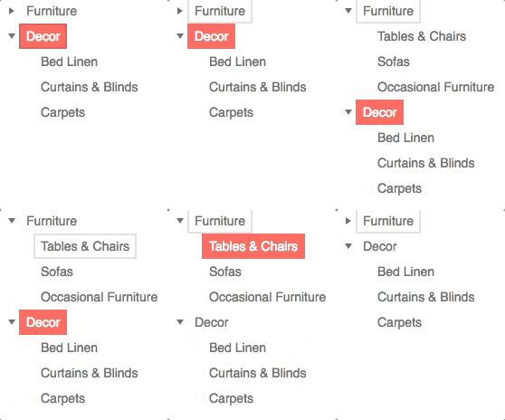
TreeView

Treeview

Figure 1: New Angular TreeView component in action!

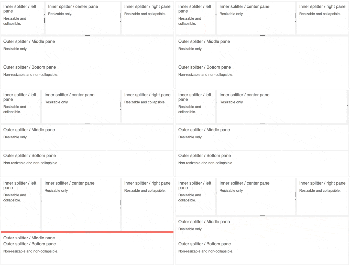
Splitter

Splitter

Figure 2: Adjusting, collapsing and expanding sections of the Splitter

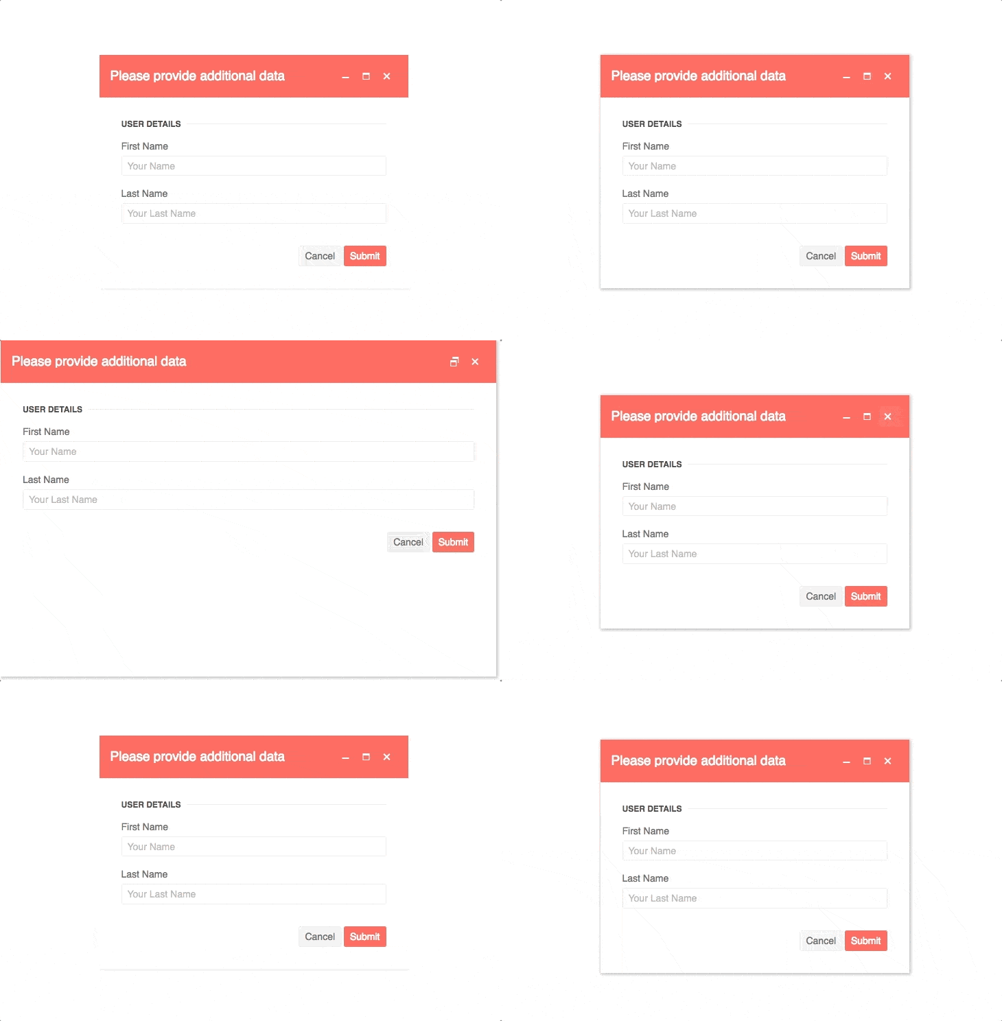
Window


Window

Figure 3: Minimize, maximize, close and open a Window component

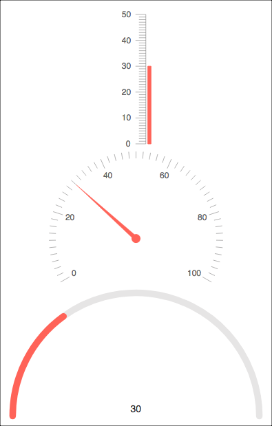
Gauges

Guages 

Figure 4: Kendo UI for Angular Gauges in action

Grid

We also added a bunch of new functionality to our Grid:

Resizing

Figure 5: Resizing columns in a Kendo UI Grid

Reordering

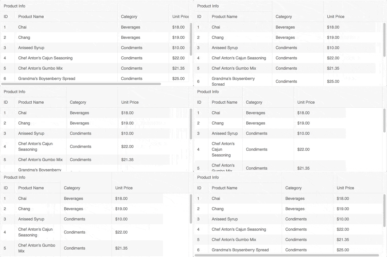
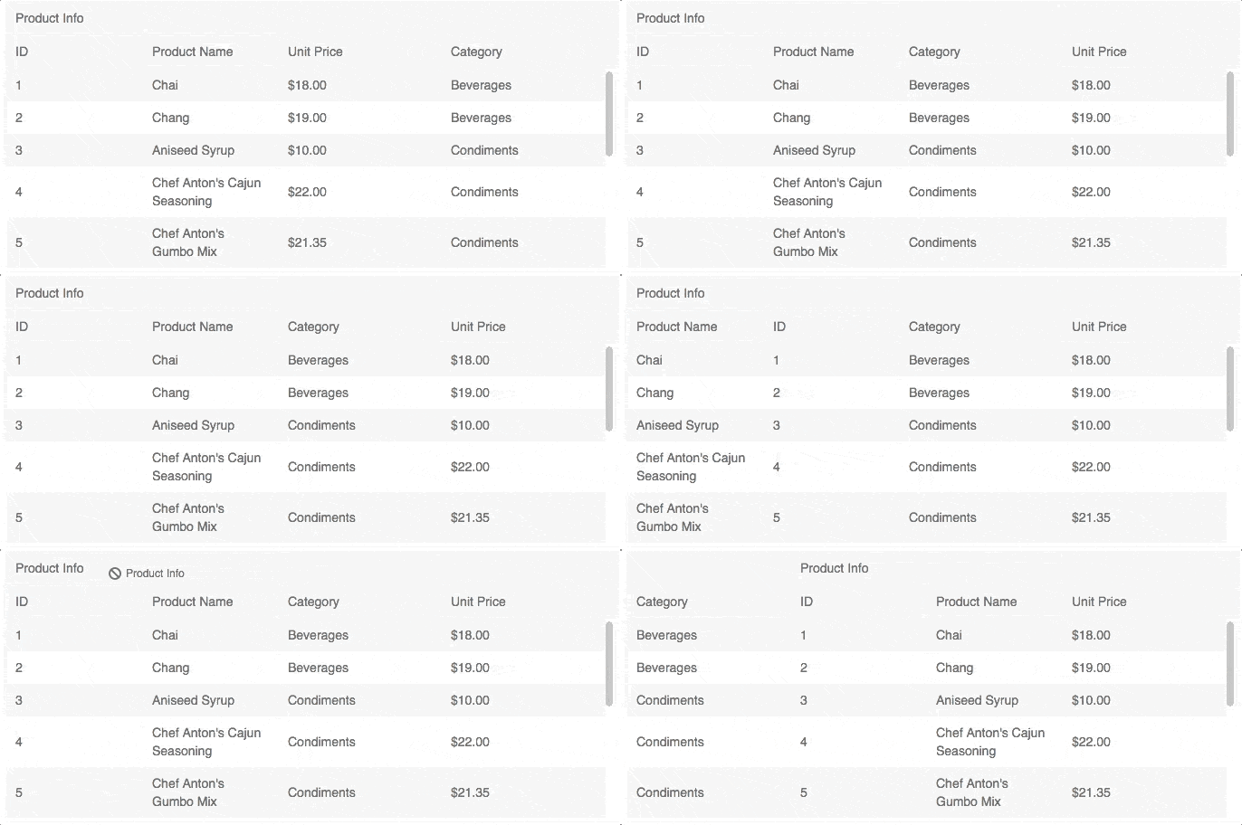
Figure 6: Re-ordering single column and multi-header columns in the Grid

Filtering

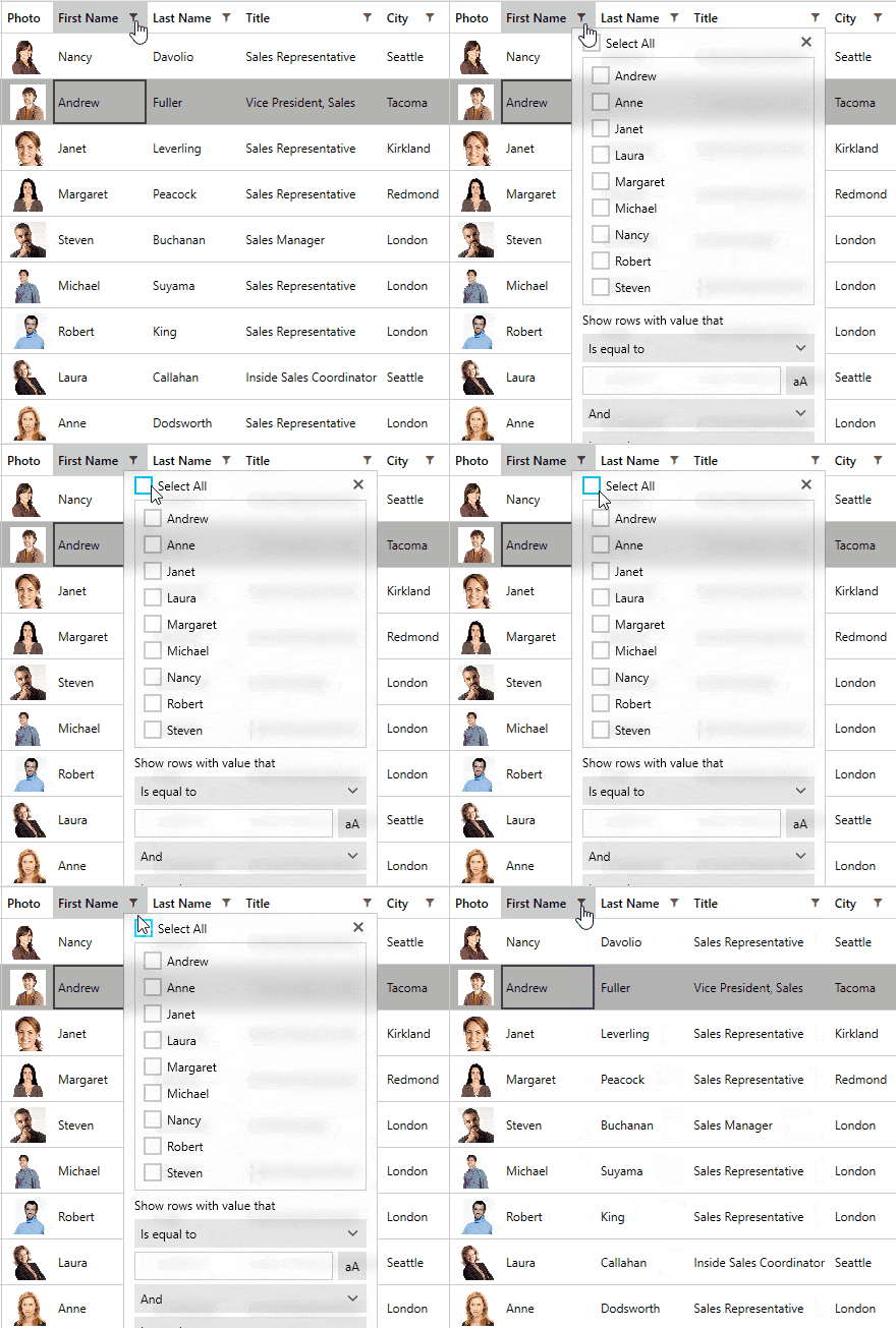
Figure 7: The new filter menu of the Kendo UI Grid 

Full Accessibility with Keyboard Navigation

The Grid now follows Section 508, WCAG 2.0, and WAI-ARIA standards which includes keyboard navigation – making the Grid a perfect fit for any scenario where accessibility is a concern.

There are also a lot of other fixes and functionalities added throughout the other Angular packages of course, so these are just a couple of the bigger items.

Updates to jQuery and UI for ASP.NET MVC

The core Kendo UI library, and by extension our UI for ASP.NET MVC, UI for ASP.NET Core, wrappers for React, and wrappers for Vue, have all been a part of a huge bug-squashing effort that makes R1 2018 one of the most stable releases to date. Since the last release we have closed over 250 issues across our public and internal issue trackers, closing over 30% more issues than were logged during the last few months.

With this release we also took a step to get closer to full OData v4 compliance. We've already supported OData for quite some time, but there are a few items that are missing to make us fully compliant with v4 of the protocol. With this release we have introduced batch processing to the DataSource (responsible for data communication in Grids etc.) and we will continue to provide more support in the coming months.

Finally we also took out the ButtonGroup from the list of hybrid-specific UI components and added the widget to the regular Kendo UI component list, removing the need to call from the mobile namespace and adding this component in all your responsive desktop web applications.

Button Group

Figure 8: The ButtonGroup no longer specific to the hybrid framework

Vue Components now Fully Cover all of Kendo UI

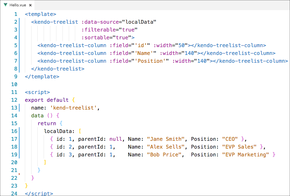
Vue.js developers rejoice: all Kendo UI components are now available to use in your Vue applications! Are you already using Kendo UI and looking to pick up Vue? We've got you covered. Are you a Vue developer looking to pick up a set of gorgeous UI components? We've definitely got you covered as well!

Treelist

Figure 9: Sample code for a TreeList in Vue.js

Beyond adding coverage for all of our components, we also wanted to make our Vue integration that much better. As a part of this, and based on feedback from current Vue developers, we now officially support using Vue.js templates along with our components! This was a big piece of feedback from people that picked up our initial version of Vue support and I'm very happy to see it be a part of the R1 2018 release.

Tag Helpers for all with UI for ASP.NET Core

ASP.NET Core continues to gain traction with traditional .NET developers and new developers alike. While many enjoy working with ASP.NET Core as the backend for their applications and have Angular, React, Vue, or another framework on the front-end, there are plenty of people looking to work with the new style of developing UI in ASP.NET Core: Tag Helpers. Without diving into what Tag Helpers are (the documentation I just linked should help), we can think of them as HTML-like way to work with Razor files (versus the fluent API of HtmlHelpers in ASP.NET MVC).

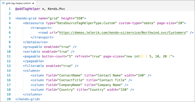
With R1 2018 I'm proud to announce that we added over 15 new Tag Helpers to our ever-expanding list, including everyone's favorite: the Grid. This component is also served by the DataSource Tag Helper that we are introducing with this release. This has been highly requested by ASP.NET Core developers and I hope you're as pumped as I am!

Tag Helper

Figure 10: Sample Tag Helper code for the UI for ASP.NET Core Grid

So, if you're an ASP.NET Core developer, or are looking to be, I highly recommend checking out these new Tag Helpers! For more information you can sign up for our Telerik release webinar that will cover all the ASP.NET goodies, or refer to our UI for ASP.NET Core overview page.

Want to See this in Action?

If you want to see all of these highlights, plus more, then I recommend signing up for our upcoming Kendo UI webinar on February 1st, at 11 AM EST. The Kendo UI Dev Rel team and myself will be taking everyone through the new Kendo UI release so don't miss out on all that fun! Seats are limited so be sure to sign up soon to reserve your spot!

Save Your Spot

Got Feedback?

As always, I want to hear any and all feedback you may ave around the release! Loving a new component? Missing a component or feature? Feel free to provide any and all feedback in the comments below! I'll also post the links to all of our public feedback portals in UserVoice so you can submit your ideas for future releases there:

JustMock R1 2018 is Live, Featuring Web-Based Builds and More

$
0
0

JustMock now includes Web-Based builds, plus up to date support of all popular code coverage and continuous integration tools.

JustMock R1 2018 has arrived, featuring Web-Builds for TFS2015, TFS2017 and TFS2018, as well as support for the latest versions of the code coverage and continuous integration tools.

Web-Based Builds

We gave you an early taste of this in the sneak peek blog post, and it's now here. The R1 2018 release brings Web-Based builds for TFS2015+ to JustMock. For the purpose, we introduced a VSTest build task that executed tests mocked with JustMock on your build machine.

1. Web based builds

Code Coverage Tools Integration

Another improvement we wanted to share is that with R1 2018 of Telerik JustMock, we ensured compatibility with the latest versions of the following code coverage tools: DotCover 2017.3.1 and NUnit 3.9.0, in addition to the already supported NCover, OpenCover, NDepend and Visual Studio 2017 Code Coverage.

2. coverage

Learn More at the Webinar

For a full review of everything that's coming for all Telerik tools in the latest release, don't forget to sign up for the Telerik R1 2018 Release Webinar on January 30th at 11:00 am ET.

Save My Seat

Get the Latest JustMock

Tune up your mocking environments and get the latest version of JustMock here.

Download Telerik JustMock

Please reach out with comments or suggestions you may have through the JustMock feedback portal.

Telerik UI for WinForms: Barcodes, Schedule Search & Fluent Theme

$
0
0

The R1 2018 release brings the highly requested RadBarcode component, convenient searching in RadScheduler, and the latest UI design for your WinForms applications with the new Fluent inspired theme.

RadBarcode

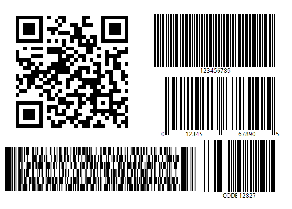
We already spilled the beans on this one, but it is one you have been asking consistently for so it deserves its spotlight here. RadBarcode allows you to generate and display a number of popular and some industry-specific symbologies like QR, PDF417, IntelligentMail, Code 25, Code 93, UPCA and more. Barcodes are highly utilized in industries such as retail, manufacturing, postage & shipping, healthcare, as well as governmental and administration facilities. It is a great addition to our toolset and a valuable weapon to have in one’s arsenal when he or she embarks on a new quest to conquer the next project. 

barcodes

Fluent Theme

Whether you like to keep up with the ever-changing landscape of modern UI or not, maybe you just love the new design paradigm Microsoft introduced, Fluent. If your internal aesthete does not quite get along with previous designs, or you're looking for a fresh start, we are here to lend you a helping hand. Our Fluent Inspired Theme will make your application fit right in among the banner apps of Microsoft’s Fluent design language. This theme brings the cutting edge in UI/UX to the trusted and dependable WinForms technology.

FluentGrid

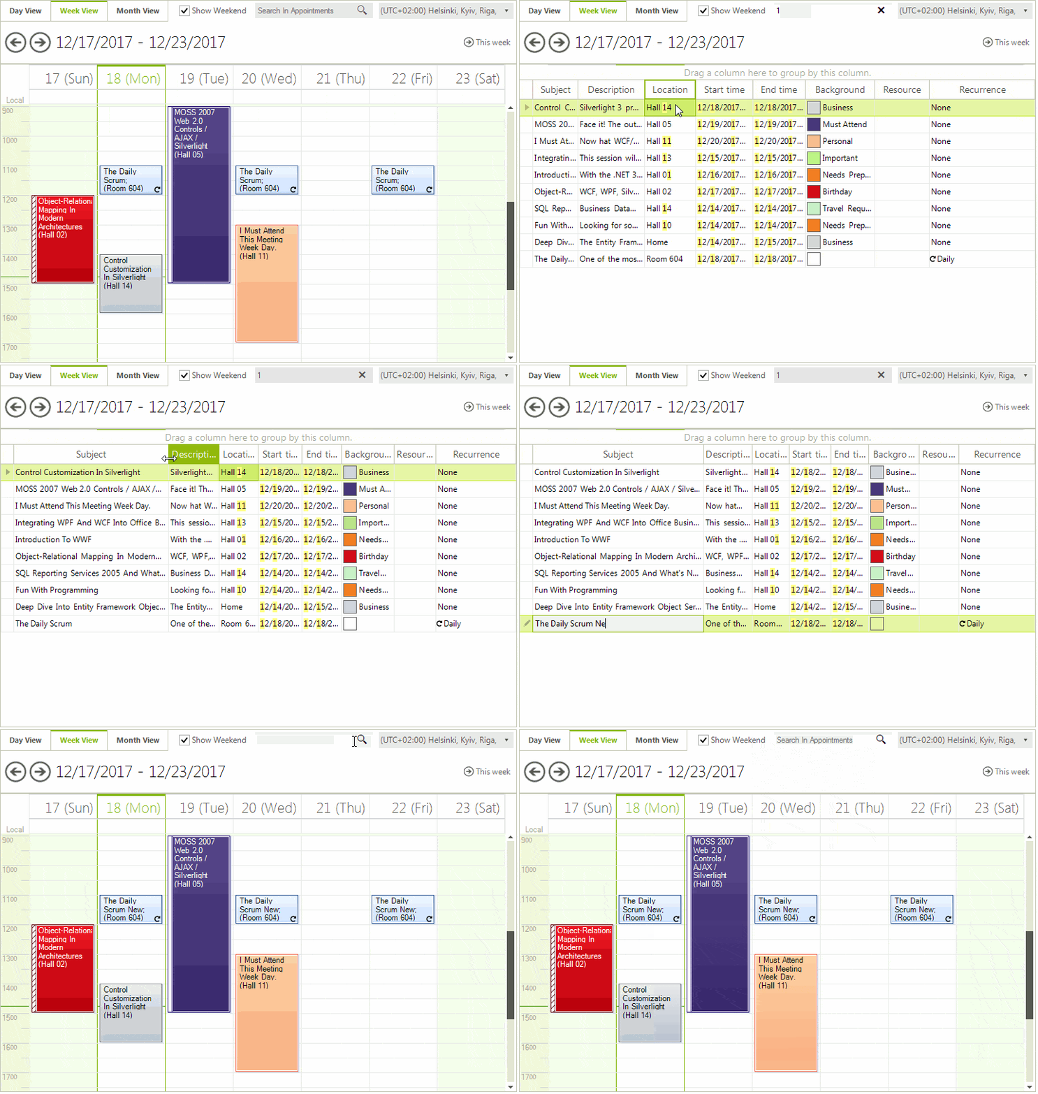
Search in RadScheduler

You have probably run into similar functionality in your daily exchanges with MS Outlook. Time is our most valuable asset, and in the component tasked with assigning this precious asset to the right objectives, the time-saving search feature is a perfect fit. When appointments in RadScheduler start growing in number, this will help one avoid forgetting key details—like which exact Thursday they had planned to start their personal transformation to release themselves on the road to joy and happiness.

SchedulerSearch

RadMap

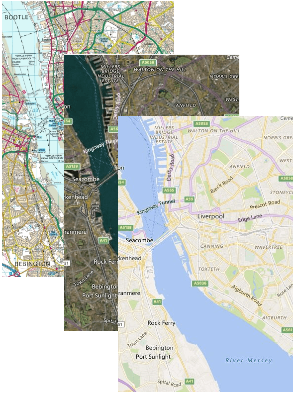
We have added three new imagery sets for the BING Maps REST service provider. The first one is the Ordnance Survey which encompasses the isle of Great Britain. The other two are “Aerial with labels on demand” and “Road on demand.” Here the “on demand” part denotes that these use the dynamic tile service and therefore new information and changes appear on them more quickly.

MapOSARODIS2

Infinite Variations of the Meterial Theme

The Material design language stays mostly in the shadows and only uses two colors. This simplicity inspired us to create a tool that will allow anyone to generate a Material theme with the primary and accent colors of their choice. Thus, opening the possibility of an infinite amount of variations of Material themes. Here is an example of an Material theme with Amber as primary and Indigo as secondary colors.

MaterialAmberIndigo

And More!

RadChartView has two new palettes to compliment your Material of Fluent themed application, RadPdfViewer now supports Encryption Algorithm 4, links in RadGanttView can be edited and deleted, there is greater control over the process of correcting errors with RadSpellChecker and the list goes on. For the full list you can go to our Release History page.

Don't forget to check out everything coming out across the Telerik tools in our upcoming release webinar on January 30th at 11am ET, and feel free to share any feedback here in the comments.

What's New in R1 2018 for UI for ASP.NET MVC & UI for ASP.NET Core

$
0
0

Advanced Tag Helpers, improved data connectivity and more in one of our most stable releases ever. See what's new in Telerik UI for ASP.NET MVC and UI for ASP.NET Core.

It's a very exciting time for ASP.NET developers right now. With so many options out there to create applications, developers really have their pick of the litter. Well, today I can add even more greatness to the tool belt that ASP.NET developers have at their disposal! With R1 2018 we have introduced improvements across the board for both of our UI libraries for ASP.NET, and we're also introducing Tag Helpers for some of our most popular components, including the Grid.

Let's jump in and see what is new in UI for ASP.NET MVC and UI for ASP.NET Core!

Updates to the Central Library

As a part of our development efforts for R1 2018 we decided to do some house keeping and focus on making R1 one of the most stable releases we've ever had. As a part of this effort we have closed over 250 issues across our public and internal issue trackers. This means we have closed over 30% more issues than were logged during the last few months. This took a big chunk out of our existing backlog of bugs and various fixes that needed to be done.

We also are now one step closer to full OData v4 compliance. The OData protocol has been supported for a while, in fact it was one of the first types we added for the DataSource (what gives the Grid, Scheduler, Charts, etc. all of their data). We haven't had a chance to fully adapt to updates that happened between v3 and v4 of OData, but we have now been able to add batch processing as a part of R1. We still have some features to implement, so keep an eye out for additional improvements over the next couple of months!

Finally, we also took out the ButtonGroup from the list of hybrid-specific UI components and added the widget in to the regular Kendo UI component list, removing the need to call from the mobile namespace and adding this component in all your responsive desktop web applications.

Telerik UI for ASP.NET buttongroup 

Figure 1: ButtonGroup in Action

ASP.NET Core Tag Helpers

If you haven't already, I definitely recommend that you check out ASP.NET Core. It's a great way to .NET developers to create server-technology agnostic web applications. Windows, Linux, or even macOS can be used to create and deploy ASP.NET Core apps.

As a part of ASP.NET Core, Microsoft introduced a new way to work with Razor pages and create complex UI: Tag Helpers. At a high level, Tag Helpers provide a very HTML-like way of adding components in your applications. Being able to lay out something as advanced as a Grid, or any other UI component that we offer, in a declarative HTML way, while still giving a lot of the server-side power that ASP.NET developers are used to, is a very powerful thing.

I am very excited to announce that with R1 2018 we have added to our list of Tag Helpers and focused on some of the most popular components that we offer, including the Grid and the DataSource. Ever since we introduced Tag Helpers people have been requesting the more advanced widgets to be a part of components available in Tag Helper form and now we can say that the day is finally here! This makes Progress one of the first companies to offer more advanced components as Tag Helpers.

Take a look at some of the screenshots below to see what these Tag Helpers look like in action

Telerik UI for ASP.NET Core Grid Tag Helper

Figure 2: Sample usage of the Grid Tag Helper

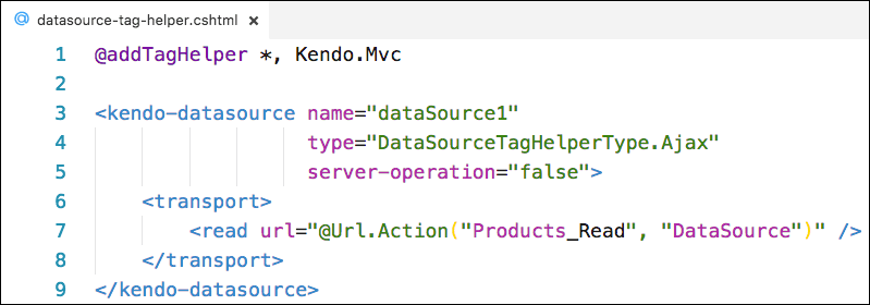
Telerik UI for ASP.NET Core DataSource Tag Helper

 Figure 3: DataSource Tag Helper

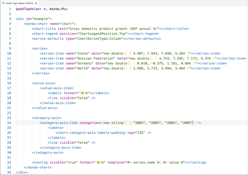
Telerik UI for ASP.NET Core Chart Tag Helper

Figure 4: Sample Bar Chart Tag Helper

Learn More

There's a ton happening with this release beyond what I just covered, so you should take a look at our various resources to see just how you can start using all of these updates in your applications today, including our upcoming release webinar on January 30th at 11am ET. I'll leave you with two links to help kick things off - happy coding!

Try UI for ASP.NET MVC

Try UI for ASP.NET Core

Better Accessibility and More in UI for ASP.NET AJAX R1 2018

$
0
0

We've greatly improved our accessibility and browser support in the latest release. Learn what's new in Telerik UI for ASP.NET AJAX.

In the midst of all of this R1 2018 release madness (so much content, so little time!) I wanted to take the time to go a little bit more in-depth on what we've done for Telerik UI for ASP.NET AJAX in this release. Specifically I want to address the updates that we did around accessibility, to ensure that our developers can create the most accessible pages possible without sacrificing user experience or functionality.

Riding the WAVE

To give you an idea of the measuring stick we used here, we specifically targeted passing the WAVE test with all of our components. If you're unfamiliar with WAVE, it's a web accessibility tool that gives us developers some sort of tool to determine accessibility. It was developed by the folks over at WebAIM and is a great tool to do sanity checks on the accessibility (a11y) of your applications. It does this with the Chrome and Firefox extensions offered on the WAVE site.

As mentioned on the help page of WAVE, the tool tries its best at checking compliance issues found within Section 508 and the WCAG 2.0 guidelines. Since UI for ASP.NET AJAX supports these two standards WAVE provides us with a good tool to check our compliance.

By the way, when I say that WAVE does its best I want to note a quick caveat: no automated tool can guarantee accessibility, only the human eye can help with this. So, while using WAVE is a great start you will eventually need to implement some human checks and balances.

Improving our WAVE Report

Coming off of our previous release we took a look at reported accessibility issues and where we stood with our support for WCAG 2.0 and Section 508. We realized that we could improve our accessibility compliance with a few of our most popular components (and some not-so-popular) to improve our WAVE report. Specifically we managed to improve:

  • RadMenu
  • DatePicker
  • Pageview
  • Spreadsheet
  • MasterTableView

I should make a special note here that all of our other UI components not listed here are already compliant, just in case I wasn't clear enough .

Thanks to these updates, with R1 2018 UI for ASP.NET AJAX is our most accessible release yet!

Browser Support

Between any one of our three yearly releases there's bound to be some updates to the major browsers that we support. As a part of this we discovered quite a few regression bugs that popped up across Chrome, Opera, and Edge. Making sure that our developers can feel comfortable being on the latest and greatest, we pushed to ensure that we took care of these regressions and improved our support for these browsers.

Tackling Other Important Bugs

Outside of the above we also tackled over 30 major issues that have been logged with UI for ASP.NET AJAX over the years. We also took the time to look inward and improve some of our processes and internal tooling to help ensure that we can serve up fixes and updates even quicker than before. Additionally, while you may not notice, we updated some of our components and their themes to improve the overall appearance of the components.

Learn More and Share Your Feedback

To learn more about everything that's new in UI for ASP.NET AJAX and all the other Telerik tools, grab a seat in our upcoming release webinar.

Save My Seat

We want to know what you think about these upgrades and whether there's anything we missed - be sure to let us know in the Feedback Portal or right in the comments below.

Telerik UI for WPF R1 2018: Fluent Theme, PivotGrid, FileDialogs & More

$
0
0

Happy New Year and Happy New Release of Telerik UI for WPF and Telerik UI for Silverlight. The first release for 2018 is packed with new stuff – beautiful Fluent Theme, many new features for RadFileDialogs, RadPivotGrid editing functionality and more.

Fluent Theme  

Last year at Build, Microsoft announced the Fluent Design System with a promise to bring the user interaction to another level by focusing on light, motion, material and scale elements. Today I’m happy to announce we are releasing our Fluent Inspired Theme for WPF, which will help you deliver a truly modern look to your desktop application and fit in the contemporary appearance of the Windows operating system! We prepared predefined Dark and Light color variations to satisfy every taste. And if this is not enough, you can easily customize all the colors to achieve the desired appearance. See the theme in action in our WPF ColorThemeGenerator app, and don’t forget to play with the current palette colors .

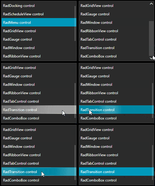
You can enjoy the beauty of the new theme on the following gif animations:

RadListBox

ListBox

RadButton


Button

RadGridView

GridView

RadWindow

Window

We are currently working on a blog post revealing all the features of the theme, so stay tuned.

FileDialogs

File Dialogs

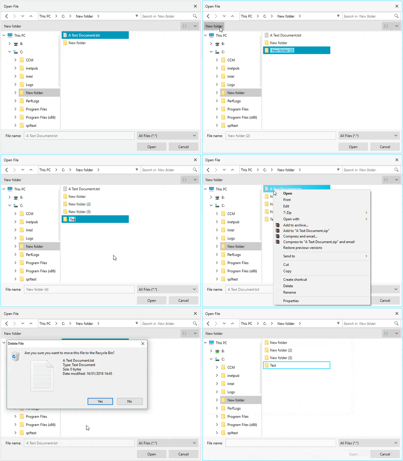
Our latest addition, the FileDialogs, are getting better and better. Since our previous release when we introduced the initial version of the dialogs, we have received a lot feedback through the forums and the support system. I want to say “THANK YOU” to everybody who shared their thoughts and feedback, we highly appreciate all of your input and for this release we considered as much as possible of it. I hope you will love the result. Of course, if there is some other functionality you would like see, please let us know. Here is list of the major features are releasing:

  • New Folder - easily create a new folder in the current directory by using the built-in button.
  • File/Folder Rename– edit the names of the files/folders in each view by pressing F2, using “slow” double click or the built-in context menu.
  • Context Menu– take advantage of the well-known Windows Explorer context menu.
  • DereferenceLinks– indicate whether to use the actual file location or the location of the shortcut file.
  • ReadOnly CheckBox– mark the file to be opened as readonly.
  • Restore Directory– reopen the dialog at the last used folder.
  • Filtering– indicate which file types should be visible in the dialog.
  • DirectoryRequesting event– allows you to filter the directories.
  • File System Watcher – full synchronization between the file system and the dialogs presentation.

PivotGrid

PivotGrid Editing

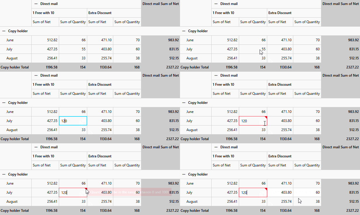
  • Editing - the control now allows UI editing of the cells values and raises an event allowing custom recalculation of the data source depending of the new value. This feature provides option to implement custom data validation.
  • DistinctValuesLimit – exposed property for the Olap DataProvider (Adomd & Xmla) in order to allow showing more than 1000 distinct values.

GridView

GridView - Frozen Columns

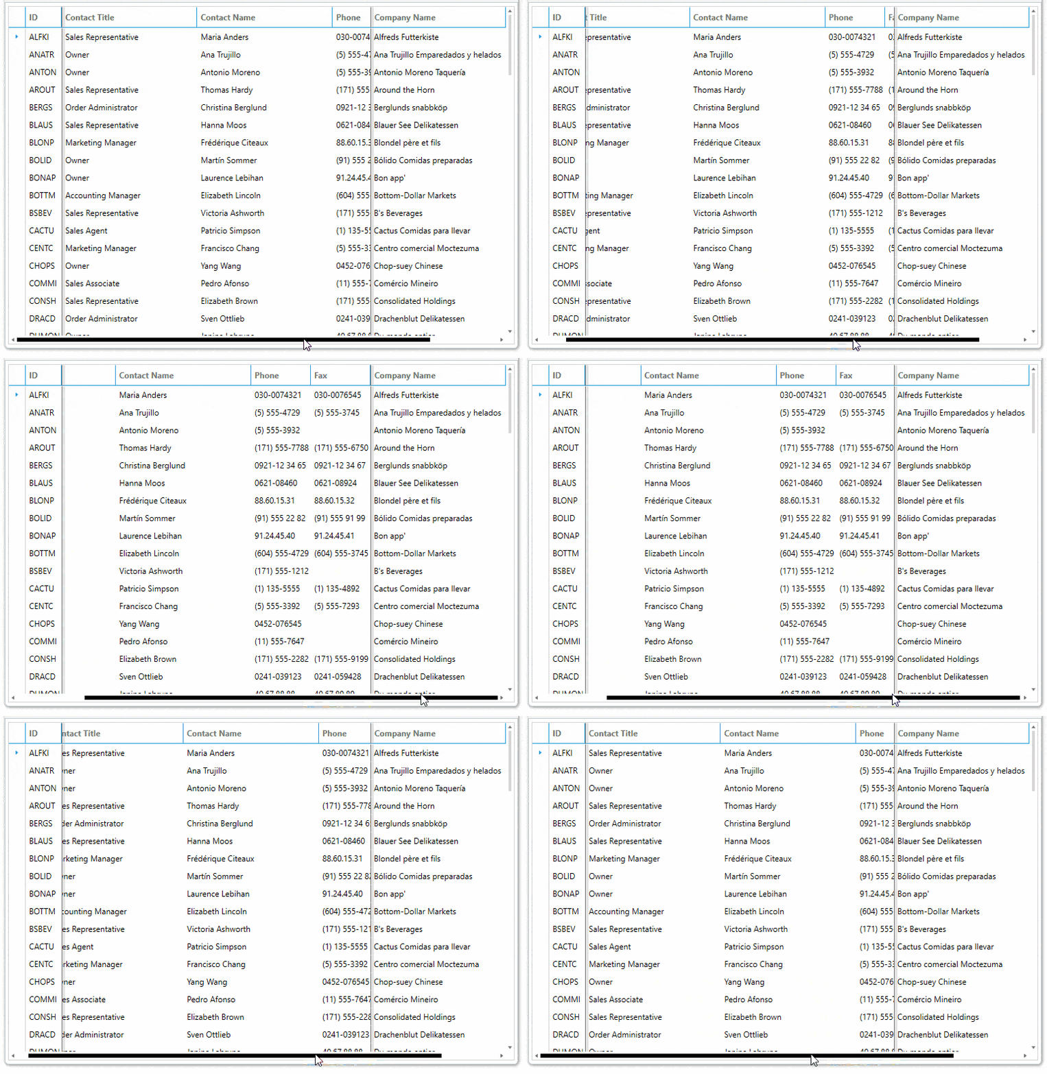
  • Right side Frozen Columns - now it is possible to freeze columns not only on the left side but on the ride side of the control as well. Using the new API you can easily define the number of the columns on the left and right side simultaneously, or the user can drag the frozen columns splitter and freeze as many columns as desired.
  • Searching in hidden columns – using the new CanUserSearchInHiddenColumns you can allow searching in the hidden columns as well.

New Controls - RadPdfViewerToolbar & RadSpreadsheetRibbon

I am happy to announce that with this release we will be introducing two new components in the suite - RadPdfViewerToolbar and RadSpreadsheetRibbon. These are ready to use, accompanying components for the RadPdfViewer and RadSpreadsheet controls, allowing your end users to work with these controls.

You no longer have to build these on your own, and best of all, every new feature that we add going forward will be brought to you with the new versions of these components. All you have to do is to upgrade your controls version.

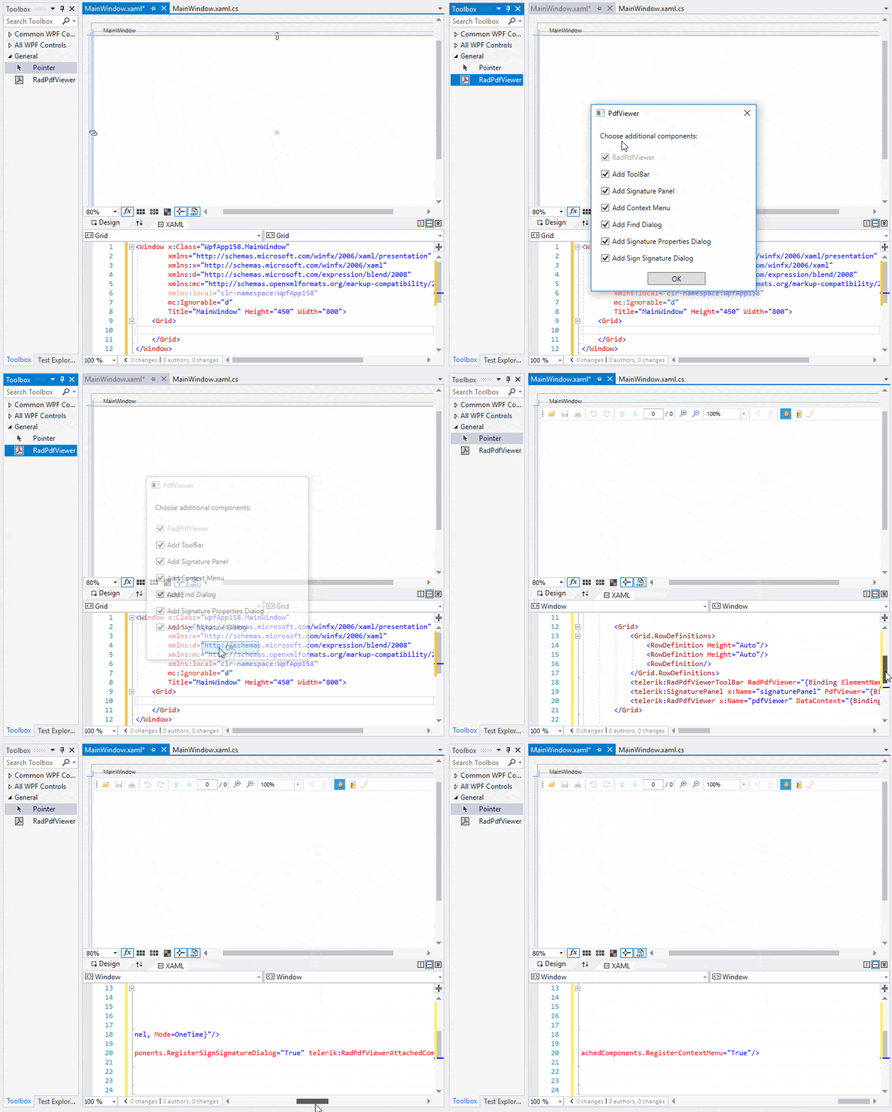
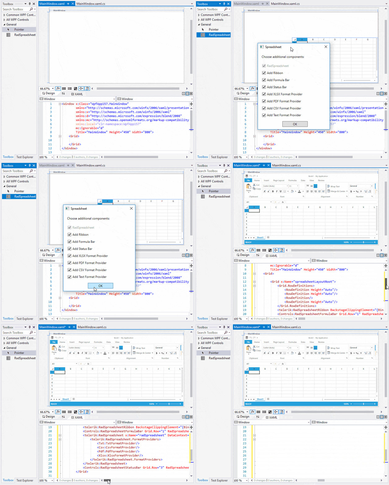
We even took a step further by presenting you with convenient dialogs when you drag RadPdfViewer or RadSpreadsheet to the design surface, so you get to pick which accompanying controls (toolbar/ribbon, status bar, formula bat, etc) you want to add with just a few clicks. The experience for RadPdfViewer and RadSpreadsheet is wrapped up in these two gifs:

RadPdfViewer- design time

RadSpreadsheet- design time

Other New Features

  • Map – new modes in the BingRestMapProvider. Added five new modes in the BingRestMapProvider – CanvasDark, CanvasLight, CanvasGray, RoadOnDemand and AerialOnDemand. You can see them in action in our WPF Demos application – just navigate to the Bing Dynamic Imager Sets example.
  • PdfViewer – the control now supports the most popular document encryption standards, including RC4 (40/128-bit) and AES (128-bit). If you got the infamous "The encryption method with code 4 is not supported." message in the past, there is a good chance your issue is resolved now.
  • DateTimePicker – implement functionality that opens the drop down on focus.
  • ComboBox – TextSearch improvement. Now when pressing the same letter multiple times, the control navigates between all the items starting the same letter.

WPF Demo App on the Windows Store

Just a reminder that since the previous official release, the WPF Demo app has been available from the Windows Store as well. Please don't forget rate it.

Install WPF Demos from Windows Store

Share Your Feedback

We would love to hear from you, so please drop a comment below sharing your thoughts about Telerik UI for WPF. You could also visit our Feedback portals about UI for WPF/Silverlight and Document Processing Libraries and let us know if you have any suggestions or if you need any particular features/controls.

Make sure to try the latest:

UI for WPFUI for Silverlight

Learn More at the Webinar

For an in-depth review of all the new stuff coming with the release across desktop, web and mobile, join us on the 30th of January for the Telerik R1 2018 Release Webinar.

Save Your Seat


Toolbox, DataGrid, Numeric and more in R1 2018 of UI for Xamarin

$
0
0

The first major release of 2018 for the Progress Telerik developer tools is here, and it’s jam packed with new productivity features and controls.

Toolbox

With the new version of Telerik UI for Xamarin you can start your projects even faster, and we make you super-productive when creating Xamarin apps in Visual Studio with the new toolbox window. Simply drag the control from the toolbox to your Xaml page and it will add you a control ready to use – just what you are familiar with in all other traditional Microsoft development platforms.

toolbox

DataGrid is Now Official

We’ve applied all the 15 years of experience that we have creating data grids for Microsoft development platforms, combined it with past five years in developing award winning mobile tooling and frameworks, and are now able to provide you an outstanding data grid for Xamarin.

DataGrid is now official, speeding up your development and allowing you to set up data intensive scenarios, both for phones and tablets. It enables you to use its dynamic binding to Enumerable.

Data Operations UI

DataGrid uses a parallel engine to perform its data operations such as filtering, grouping and sorting. Up until now you would need to build and set the appropriate data descriptors from code.

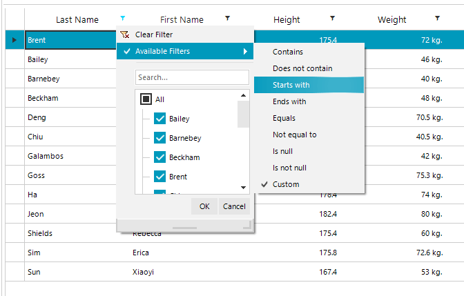
DataGrid now allows you to use its UI to apply sorting, filtering and grouping dynamically. It generates the UI based on the column type – for example, the filtering of dates, numeric and string data can be done directly from the UI. It also allows you to build your own filtering control UI for any specific data type. In addition, the user can choose the order and the number of visible columns using our column chooser.

datagrid - data operations

Customizations

RadDataGrid offers fine-grained customization options – from the header, content, data indicators and gridlines to row and cell styles and alternation. It also allows the user to use style and template selectors to achieve the desired scenario.

Editing

Whenever you need cell editing functionality, DataGrid has the solution. Each column automatically defines its own editor based on the type of data used.

DataGrid - edit

Load on Demand

Loading a large data set on a mobile device has its challenges. One of the most popular approaches is using incremental data loading as additional items need to be visualized, or on demand by user. Telerik UI for Xamarin DataGrid offers the ability to load the data items using automatic loading once you scrolled to the last available record or by displaying a customizable button which will initiate loading more data items.

Grid - load on demand

Localization

DataGrid is fully localizable, giving you control over localizing the strings in filtering, load on demand and data UI.

New Control: Numeric Input

Almost every input scenario requires number entering. To achieve it easily we have developed numeric input covering these cases in all of the target platforms – iOS, Android and UWP. In addition, RadNumericInput gives you control over the appearance of things like the foreground, button content and borders, as well as the layout of the control (e.g. setting the position of the +/- buttons). It also supports defining and using themes with it.

Numeric

New Control: Button

In the R1 release we ship our button, which provides a richer experience than the default one. RadButton enables you to control border thickness and location as well as add an image as its background. You can also control the border radius or use an icon to achieve come cool scenarios. Finally, it is fully themable with our theming mechanism.

button

New Control: Entry

Finally, we bring you an entry component that features control over the background, text color, font size/location and keyboard used, plus the ability to control its border and its corner radius. Of course, it also supports our Theming mechanism.

entry 

Your Feedback is Welcome

From a developer to a developer – I would really appreciate if you take it out for a spin and let me know your thoughts. If you are an existing Telerik customer with an active license, go ahead and download the latest bits from your account for free. Or, if you are just giving us another look, please get the latest version– remember all our trials are fully functional and fully supported. We look forward for your feedback.

All of these now can be seen in our new Demo app! And if you like it we made it easily to reuse any part of the code as we shared the source to GitHub.

Try it Out and Learn More at the Webinar

If you are new to our tools or have only tried some, make sure you download the trial and take them for a spin. You can either download just the Telerik UI for Xamarin tools or download a trial of our entire set of .NET and JavaScript tools with the DevCraft bundle. And make sure you register for our Telerik release webinar on Jan 30 at 11am ET. 

Register: Telerik Release Webinar

What's New in Telerik Reporting and Report Server R1 2018

$
0
0

Standalone Report Designer Localization, DataDirect ODBC Drivers, WinForms and WPF Viewers Accessibility, Report Server Object Data Source, and last but not least many bug fixes are included in the new release.

The Reporting and Report Server R1 2018 releases are now live and we can't wait to share with you all the goodies we packed into them.

Standalone Report Designer Localization

Application internationalization involves improving the experience and decreasing the learning curve for all non-English speakers. To enable Report Designer localization, we now provide resource files containing the string resources and keys for all UI areas such as ribbon items, wizards, editors, enumeration descriptions, and properties.

localization

DataDirect ODBC Drivers

R1 2018 simplifies the data connectivity process by providing a Telerik Reporting exclusive bundle of the Progress DataDirect ODBC drivers free of charge, allowing the developers to connect their reports to most of the major databases used today. The DataDirect drivers are recognized as a market leading product, providing high performance and rich data sources coverage.

datadirect drivers installer

WinForms and WPF Viewers Accessibility

Telerik Reporting aims to provide a reporting solution accessible to a wider user audience. This includes users with motor control restrictions and ones working with assistive technologies. In this release, we implemented the recommended practices in Section 508 of the Rehabilitation Act and added accessibility features to our WinForms and WPF report viewers.

Object Data Source in Report Server

A common application design practice is to separate the presentation layer from business logic and encapsulate the business logic inside business objects. The Report Server can not only be integrated into such applications but now it can also use their business objects to provide data for reports. Custom .NET assemblies containing dedicated classes and data-retrieval methods can be added to the Report Server and the business objects data will be available during design-time and run-time of reports.

ObjectDataSource

Report Server Online Demos 

Try our new Report Server online demo. Preview and export sample reports, view scheduled tasks and alerts and get familiar with the user interface. 

Eliminated Bugs

For the full list of all the bug fixes, check the release notes for Telerik Reporting and Telerik Report Server.

Try it Out and Share Feedback

We want to know what you think—you can download a free trial today and share your thoughts in our Feedback Portal, or right in the comments below.

And don't forget, you can learn more about the latest upgrades for Reporting, Report Server and all the Telerik tools at our R1 2018 release webinar on January 30th.

DevReach 2017: Using Styling and Functionality in Kendo UI with Angular

$
0
0

DevReach is Telerik's premier developer conference in Central and Eastern Europe. In 2017, it featured 30+ presentations delivered by 20 world-renowned speakers. These presentations were recorded and we're pleased to make them available online for everyone. The playlist for these videos is available on Youtube: DevReach Conference 2017.

Here's the recording of Chris Noring's presentation entitled, "Using Kendo UI with Angular":

About the Presentation

There are many alternatives to style your components today like Bootstrap, Angular Material even Ionic has its own style. Kendo UI components offer something more. It offers styling as well as functionality that will save you as a developer a lot of time. Working with them is even easier. Let’s showcase what these controls are and what functionality they have that could really impress your next customer.

About the Speaker

Chris is a Google Developer Expert and Telerik Developer Expert. He runs the London JavaScript meetup, is a public speaker and author of the book Rxjs Ultimate found under Angular.io/resources

Resources and Further Reading

3 Performance Tips to Speed Up Your React Applications

$
0
0

There are a number of ways to squeeze more performance out of a React app with simple changes. This blog covers three easy steps that help you make sure your React app is as efficient as possible.

When building modern web applications, app performance is critically important. As developers, we strive to ship code that not only delivers on customer expectations and is bug-free, but also performs well. After all, poor performance is a bug in itself, and can quickly lead to a failed app.

And while we're fortunate to have a bevy of great front-end frameworks and libraries, sometimes these libraries come with a cost to performance. Thankfully, in nearly every case, there are easy things that we can do in our apps that ensure that our frameworks don't slow down our experiences.

If you're building React apps, here are three simple things you can do to make sure that your apps run as fast as possible once in production.

1 - Use babel-preset-env to Keep Your Cross-Platform JS Code Compact

One of the things that draws many developers to React is the ability to use modern JavaScript features before they are implemented in all browsers and runtimes. This ability comes from React's use of the Babel compiler. Babel compiles your code by taking your React source, which uses many ES6/2015+ features, and producing a cross-browser-compatible equivalent.

Babel does this via plugins you specify, or in the case of React, by default (assuming you've created a new app with create-react-app), using a preset, or collection of plugins.

Until recently, React used the es2015 and react presets, by default, which covered a number of ES6/2015 features used for React apps. You could also use newer ES7 or 8 presets, if preferred.

And while this was great, the code compiled by babel was targeted at the oldest supported browser version, meaning that all browsers were getting the same code, no matter what versions your app needed to support.

With babel-preset-env, developers now have control over how babel compiles their code. After installation, you can activate the env preset via a simple entry in your package.json. For instance, if my app needs to support the last two versions of all major browsers and Safari 7 and up, I can specify that, like so:

{
  "presets": [
    ["env", {
      "targets": {
        "browsers": ["last 2 versions", "safari >= 7"]
      }
    }]
  ]
}

This powerful configuration means that you can target babel to the browsers you know your app needs to support, and get the smallest compiled code out the other end, making your client-side downloads—and your app—faster.

Advice: Use babel-preset-env and specify the browsers and versions you need to support in your package.json file.

2 - Use Polyfill.io to Target Polyfill-Loading to Actual Browser Usage

Babel is a fantastic tool for giving us modern language features, and has played a huge role in the acceleration of JavaScript language improvements, but it's not a polyfill, meaning that it doesn't provide support for browser built-ins and features that might not be present in every browser you need to target.

If you prefer to use new built-ins and features, and you're stuck supporting an older browser, you have two options. One is to load polyfills on a case-by-case basis, either via libraries or by creating them yourself. There are a ton of great polyfills out there, and if you want to write your own, MDN usually has copy-pastable polyfill source in its docs for new features. (Here's an example for Array.prototype.fill)

Another option, and one I suggest, is to use Polyfill.io, a library that uses your visitor's User-Agent header to determine which browser they are using.

It's easy to install. You add a script tag to your root HTML doc like so:

<script src="https://cdn.polyfill.io/v2/polyfill.min.js"></script>

And you're off! Once in place, Polyfill.io will examine the User-Agent string of every browser user that visits your app, and deterministically load only the polyfills needed. You can even use the API to only load polyfills you need.

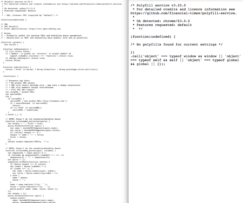
If you want to verify how cool this is, paste the CDN Url into two different browsers (like Chrome and Safari or IE/Edge). The script file will load and you'll quickly see a difference. For example, here's what Polyfill.io loads for Safari 11 (on the left), versus Chrome 63 (on the right).

3 Performance Tips to Speed Up Your React Applications 


Advice
: Drop the Polyfill.io script into your main app HTML document and enjoy those new browser built-ins.

3 - Perform Tree-Shaking with Webpack 2+

The first two tips are centered around keeping your babel compiled code and polyfills small and compact. This last one is about ensuring that the code you write doesn't accidentally ship dependencies you don't need. We can do this via something called tree-shaking.

Tree-shaking is a term often used in JavaScript to refer to dead-code elimination. When automated, tree-shaking scans your JavaScript code for dependencies you don't need, and removes them automatically.

This comes in especially handy when you use 3rd party libraries like Lodash, Bootstrap and the like, some of which can be huge. Tree-shaking allows you to use features from these, and removes the dead code you’re not using in your app.

The good news is that, for React apps, tree-shaking is easy, and requires you to do three things:

  1. Use ES2015 module syntax (i.e. import and export) in your code
  2. Use Webpack 2, or above
  3. Use a minifier that supports tree-shaking, like UglifyJS, Rollup or Babel.

If you created your app with create-react-app you should be good to go as Webpack and Babel are configured out-of-the-box. ES2015 module syntax are also used in the boilerplate code, and you should continue to use import and export as you build out the app, for JavaScript, CSS and even media assets. If you load any of these using HTML tags, your minifier won't be able to detect or remove dead code in those files.

Further, when performing imports, especially from 3rd party libraries, make sure you import only the objects and functions you need, as opposed to the library itself. For instance, if you’re using lodash and need the Array flatten function, import it at the top of your JavaScript file directly:

// Instead of this
 
import _ from ‘lodash’
 
// Do this
 
import { flatten } from ‘lodash’

Advice: Make sure you're using ES2015 module syntax to import dependencies, along with Webpack 2 and a minifier that supports tree-shaking to ensure that you’re shipping the smallest, fastest code to browsers.

There are many ways to boost web app performance. Many times the biggest performance gains come from small, simple tweaks that reduce file sizes and speed up network calls. Using these three tips, you can ensure that your React apps and loading and running as fast as possible for all your users.

For more tips, tricks and considerations for starting a new React application, check out our "Planning a React Application" whitepaper.

Plan Your React App

How Reporting Adds Value to any UI Suite

$
0
0

A reporting solution can add value to any application in both .NET and JavaScript. Here’s a few tips on how to use one to your benefit in any business scenario.

The amount of data being generated every day continues to increase, and visualizing it all in a way that’s appealing to the eye and easy to understand is not easy. If you need to present a large amount of data to someone, there are a few ways you could try to do this. If you use a control suite you can make CRUD data input, apply some customization and theming, and even make paging virtualization. You can do all this with a certain amount of coding, along with frequent fixes and adjustments.

On the other hand, there’s an easier and more user-friendly way to generate data visualizations of virtually any type—a Reporting solution.

Beautiful Reporting

The core of a reporting engine is the declarative definition paradigm. Most programming languages define what something is and how to do something. The report definition describes what the output will look like and where the source data is coming from. This leaves the reporting engine free to decide how to generate the defined look and feel, regardless of the programming language or underlying architecture. The end result is an easy and coding-free option to create impressive reports with a data-driven report layout.

With our Reporting solution, in just a few clicks, you can do any of the following:

  • Create a desired data presentation very quickly with a WYSIWYG business user-friendly report designer
  • Apply a variety of styling possibilities without any coding—including CSS-like styling and conditional formatting based on the data input
  • Integrate reporting into your desktop or web application using dedicated Visual Studio Items templates (check out more on this topic)
  • Set up interactivity built into the report definition, improving the end-user experience—things like sorting, toggle visibility, navigate to report, bookmark or URL, plus whatever you need with custom interactivity action handlers
  • Design reports across technologies (Angular, HTML5, ASP.NET MVC, ASP.NET AJAX, WPF, WinForms, Azure Cloud) and across platforms (web, mobile and desktop)
  • Use a long list of comprehensive formats for report export (more than 20)
  • Enjoy printed media support with page settings and extensive pagination rules
  • Rely on easy integration with a huge variety of data sources (from Microsoft SQL Server, through inline CSV and business objects to ODBC data sources) and simplify all data operations like filtering, sorting and data mashing

Telerik Reporting

Telerik Reporting

If you are curious to see how Telerik Reporting can save you time and effort, you can start a free trial today.

Telerik Report Server

Telerik Report Server

Managing a vast collection of reports may be challenging, which is why we also created the Telerik Report Server solution to efficiently store, create, manage and analyze reports in a single server-side repository.  Report Server leverages the feature-rich Telerik Reporting engine and supports all must-have report server features like scheduling, data alerts, versioning, report caching, authentication with AD FS support, ready to use report server web portal with enabled white labeling and complete REST API for integration with your desktop and web applications. If you’re ready to dive right in, you can start a free trial of Report Server right now.

Get Telerik Reporting in Our Bundles 

You can get Telerik Reporting as an individual product or as a part of our bundles. We bring the best of Telerik and Kendo UI together in convenient bundles, including a wide-range of UI, reporting and productivity tools for both .NET and JavaScript technologies and support that’s got your back in every step of your project. Thanks to our intuitive APIs, alongside thousands of demos with source code availability, comprehensive documentation and a full assortment of VS templates you will get up and running with our tools in no time and fully embrace your inner Kendoka/Ninja warrior.

By leveraging the broad array of themes, skins, styling and customization options, your application will awe even the best frontend designers. Check it out!

Changing Careers to Coding

$
0
0

On this episode of Eat Sleep Code, guest Julie Torres shares her story of switching careers. Julie, banker turned developer talks about coding bootcamps and learning to code. Julie outlines what to expect in a Jr. Dev interview, and other advice covered in her new book How to Become a Web Developer: The Career Changer's Guide.

Julie Torres (@JulieTorero)

Julie Torres

Julie Torres is a former banker turned web developer, and one of the hosts of the Code Crush podcast. She got her start in Ruby on Rails, but now works mostly in React JS. She is passionate about helping career changers and underrepresented groups get into tech. Her new ebook on the subject, "How to Become a Web Developer: The Career Changer's Guide" has just been released on Amazon.

Show Notes:

Telerik R1 '18 Brings Many New Features to WPF FileDialogs

$
0
0

In the latest version of Telerik UI for WPF, we've got a lot of powerful new features and upgrades coming to the File Dialogs.

As you already know, we recently released a new version of Telerik UI for WPF.
If you still haven't tried it, now is the time to press the download button.

Download UI for WPF

When you install it, you will find a lot of great components which will empower you to build modern desktop apps. We're always working to make these components better, and recently added some powerful functionality to our File/Folder Dialogs. Let's dive into the major upgrades and additions.

Overview: New Features in UI for WPF

In their first release, Dialogs provided a modern UI and ability to chose files/folders via an API which is as close as possible to the one in MS Win32 Dialogs. The FileDialogs in Telerik UI for WPF are now more powerful and provide the option to create new folders, rename files and folders, and use the well-known windows context menu to invoke actions on the selected items.

We also listened to your feedback and added the ability to filter the available Drive/Directory structure in the navigation tree and breadcrumb. We’ve improved the keyboard support, providing directional navigation with arrow keys on selected and focused files/folders. You will also find that changes in the file system are immediately reflected in the dialogs which is done behind the scenes via a background file system watcher mechanism.

Let’s have a look at all of these features.

Key New Upgrades

  • New Folder: This button comes out of the box and will create new child folders in the current folder, just like you are used to do it in the MS Dialogs:

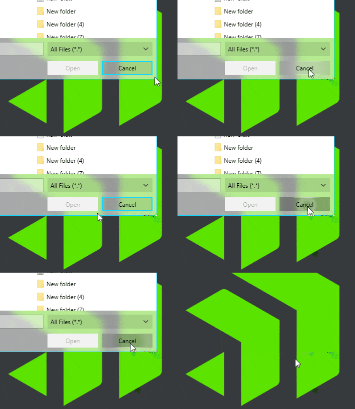
    Telerik UI for WPF—New Folder

  • Editing: This can be done either by selecting a file/folder and double clicking on the text area, or by hitting F2. The well-known MS ContextMenu can be opened by right clicking a file/folder, and the rename option is available there as well. In the gif below you can observe how changing the file type by renaming quickly updates the file icon and file extension, which is done internally by the background file system watcher. It monitors the changes in the file system and notifies the UI that update is needed: 

    Telerik UI for WPF—Editing

  • Drive/ Directory Filtering: If you need to simplify the dialog usage to only work in several Drives, you can add a few lines of code in the DirectoryRequesting event. There you can filter the Drives or Folders you don’t need displayed in the navigation tree, breadcrumb or in main pane:

    privatevoidOpenDialog_DirectoryRequesting(objectsender, DirectoryRequestingEventArgs e)
    {
        if(e.Directory.Name.StartsWith("C:\\") ||
           e.Directory.Name.StartsWith("K:\\") ||
           e.Directory.Name.StartsWith("R:\\"))
        {
            e.Cancel = true;
        }
    }

    The result is that the “C:\\”, “K:\\” and “R:\\” drives are not loaded the left navigation tree:

    Telerik UI for WPF—Drive-Directory Filtering

Other Features

  • RestoreDirectory is the new useful Boolean property which will keep the last used folder in memory, and will open it on load of the same dialog instance.
  • DereferenceLinkscomes into play in RadOpenFileDialog. When true and you select a Shortcut, the FileName of the Dialog will give you the location of the original file.
  • ShowReadOnlyand ReadOnlyChecked give your users an ability to trigger future action with read only files. On dialog close, the users can take the value of ReadOnlyChecked to perform some action.

New Kid (Theme) on the Block

I know what your BIG question is: What is this awesome new theme you saw in the gifs above? Of course, this is our brand new FLUENT theme which comes in two variations—light and dark. There will be another blog post talking more about that, so please stay tuned. 

Check Out the Latest Version and Share Your Feedback

Make sure to try the latest version of our UI for WPF suite, and explore all the new features that came with the Telerik R1 2018 Release.

Telerik UI for WPF

In order to make the File Dialogs the best they can be for their official release in May (R2’18), we would love to hear what you think, so don't be shy and please drop us a comment below to share your thoughts. You can also visit our Feedback portal for UI for WPF and let us know if you have any suggestions or if there are any particular features/controls you would like to see.

Learn More at the Webinar

For an in-depth review of all the new stuff coming with the release across desktop, web and mobile, join us on the 30th of January for the Telerik R1 2018 Release Webinar.

Save Your Seat


Telerik Reporting R1 2018 Makes Database Connectivity Even Easier

$
0
0

The latest release of Telerik Reporting includes a DataDirect ODBC Drivers bundle, making connecting your reports to databases even simpler.

Feeding data to your reports is a simple task, thanks to the many data sources available out-of-the-box in Telerik Reporting. The most used instance is the SqlDataSource, which can connect to virtually any database, if a valid ADO.NET provider is installed on the machine. In our R1 2018 release we have now gone a step further, adding a valuable feature in terms of data connectivity—now our product ships with a bundle of 30+ ODBC drivers, provided by Progress DataDirect for Telerik Reporting at no additional cost.

DataDirect drivers are well known for their great performance and efficiency, which makes them the perfect choice for data-driven applications that require integration with various databases like MySQL, Oracle, OpenEdge, MSSQL and many more.

Connecting Made Easy 

Usually the database developing companies provide connectors and data providers for their products, but the installation process is often preceded by registrations, approvals and downloads of huge bundles of software that might not be necessary. We decided to take only the important parts and squeeze it into a neat package, which is downloaded once and reused when needed. Should you connect to the production database or are just testing a quick proof-of-concept solution, the DataDirect ODBC Drivers Installer will help you connect your report to the needed data. 

Telerik Reporting Exclusive

The installed drivers are branded exclusively for Telerik Reporting and are not intended to be used by other software products. Users should simply use the ODBC drivers no differently than they would usually use ODBC drivers—to create a corresponding ODBC DSN and utilize it in the SqlDataSource Wizard. 

What’s in the Box?

The bundle can be downloaded as a separate ZIP-archive because of its substantial size. It contains a library file, which holds the drivers for x64 and x86 platforms, and two executables, which are the actual driver installers and come in two flavors—a command-line interface and a simple Windows Forms application. The executable files require administrator permissions, since the drivers might be installed in a directory that requires elevated privileges and registered in Windows Registry.

Windows Forms Installer

datadirect-drivers-installer-gui

The single-paged application provides a user-friendly interface that eases the installation/uninstallation process. The current platform (32-bit or 64-bit) is automatically determined, but the user can still change it, choose the exact driver or drivers to be installed, set the target directory and choose if the output log to be written in a file. After clicking the Install button, the application copies and registers the selected drivers, generating a verbose installation log, that can be inspected in-place or copied to clipboard for further examination.

Command Line Installer

The CLI application provides all the necessary options for installing or uninstalling the drivers and is suitable when executing a script or batch file. For a full list of the available arguments, check the documentation here. A typical set of installation command arguments would look like this:

/mode install /targetpath "C:\Program Files\Progress\Telerik Reporting ODBC Drivers" /platform x86 /drivers "SQLS,ORA" /successToken "OK"

Additional Information

The installers do not create or modify any data source names (DSN) in the ODBC Manager application, and as mentioned above, they should be manually added after installation.

The installers support partial uninstallation—i.e. a single particular driver can be removed from the registry and installation folder. However, if all the drivers are selected for uninstallation, the tool will perform a complete uninstall and remove the whole directory, if there are no other subdirectories in it. 

Share Your Feedback

We would love to hear what you think, so feel free to drop us a comment below and share your thoughts. You can also visit our Feedback portal for Reporting and let us know if you have any suggestions or if there are any particular features/controls you would like to see.

Get the Latest Telerik Reporting in our Bundles

Our DataDirect ODBC Drivers Installers are a fast and convenient way to provide database integration to your reports in a matter of minutes. The high performance and rich data source coverage make them a significant contribution to Telerik Reporting. If you would like to learn more, take a look at the new features or try it yourself for free!  

You can get Telerik Reporting as an individual product or as a part of Telerik DevCraft. We bring together a wide range of UI, reporting and productivity tools for both .NET and JavaScript technologies and support that’s got your back in every step of your project. Thanks to our intuitive APIs, alongside thousands of demos with source code availability, comprehensive documentation and a full assortment of VS templates you will get up and running with our tools in no time and fully embrace your inner Kendoka/Ninja warrior.

By leveraging the broad array of themes, skins, styling and customization options, your application will awe even the best frontend designers. Check it out!

Check Out DevCraft
Try Reporting Now

Learn More at the Webinar

For an in-depth review of all the new stuff coming with the Telerik R1 release across desktop, web and mobile, join us on the 30th of January for the Telerik R1 2018 Release Webinar.

Save Your Seat

3 Essential Tips for Managing State in React Applications

$
0
0

Learn a few quick and essential tips on working with State in a React app to help you decide which option (like out-of-the-box, Redux or MobX) is right for your environment.

If you're new to React, or are getting ready to start a new React application, you're thinking a lot about the tools and libraries you want to use. You're considering Kendo UI, Bootstrap or Semantic UI for your visual components. You're debating the merits of Yarn and npm and trying to determine which is the best solution for package management.

As you create a plan for your app, I'll bet you're also thinking about application state. You're trying to decide if you can use what React provides, out-of-the-box. Or whether to start with a state management solution, like Redux or MobX.

After all, it seems like every front-end developer you meet these days introduces themselves as a "React/Redux" or "React/MobX" dev, so doesn't that mean that you always need one of these libraries?

Fear not, intrepid developer! For I am here to provide a few quick and essential tips that you can use to help demystify how to start working with State in your a React app.

Don't be Afraid to Start with setState()

First things first, if you're new to React, or starting a new React app, start with React's built-in state functionality. Unless you are absolutely sure that new app is going to grow to be a complex behemoth, resist the urge to start with a state management solution. I have two reasons for making this recommendation. First, if you're new to React, you should focus on learning React’s ins and outs before you introduce an external dependency. Redux and MobX are great, but picking up a state solution at the same time you learn React will not only steepen your learning curve, but will muddy your understanding of both. Get comfortable with React, and then, when the time is right, add another piece to the puzzle.

The second reason is valid for both new and seasoned React developers: YAGNI. That's right, "You aren't gonna need it." You may think you do, whether in one week, a month or a year, but chances are, you don't need it now. Today. So, start with setState(), focus on "thinking in React" for as long as you can. If things change, grab a solution, and refactor away.

When Needed, Reach for Redux or MobX...

The app you're building might stay simple for a long time, and you may find setState() to be a fine solution to handling UI changes within and between components. So when is the right time to consider adding Redux or MobX to your app?

There's no hard and fast rule. Complexity tends to creep into our apps and rear its head suddenly. When you find yourself passing state between components over and over again or bubbling up child component state level after level so that a parent or higher-order component can use that state, you’ll know it's time for a solution.

Both Redux and MobX are organized around the principle of implementing one or more stores to manage state. Components then dispatch state changes to those stores and subscribe to state changes when they need access to state. These patterns introduce indirection and complexity into your app, but when the state of your app itself grows in complexity, it's a good idea to reach for one of these.

As for which solution is right for you, whether Redux, MobX or something else, my advice would be to kick the tires on both, pick one and move forward. Redux and MobX have their pros and cons, but they're both great and well-supported.

...But it's Okay to Keep Using setState()

Finally, if you do decide to implement a state management solution, feel free to continue using setState(), in certain circumstances.

Consider: does a button press in a child component that updates the UI of that component but has no impact elsewhere in the hierarchy really need to make its way into a state store?

Probably not.

One of the mistakes I made the first time I implemented Redux was putting everything into the Redux store, creating actions and reducers for every single UI change. This comes with its own form of creeping complexity that, when unchecked, might leave you wondering if you ever needed a state management solution in the first place.

There are many times where it's ok to keep using local component state, even when using a solution like Redux or MobX. My personal rule of thumb is to use local state UI interactions that are totally self-contained, or with components that are meant to be portable, therefore not reliant on a global store.

An example: In a recent project, we created a Map component that was used in several places in the app to display incident details, current locations and the like. The component relied on state (via Props) for the data it displayed, but we used local state to manage internal state, such as which map pin was selected, and whether an info window should be displayed. The constructor looked something like this:

class Map extends Component {
 
    constructor (props) {
 
        super(props)


        this.state = {
 
            showingInfoWindow: false,
 
            activeMarker: null,
 
            selectedPlace: {},
 
            map: null
 
        }
 
    }


    onMarkerClick (props, marker, e) {
 
        this.setState({
 
            selectedPlace: props,
 
            activeMarker: marker,
 
            showingInfoWindow: true
 
        })
 
    }


    onInfoWindowClose () {
 
        this.setState({
 
            showingInfoWindow: false,
 
            activeMarker: null
 
    })
 
    }


    onMapClicked (props) {
 
        if(this.state.showingInfoWindow) {
 
            this.setState({
 
                showingInfoWindow: false,
 
                activeMarker: null
 
            })
 
        }
 
    }


    onMapReady (mapProps, map) {
 
        const { agency, languageCode } = this.props


        this.setState({
 
            map: map
 
        })


        if(agency) {
 
            const assignees = agency.details.assignees


            if(assignees.regions) {
 
                assignees.contract.map(region => {
 
                // Do things
 
                })
 
            }
 
        }
 
    }
 
}


Conclusion: Remember YAGNI

Bottom line: it's ok to use local state, especially if it helps you keep global state clean and organized.

When starting a new React app, whether you're a React newbie or a seasoned pro, it can be tempting to add a state management solution from the jump. Before you do, though, remember YAGNI and consider waiting until the time is right.

Learn More Tips

For more tips, tricks and considerations for starting a new React application, check out the “Planning a React Application” whitepaper.

Plan Your React App
Check out the New Button Control in Telerik UI for Xamarin

$
0
0

We all use apps when we have to—but we prefer to use beautiful ones. See how you can easily improve your Xamarin Forms app with new round and image-based buttons in Telerik UI for Xamarin.

We all use apps daily. We use them not just because we want to, but because we have to—we just need to get something done. But we prefer beautiful apps with animations, transitions, effects and so forth. That's why when you create an app you want it to deliver the best possible user experience. There are many ways you can do this, but one easy way is to customize your buttons!

Introducing the new Button in Telerik UI for Xamarin

In the Telerik R1 2018 Release we introduced the brand new Button Component for Telerik UI for Xamarin. But why did we implement a new Button when there is already a Xamarin Forms Button?

We wanted one that can do it all. The new Button gives you the ability to:

  • Support Telerik themes
  • Set an image in the background
  • Have rounded corners and be fully circular
  • Align the Image and Text as desired
  • Have individual stroke thickness on each side
  • Do everything a Button could do before

In the next few sections, I will demonstrate a couple of ways to use our new Button and customize its look.

Creating a Round Button

As a start we can make our buttons round. Because I will have two, I have created a style that both buttons will use.

<Stylex:Key="roundButtonStyle"TargetType="telerikInput:RadButton">
  <SetterProperty="WidthRequest"Value="36"/>
  <SetterProperty="HeightRequest"Value="36"/>
  <SetterProperty="BorderRadius"Value="18"/>
  <SetterProperty="TextColor"Value="White"/>
  <SetterProperty="FontAttributes"Value="Bold"/>
</Style>
 
 
<telerikInput:RadButton
  Text="&#x2717;"
  Style="{StaticResource roundButtonStyle}"
  BackgroundColor="#D50000"/>
 
<telerikInput:RadButton
  Text="&#x2713;"
  Style="{StaticResource roundButtonStyle}"
  BackgroundColor="#007E00"  />

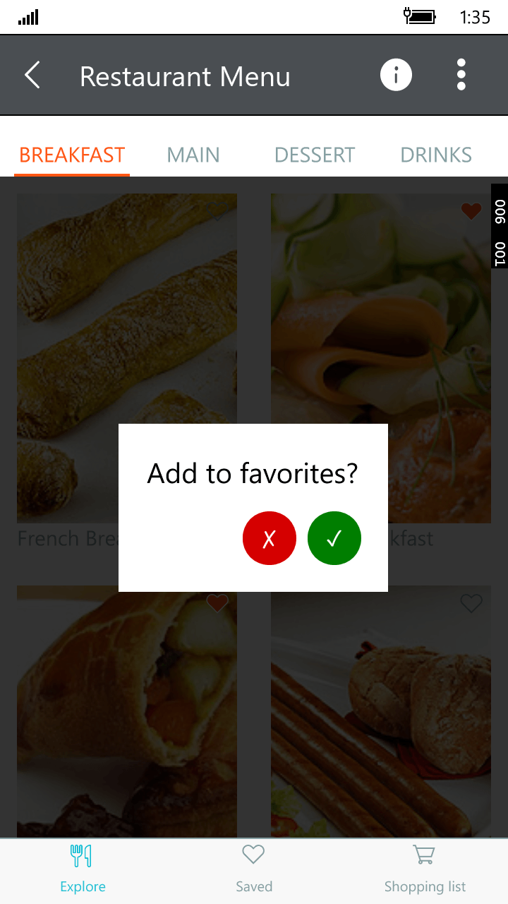
In essence, you need to set the width and height request to the same value, and set the border radius to half of that value. And this is the result I get on a UWP emulator.


RadButton_UWP_Round_Circle

Creating an Image Button

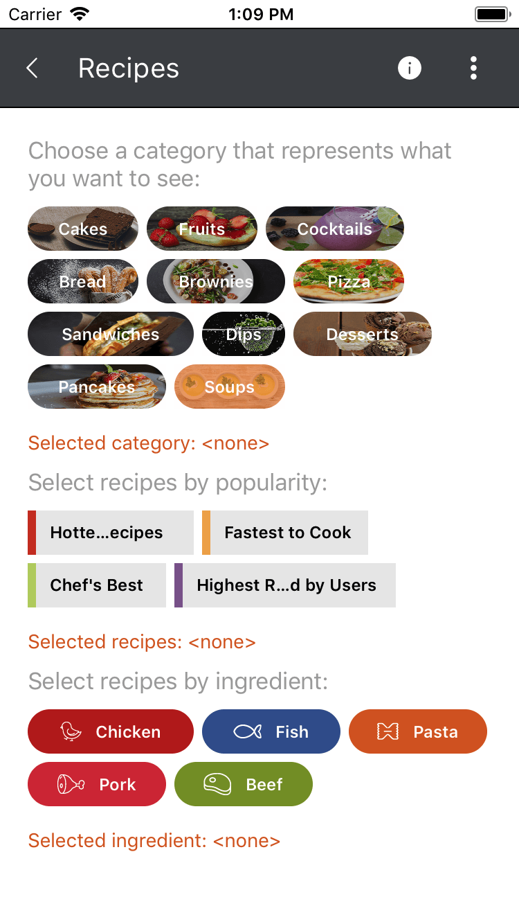
In a similar manner you can create buttons that have longer text, but still have rounded corners. You can find an example of this in our QSF examples (source code). Here the HeightRequest is set to 32 and the BorderRadius to 16. The WidthRequest is not set, because we want the button to autosize. In order to get the image in the back, you can use the BackgroundImage property.


<telerikInput:RadButton.BackgroundImage>
  <OnPlatformx:TypeArguments="FileImageSource">
    <OnPlatform.Platforms>
      <OnPlatform="iOS, Android"Value="Button_Recipes_Cakes.png"/>
      <OnPlatform="UWP"Value="Assets\Button_Recipes_Cakes.png"/>
    </OnPlatform.Platforms>
  </OnPlatform>
</telerikInput:RadButton.BackgroundImage>

This is what you will get on an iOS simulator.


RadButton_iOS_BackgroundImage_Image

If you need the image to be next to the text and not in the background, you can utilize the Image property.

<telerikInput:RadButton.Image>
  <OnPlatformx:TypeArguments="FileImageSource">
    <OnPlatform.Platforms>
      <OnPlatform="iOS, Android"Value="Button_Recipes_Chicken.png"/>
      <OnPlatform="UWP"Value="Assets\Button_Recipes_Chicken.png"/>
    </OnPlatform.Platforms>
  </OnPlatform>
</telerikInput:RadButton.Image>

Yes, it's that easy! Now go beautify your app and let us know how you like the new Button Component in our suite.

Try It Out and Share Your Feedback

Make sure to download the latest version of the Telerik UI for Xamarin, and try the new Buttons in your mobile app alongside all the other new features that came with the Telerik R1 2018 Release.

Download Telerik UI for Xamarin

We'd love to hear what you think, so please make sure to share your feedback through our Forums or through the Feedback Portal. Additionally, here are some other Telerik UI for Xamarin resources that you can find useful: online documentationSDK demosQSF Application and its source code.

Thanks and happy coding!

New ERP Demo App Available in Telerik UI for WinForms

$
0
0

This Telerik UI for WinForms sample app simulates a real-world ERP business application, showcasing a common LoB app scenario. It's a great example of how you can easily deliver an awesome UI.

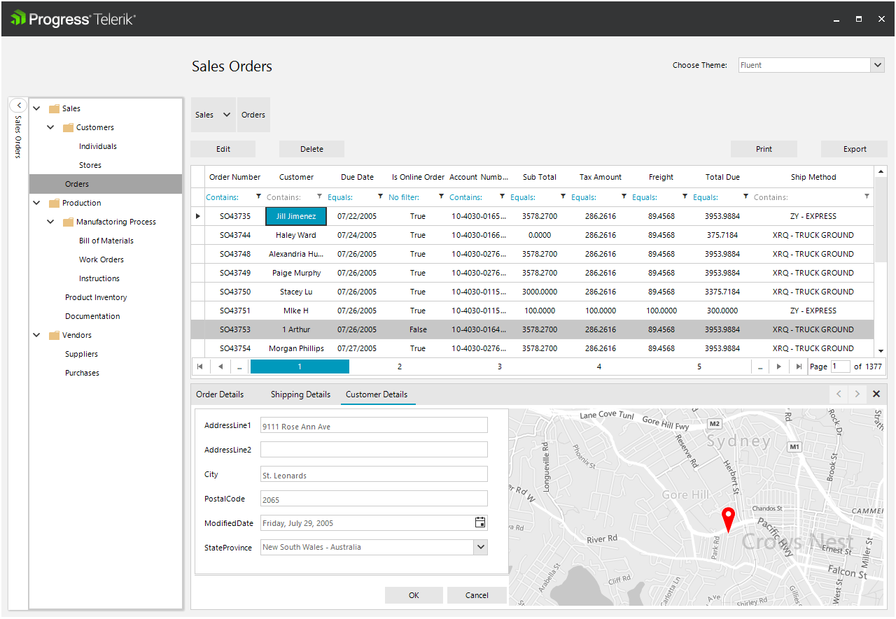
The new ERP demo application in Telerik UI for WinForms aims to provide an example of a real-world desktop ERP application. It follows the MVVM pattern (the UI is separated from the business logic), is designed to be DPI aware and the layout is automatically scaled without requiring any explicit code.

erp_1

Using MVVM in Your WinForms Application

Model

The model is created by using a WCF data service, which provides the connection and a data layer. This allows you to interact with the remote server database. The demo shows how you can use the Telerik UI for WinForms suite with this service and access and edit the data. The data layer is separated from the UI and can be used with other client applications as well (WPF for example).

View

There are 10 views in the demo and they all follow the same pattern for interacting with the model. The model is only accessed when we need to retrieve or change the data. The data is retrieved by executing a single query. This is done asynchronously. You can save the data by executing a single method as well. The other logic would not differ if you were creating a standard WinForms Application with static data. There is no actual view-model because there is no benefit from it (we cannot bind the view to it).

DPI-Awareness

The application is made DPI-aware, meaning that the layout will be automatically scaled on displays with various scaling settings. This is achieved by docking the controls and using TableLayoutPanels. The benefit from using TableLayoutPanel is that the controls can have a specific Margin when they are docked (if you directly dock the controls their Margin is not applied). This allows you to easily align the controls in the cells.

The general idea is that the docked controls do not have static location and size. Because of this they are properly resized depending on the available space. This way, thanks to the built-in HDPI, support the controls will be automatically scaled and they will still fit the available size. Another benefit from this approach is that you can use a theme with a different font and controls sizes and directly change it at runtime e.g. touch theme.

Multiple Theming Options for Just the Right Look

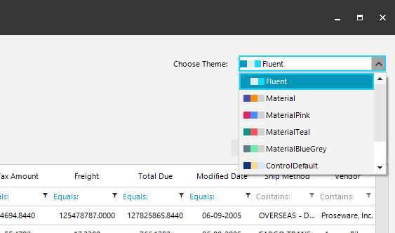
It’s also worth noting that the ERP Demo application includes theming support. There are a variety of themes, which can be selected from the dropdown menu at the top, making it easy to visualize how your app will look if you choose to adopt one.

ERP Themes

In addition to the Material Theme that's already available (with multiple color palettes), in our latest release we have added a brand new Fluent Design-Inspired theme to Telerik UI for WinForms. You can try it out in the ERP demo app as well. This is one more way we hope to help you create modern looking WinForms desktop applications that follow the latest UX design guidelines.

Try It Out and Share Your Feedback

We would love to know what you think, so go ahead and download the latest version of Telerik UI for WinForms and take it for a spin.

Download the Latest Version

Do share your thoughts in our Feedback Portal, or right in the comments section below.

Additionaly, the ERP sample application is also available in the Telerik UI for WinForms Demo Application in the Microsoft Store. And for your convenience, here is the source as well: ERP Source. Feel free to also check out the other Sample Applications that we have.

Thank you and I hope you find this useful!

New Enhancements in UI for ASP.NET MVC & UI for ASP.NET Core

$
0
0

We've got even more new features and updates to share with you, from the ButtonGroup to Tag Helpers to Scheduler and more. See what's new in UI for ASP.NET MVC and UI for ASP.NET Core.

For those of you who were able to join the Telerik R1 2018 Release Webinar, you heard all about the enhancements made to both Telerik UI for ASP.NET MVC and Telerik UI for ASP.NET Core. If you didn’t, never fear. I’ll give you a brief recap here or you can always watch the recording at youtube.com/telerik.

In both Telerik UI for ASP.NET MVC and Telerik UI for ASP.NET Core, we’ve added enhancements to existing controls, improved support for OData v4, and successfully completed our largest issue resolution effort to date.

Drag-and-drop Multiple Events in the Scheduler

The Scheduler component now supports the ability to select multiple events and drag-and-drop them around the calendar interface. This will preserve their relative positions to each other and gives the flexibility for users to move multiple sessions to new days, or re-arrange the time of day that these events will occur during the day.

ButtonGroup Update

ButtonGroup has been removed from the list of hybrid-specific UI components and added to the regular Kendo UI component list, removing the need to call from the mobile namespace and adding this component in all your responsive desktop web applications.

Improved Support for OData v4

In R1 2018 we added batch processing support to our OData v4 support offering. We support earlier versions of the protocol in full and this release brings us one step closer to full OData v4 compliance. We still have some features to implement so watch the service pack announcements for new additions.

Stability

With a focus on stability and a commitment to continued product improvement, we closed more than 250 issues across our public and internal issue trackers. This made a huge dent in the backlog and gives us the confidence in the stability of the R1 2018 release. 

New Tag Helpers

Tag Helpers are the HTML-friendly way to create views and define UI in ASP.NET Core applications. In R1 2018 we added than 15 new Telerik Tag Helpers to the suite, including the Chart component, Gauges, MaskedTextBox (and other input elements) and more! This brings the total number of Tag Helpers in our suite to more than 30, making Progress one of the first companies to offer these more advanced versions of the components.

New Kendo UI for Angular + ASP.NET Core Template

The Kendo UI for Angular Project Templates package is an integration example between Kendo UI and ASP.NET Core 2.0. This SPA application template covers the most widely used components including the Grid (with remote binding), DropDownLists, and Chart. It is a great starting point for everyone interested in creating an entire SPA with Kendo UIfor the front end and ASP.NET Core as a backend.

Try It Out and Share Your Feedback

So what are you waiting for? Start taking advantage of all of the new enhancements to both suites at the links below. If you have an existing license subscription, make sure you download the latest bits from your account. If you haven’t used either, make sure you download a trial.

Download UI for ASP.NET Core
Download UI for ASP.NET MVC

Viewing all 737 articles
Browse latest View live


<script src="https://jsc.adskeeper.com/r/s/rssing.com.1596347.js" async> </script>